The Metabarons

The Metabarons is something of an enigma. Spinning out a single character from one of the greatest works of comic fiction, The Incal, and creating an epic story spanning 100s of years seems like a risky thing to do.

Luckily the author of The Metabarons (and of The Incal), Alexander Jodorowsky, is nuts enough to give it all a real bash. With able assistance on art duties from Argentinian artist Juan Giménez, the duo have crafted a bizarre, sprawling epic that’s part Greek tragedy, part Dune, part Heavy Metal magazine and 100% operatic space weirdness.

Heads up kid!

Inspiration

Once again my Comic Book Club choice was inspired by ‘something I read on Twitter’, this time from the Batman screenwriter David Goyer. Can I find that tweet? Can I b*****ks. But it did happen. Honest.

Anyway, Mr Goyer has written a gushing introduction to The Metabarons hardback volume which should give you an idea of why I thought this might be interesting:

The Metabarons is truly passion writ large… and is, to my mind, the greatest work of graphic fiction ever produced – David Goyer

Wow.

Er, that might be pushing it a bit far Dave. But we’ll take a look and get back to you.

Note: Although we were supposed to be reviewing just the 1st volume of The Metabarons all four of us opted to purchase the hardback Humanoids edition containing all 8 volumes (and more). The book itself is lush and everyone’s glad they opted to go ‘real life’ over the cheaper digital editions.

It’s a tragedy

I opened with a broad comment about how much the Metabarons wanted to reference Greek tragedies. I mentioned that the tome itself felt epic (in length and duration) to which Jake pointed out that most Greek tragedies are pretty short in page length. Damn your classical training Jake :-)

As expected, it was pretty pervy and explored some rather complex, challenging themes over its 500 or so pages.

The bit where the first Metabaron prepares for take-off by plugging his protonic willy into the dashboard… – Dan

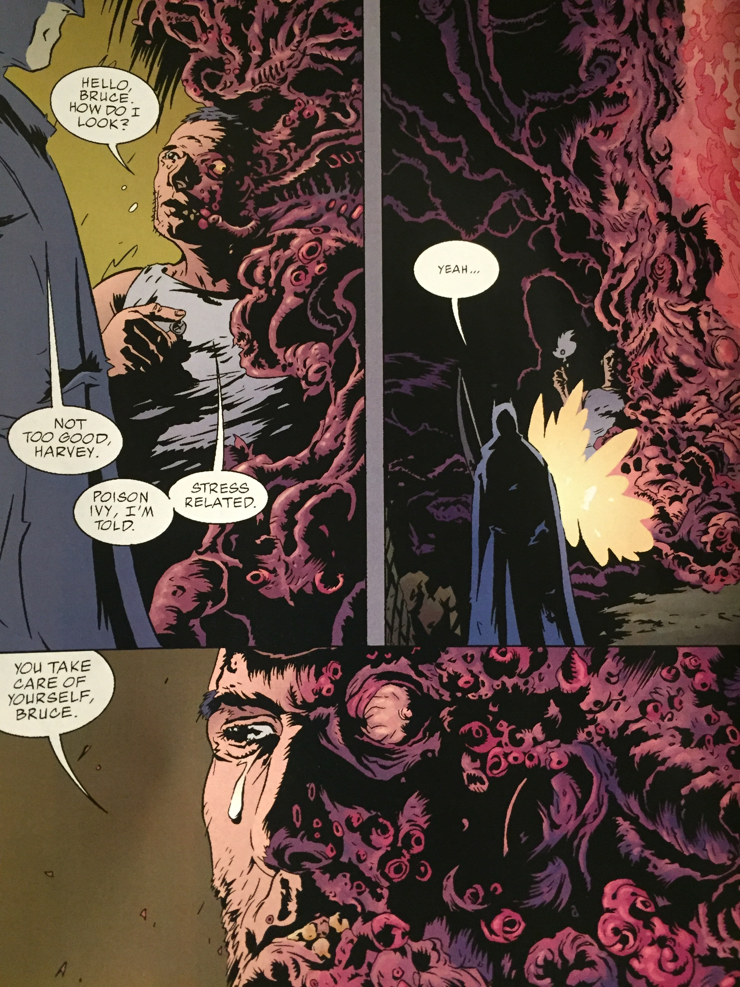
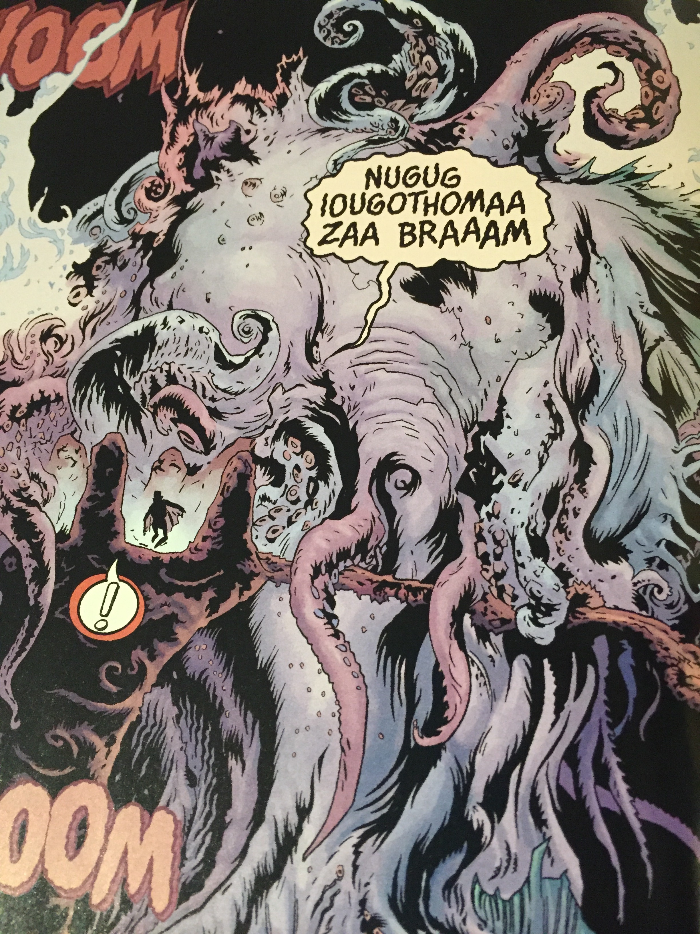
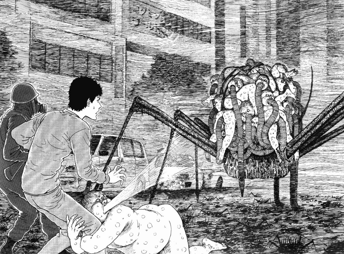
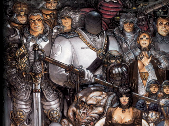
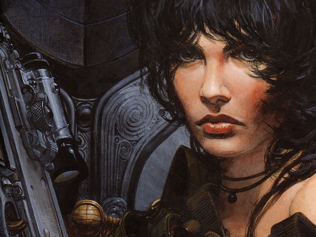
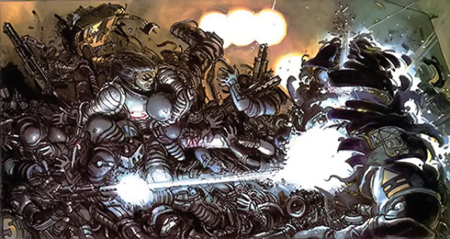
Jodorowsky is not afraid to casually toss in rape, incest, child-dismemberment, casual planetary genocide and torture with his already heady mix of ham-fisted political and social allegories and swashbuckling sci-fi clichés. His cohort Giménez is more than happy to render it all in highly-detailed painted art.

All in all it felt like a book that was squarely pitched at overly-hormonal 14yr old boys.

To be honest I don’t think Jodorowsky was aiming that low. I think he thought he was writing a literary masterpiece” – Jake

Princess Dona Vicenta

Subjective objectification

Kelv felt that the treatment of women throughout was very unpleasant, with them often reduced to minimally-clad ciphers or objects to be disfigured, remodelled or just used to further the story and the Metabaron bloodline. However, despite all our objections to the grating sexism on display most of us were rather taken with the depth of the story itself, drawn in to an epic narrative about the ongoing lineage of the Metabarons.

It’s so bad it is really quite good – Kelvin

Tom and Jake felt that the story might well have felt a bit more… epic had we read it in its original form (8 volumes released over the course of 12 or so years). Things do get a bit confusing and it’s easy to lose track of motives, origins and relationships as Jodorowsky merrily smushes characters together or erases them on a whim.

Although Jake wasn’t completely sold on the story, his interest in the universe and lore surrounding the Metabarons was piqued enough to read The Incal, which features the first appearance of the Metabaron character.

Othon, the first Metabaron, fights off space pirates

You write it, I’ll paint it

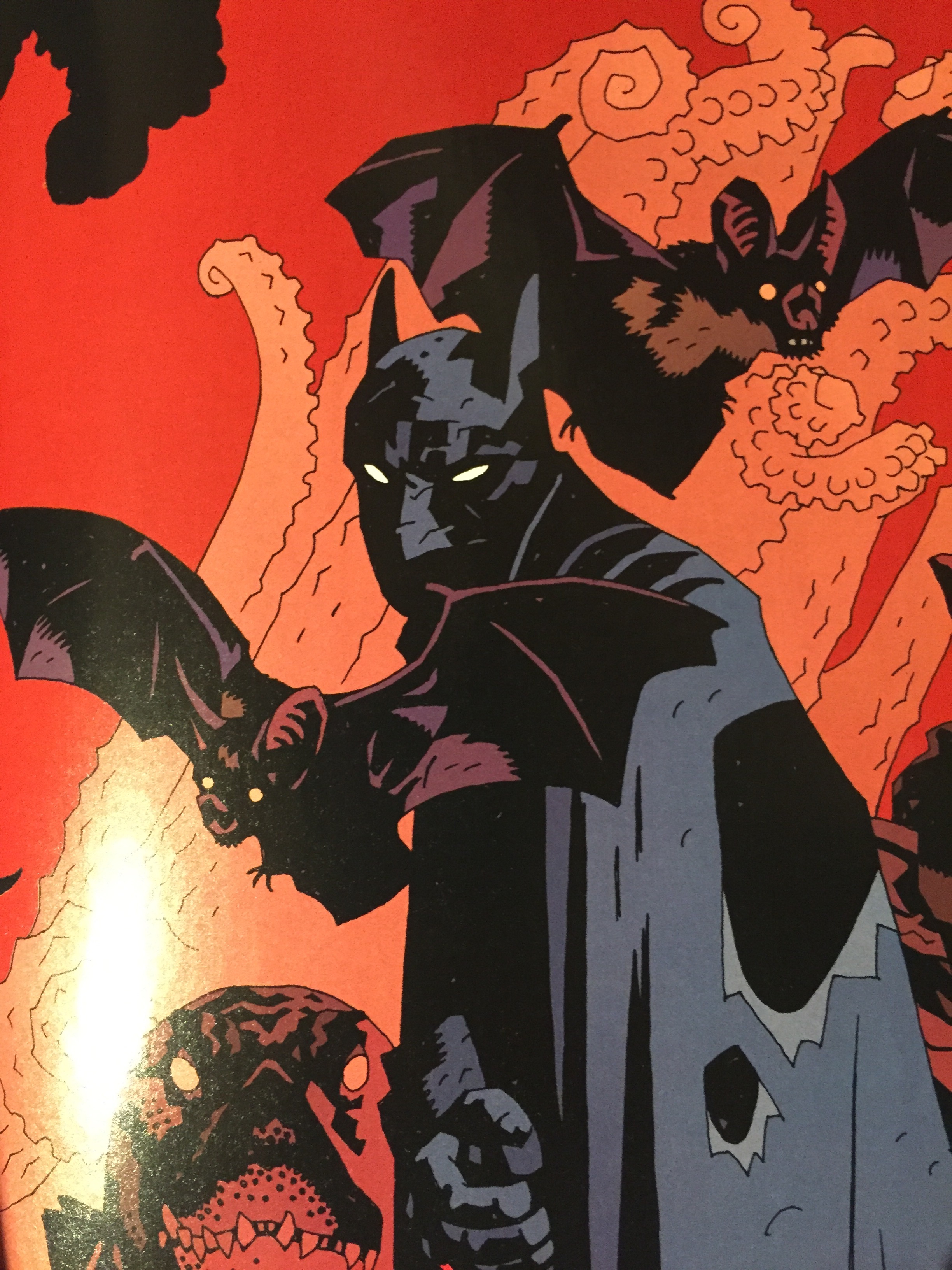
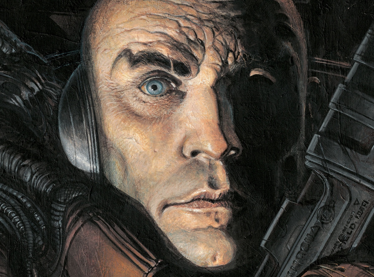
The art came in for some high praise across the board, with Tom identifying a very modern cinematic teal and orange palette. Giménez does a fine job throughout and the book looks gorgeous although the art does swerve into 80s Metal Hurlant territory with busty space-wenches and phallic spaceships aplenty.

There’s no shying away from depictions of some genuinely shocking imagery including the decapitation of an infant via psychic beam.

Heads up kid!

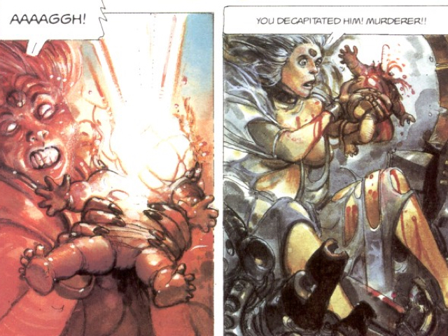
I struggled to put into words exactly how I felt about the event above. The best summary I’ve found so far was by Konstantine Paradias on his Shapescapes blog. I’ve made some small edits to the orginal quote to avoid spoilers:

I mean, dude, there’s comic book logic and there’s Metabarons logic. Whereas Marvel and DC have repeatedly killed off and brought heroes back in increasingly strange ways, Jodorowsky just shrugged and typed: baby’s head explodes, mad witch mama <redacted> onto <redacted>. Problem solved! – Konstantine Paradias

In summary

I’m slightly ashamed to admit that the 14yr old boy in me loved it, whereas the grown up me felt a bit sad and seedy.

I’m glad to dip my toe into this kind of stuff – Tom

Paleo-Christ! It’s the scores!


:star::star::star::star:

@dandineen


:star::star::star::star:

@chao_xian


:star::star::star:

@tygertale


:star::star::star::star::star:

@tomwe


So what now?

Eager for more paleo-insanity? Intrigued by techno-techno and concrete seagulls? There’s only one place you can go after The Metabarons and that, ironically, is back to the beginning.

The Incal

Batman: The Doom That Came To Gotham

Sounds like a delicious combination does it not? A dark and gothic noir Batman in a loveletter to Lovecraft. And those Mike Mignola covers are enticing!

Well what a let down Batman: The Doom That Came To Gotham is.

I was fairly ambivalent to the writing’s mediocrity, but the artwork is infuriating. Well I was furious because I could probably render faces better than this book’s depictions, yet these professionals were paid to draw the hallowed Batman.

Not the face!

Bad face

I mean look at this monstrosity. That’s not a Lovecraftian homage, that’s meant to be Bruce Wayne.

Oliver

Is this a homage to Lovecraft or the Bayeux Tapestry?


:star:

A heartbreaking disappointment. It made me sad.

@chao_xian


I just couldn’t get past how bad the artwork was and I’d given up reading it after a few pages. I had been so excited when the book arrived in the post and couldn’t wait to read another Batman book. The reviews for it were ok and nothing hinted at this being a disastrous pick. I had to force myself to finish reading it.

Although I don’t hate the book, I don’t like it in the slightest bit.

Who’re you calling ugly?

Tom didn’t hate it either but liked it far more than I did. He described it as, rather charitably in my opinion, “nicely ugly”. I don’t know if he meant the faces.

He noted that Ra’s Al Ghul’s portrayal as a bearded, ancient immortal attempting to awaken otherworldy monsters to bring about the destruction of the world was a carbon copy of Grigori Rasputin in volume 1 of Hellboy.

He thought it interesting but not a classic and felt that Cthulhu has been done to death now. Maybe back in 2000 it was a fresher theme.


:star::star::star:

I like the ugliness.

@tomwe


Laugh out loud

Dan loves a bit of Lovecraft and also felt a bit let down. He thinks that they didn’t have the courage to go full Lovecraftian. Where were the names of Lovecraft’s own monsters? It’s out of copyright surely? And he also thinks that this approach of making a thing with a specific treatment has been done better in Hellboy and League of Extraordinary Gentlemen. Dan bought Gotham By Gaslight the day it came out and although imperfect it’s a damn sight better than this.

Gotham By Gaslight

Dan liked the backstory of Gotham but felt that the creators realised too late that it’s far more interesting. Maybe this and Thomas Wayne’s history having an impact in modern Gotham inspired Scott Snyder today on his seminal Batman run?

He also enjoyed the interesting take on Harvey Dent where you felt rather sorry for his plight. He is cursed by what appears to be Poison Ivy. Half of his body explodes into a mutated grotesque mass. The acid in the face thing is a bit hard to swallow after all. He never got to be the villain that he’s meant to be.

Harvey

For me the tragedy and empathy is brief and I’m used to seeing the best depiction of Harvey through Paul Dini and Bruce Timm’s version in The Animated Series. They were the first to make you sympathise with the character, although they hinted that the destructive monster was always within him. A theme that Frank Miller first introduced in The Dark Knight Returns when Harvey is finally “cured”.

Dan also made clear that he hates Jack Kirby’s demon Etrigan. He hates the yellow face and the pixie boots.

Yellow faced demon

When Dan finally got round to critiquing it, he said “the art is complete dick”. His “favourite” panel was the lack of depth or perspective in the pic of the policeman stood behind Gordon.

Bad policeman

“Why didn’t they get slapped and told to redraw?” Why indeed Dan. Why indeed.


:star:

The Mignola covers are lovely, the interior art is guff. I found it laughable. The star is for Harvey Dent.

@dandineen


I wish I had a wine cellar

Jake was also unimpressed. He did however pick out a few gems such as his favourite representation of Oracle.

Oracle

She’s a far cry from the feisty red head on a kitch motorbike.

He liked the restaging of the Wayne murders and the use of the belfry instead of the cave as Batman’s lair. With regards to the cave Jake thought it humourous when Bruce Wayne scolds Alfred: “Don’t call it a wine cellar!”

Jake normally enjoys Elseworlds stories. He’d brought along copies of Gotham By Gaslight and Batman Year 100 (which I wish I’d picked instead but Jake and Tom have read it). He likes how characters are deployed into a story from something else. But he also thought the faces were awful, as he’d said “it’s great when you can’t see the faces”.

Jake enjoyed that the Robins were killed off. Dan also made a particular comment about how they were indistinguishable from each other and lacked any stature. We all thought they were completely throwaway.

Lovecraftian

The story was too weak to succeed as a Lovecraftian tale. It could’ve done with more body horror (like Harvey). The worst thing for Jake was Bruce’s character. The creators had removed his origin - his essence - but replaced it with nothing. He was completely cardboard. What had Bruce Wayne been doing on a boat for 20 years???


:star::star:

Lovecraft has to be good to work. This is far from well written.

@tygertale


Something else

Well we pretty clearly didn’t like this much. I want to make up for this by buying myself Paul Pope’s Batman Year 100 and forget about The Doom That Came To Gotham. But before we end here’s a reminder of what could have been…

Why not this?

The Private Eye

Ah, my choice again and this time I kind of copped out by choosing a book written by arguably the best modern scribe in comics, Brian K Vaughan. However, the twist with this series is that it is published as a webcomic.

BKV and his artistic partner in the venture Marcos Martin released the series as periodical downloads via a new comics portal called Panel Syndicate, where they allowed the reader to pay whatever they wanted for the book, basically giving the book away for free. However, the pair have claimed much financial success from the gamble and have now begun a second series on the website, as well as also publishing Albert Montays’ SF comic UNIVERSE. Of our group, one chose to pay nothing while two others paid an amount they would happily pay for a discounted collection on ComiXology.

Vaughan & Martin always said The Private Eye would remain a webcomic only, an ironic nod to the story’s future world where The Internet and The Cloud are no more. However, Robert Kirkman eventually convinced them to release the series in print through Image and the deal even allowed the webcomic creators to do a one-off issue of Kirkman’s own Walking Dead series on their digital platform.


:star::star::star::star::star:

This is probably the best book I have read this year. The story rips along at a tremendous pace and kept me wanting to turn the page / swipe the screen and read more.

@tomwe


The print edition of The Private Eye is a hardback book unusually bound in landscape format matching the layout of the strip as it appeared online. This was the format I read the book in, though I have also looked at the webcomic to compare and contrast. I personally felt the series read better digital because of the sheer number of page turn reveals BKV packs into the storyline and also the slightly awkward way the book must be held to read, with the pages sliding down slightly.

Dan was frustrated with the digital format. He doesn’t pledge very much worth to webcomics and prefers to hold his iPad portrait. His instinct was that he had been shortchanged by the apparent half pages he was looking at and he said the lettering was cock. Jake also sees little value in webcomics, but Kelvin was happy with reading on his iPad and found it akin to Sunday Funnies as far as the layout was concerned.


:star::star::star:

This is Saga slightly turned down and made into normal stuff with a weird mask on.

@dandineen


Although I loved it, Jake felt let down by the story. He hates PI stories like Chinatown and The Big Sleep and saw many of the genre’s tropes at play here, like plasters on character’s noses. He coined the term Neo Noir for this futuristic detective story. Dan and Kelvin both saw it as similar to Vaughan’s series Saga, where a mundane concept is presented through an utterly bonkers lens, only here it was less so and suffered as a result. Kelvin loved the story though, and wondered what went on outside the bubble of the city, beyond ocean barrier The Wonderwall.


:star::star::star::star:

I like the setting. It’s a dystopia but a bit safer than the one in Lazarus. I can buy this happening but it’s not such a terrible, post-apocalyptic future.

@chao_xian


Dan said Martin’s art was Meh. Kelvin did like it thankfully, both he and I had read his stuff before on titles like Batgirl Year One, Daredevil, and Doctor Strange The Oath (a previous collaboration with Vaughan). I thought the layouts here were exquisite and something only this landscape format would allow. The drawings capture just the right moment of the action, and when you add to that the sometimes dramatic, sometimes muted but always fitting colours by Marcos’ partner Munsta Vincente the dazzlingly bizarre world is one you can study for hours. Jake compared it to Kevin O’neill in that regard and found the colour pallette reminded him of the Channel 4 series Utopia.


:star::star::star:

The Webcomic format is intrinsically worthless, were this a book on the shelf I would read it again.

@tygertale


Overall Dan liked the big idea but didn’t think the characters were developed properly, something I disagree with. I thought Vaughan fleshed them out at a good pace and in doing so drip-fed us facts about this future. We had conflicting opinions about PI & his assistant but all liked Grandpa. He reminded Dan of Warren Ellis’ Spider Jerusalem from Transmetropolitan, and I suspect we see something of ourselves in him as he is of our own generation in this future. He is constantly wondering why he can’t get online, and in fact both Kelvin and I wanted the villain to succeed at the end (spoilers!). Jake thought the baddie was rubbish.

I have been a little vague with the actual plot in this review as I hope readers will seek it out and experience this new world for themselves, you could even do so for free so what are you waiting for!

Klaus by Grant Morrison and Dan Mora

Jake hosted a double dip for our Christmas bonanza. We even feasted together for a Christmas meal for the occasion. The two books were Vertigo Pop’s Tokyo Days, Bangkok Nights featuring art by Seth Fisher. This was followed up by Klaus, a festive tale by Grant Morrison.

Jake’s full write-up can be found on his lovely website as part of his Christmas Advent Calendar series of posts.

Gyo - The Death Stench Creeps

As Christmas creeps ever closer I felt The Comic Book Club needed an injection of something a little more… grotesque to balance out all this goodwill to all men stuff.

I was looking for something a bit different to what had been covered so far. We’d mainly stuck with American publishers with a solitary, brief visit to Europe way back in July. We needed to head east.

Whilst hunting for inspiration I stumbled upon an article on polygon.com on Guillermo Del Toro’s aborted Silent Hill film. In the article Del Toro referred to The Death Stench Creeps author and artist Junji Ito as a master of Japanese horror.

Sounds perfect. Let’s do this.

Note: I initially suggested we read volume 1 only. However 2 out of 4 of us elected to purchase the 2 volume hardback edition. The other two purchased the 2nd volume after completing the 1st. This write-up assumes knowledge of both volumes. With this in mind there may be spoilers ahead :-)

Jake

Jake had read some manga previously but came into The Death Stench Creeps with no real idea of what awaited him. In general he enjoyed the book but found the characterisation wooden and the leads hard to relate to. Jake also commented on the apparent horror derived from the mundane items such as plastic bags and gastro-intestinal upset.

He was much more of a fan of the short stories after the main story feeling that they were much darker and more engaging than the main storyline.


:star::star::star::star:

It was worth it for the fart cannon.

@tygertale


Tom

Tom wasn’t a big fan of the main storyline, feeling that it wasn’t horrific or scary at all. In fact he described it as ‘bordering on laughable’ rounding particularly on the bio-mechanical shark that forms one of the main set pieces in the first volume. He found the end pretty unfulfilling and abrupt.

As with Jake, Tom found that the short ‘backup’ stories provided more enjoyment than the main event, likening them to the classic 2000AD Tharg’s Future Shocks.


:star::star:

I’m the Craig Revell-Horwood of comic book reviewing.

@tomwe


Kelvin

Kelvin grew up in Malaysia reading comics from Hong Kong, China and Japan so he had no problems adapting to the reversed format (unlike the rest of us who kept struggling with the back-to-front panel order for the first few pages).

Kelvin had a similar issue to Jake, Tom and I finding the two lead characters shallow and unlikeable. He wasn’t surprised by the unfortunate depiction of women citing the cultural background of the author.

Kelvin was the only one of us to really get spooked by the subject matter as the insectile nature of the mecha-fish played upon his own fears of insects.

Tik! Tik! Tik! Tik! Fwwwwwsssshhhhh


:star::star::star::star:

I’m pleasantly surprised you picked some proper manga.

@chao_xian


Dan

My general feeling was that this was really rather weird. I struggled with the reversed reading order for quite a while until getting into the swing of things. Once I was there I have to admit to being slightly disappointed - it was far less horrific and gratuitous than I expected (although things do start to ramp up in volume 2).

There was a lot of farting in this book, in fact I don’t think I’ve ever seen (heard?) as much flatulence in a comic before. This approach to body horror was fairly unique.


:star::star::star:

I’m sure there was a chase sequence where some people ran away from a plastic bag.

@dandineen