Can superstar creators Kelly Sue DeConnick and Phil Jimenez give Wonder Woman the epic, mythical origin she deserves?
DC have a long track record of producing complex, nuanced re-workings of the three major characters in their pantheon - the DC trinity. The majority of these lauded interpretations focus on Superman and Batman - the ‘big two’. It’s about time that Diana of Themyscira, Wonder Woman, gets her turn in the spotlight.
Wonder Woman: Historia is the latest in a recent line of books that looks to re-examine the mythological aspects of Diana’s origins. In Historia exquisite comic art blends with a sophisticated, almost academic approach to storytelling, befitting of the series Black Label status.
Note: At the time of meeting only volume 1 of Historia was available. Volume 2 has recently been released.
First and foremost Historia is a truly beautiful book.
The oversized format, beloved of DC’s Black Label line, looks and feels premium. It’s a format that harks back to 90s Marvel one-shot graphic novels or the larger A4 European comics. As with almost every other ‘tentpole’ comic release these days Historia also comes with a set of alternative ‘collectible’ covers. Of the five of us, Jake and Kelv managed to secure copies with a Jimenez cover. Tom, Paul and I ‘made do’ with the (admittedly lovely) alternative by Olivier Coipel.
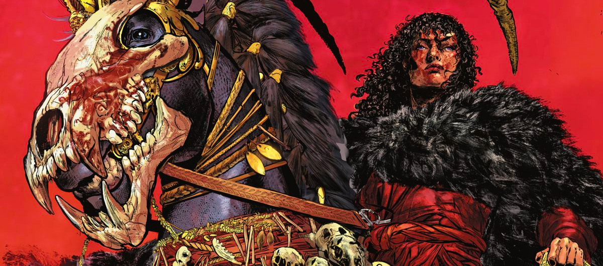
It’s difficult to talk about Historia without heaping praise upon Phil Jimenez’s glorious art work. His art flows across pages into seamless, epic double page spreads in a manner that evokes JH Williams seminal work on Sandman. There’s so much detail, so much vibrancy and dynamism, that it can become a little overwhelming. Once in a while his panel construction gets a bit too complex, a bit too sophisticated for us mere mortals to follow.
Then again, this is a book about gods. Maybe we just need to up our game a little :-)
In a couple of places we spotted a few problems with the quality and reproduction of the print. Some of the images looked less than pin sharp, with vaguely fuzzy edges on what should’ve been razor sharp line work. This was disappointing, especially as the rest of the book is so well put together.
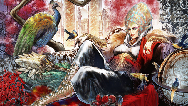
And one particular double-page spread just feels… ill-judged. The focus of the page composition - the mighty goddess Hera - is slap bang in the middle of the page.
In our hard copies Jimenez’s glorious rendition of Hera is almost entirely obscured by the fold of the spine. In this instance a quick look at the digital version reveals the full glory of the artwork, unhindered by the glue of the binding.
Perhaps this is one of those rare books that might actually benefit from being read digitally?
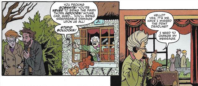
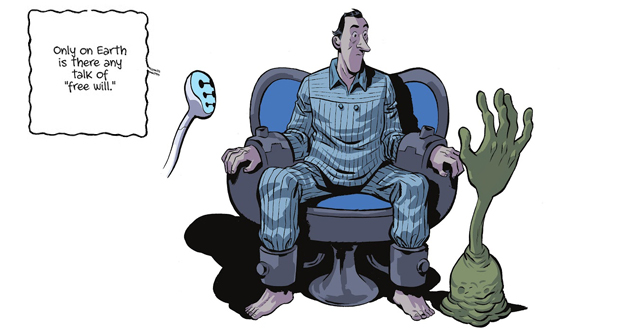
As might be expected from writer Kelly Sue DeConnick Historia delivers a powerful vision of Wonder Woman’s world that pulls no punches. The Amazons are born from the frustrations, anger and rightful resentment of women’s treatement by men throughout the ages. Men are the problem, gods included. That they cannot (will not) see it drives the conception of a new race of powerful women who encapsulate each and every aspect of womanhood.
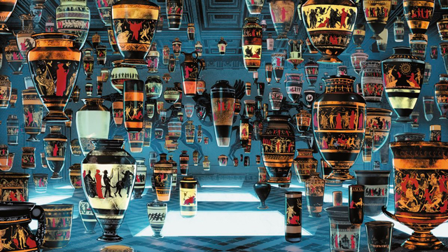
The never-ending crimes of men are powerfully documented in a double-page spread of thousands of vases each detailing an act of violence by men against women. Every vase is different, but they all reiterate the same sombre message. It’s a breathtaking page that provoked a strong sense of patriarchal guilt from all of us reading.
Historia is an origin of origins that refines and resets every Amazon in DC lore. What it might not be is an easily readable comic book!
It could be argued that Historia functions as more of a text book, a historical guide book to Amazonian history, than a comic book (graphic novel) in any real sense. Jake, who studied the classics, keenly felt the connection and the similarities to the structure of those ancient stories. It certainly feels as though DeConnick set out to write something that felt timeless, authoratitive and worthy of regard alongside more ‘serious’ works. However, this is not Wonder Woman’s Dark Knight or Superman’s All Star Superman - it’s something different, more considered, more literary. Comparisons with the tone and feel of Gaiman’s Sandman came up time and time again in our discussions and I think they hold true.
Something to note is that while Kelly Sue’s distinctive voice remains constant across all three volumes, the artists change on each volume. Whether that will affect the book I don’t know. Historia is certainly something special and I look forward to seeing where it goes from here.
-Tom ⭐⭐⭐⭐
-Paul ⭐⭐⭐⭐
-Jake ⭐⭐⭐
-Dan ⭐⭐⭐⭐
-Kelvin ⭐⭐⭐⭐
I can’t believe it’s a year since we read Scarenthood by Nick Roche. This review is really late. And also: I’ve not had another book since. What’s up with that?
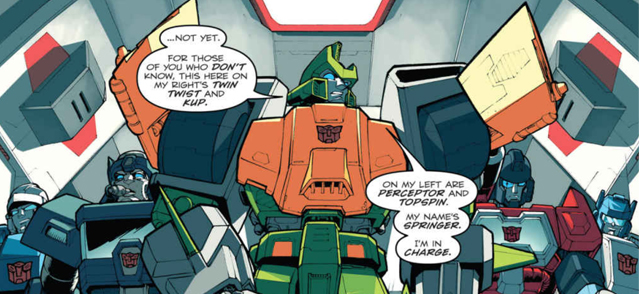
Roche is a creator mostly associated with drawing IDW’s Transformers comics, specifically the Wreckers Trilogy. Like many British comics readers of his (my) generation he grew up reading the UK weekly and was part of the fan culture that survived its demise in 1992. What a dream to have made it and drawn them professionally!
But everyone wants a piece of the creator owned pie and so here’s a new title with his name coming from IDW.
I didn’t know anything about the in advance, not even that it was pitched as an ongoing story, of which this was just volume 1. I see no evidence of any further issues though so it may just end here. The following review may suggest why.
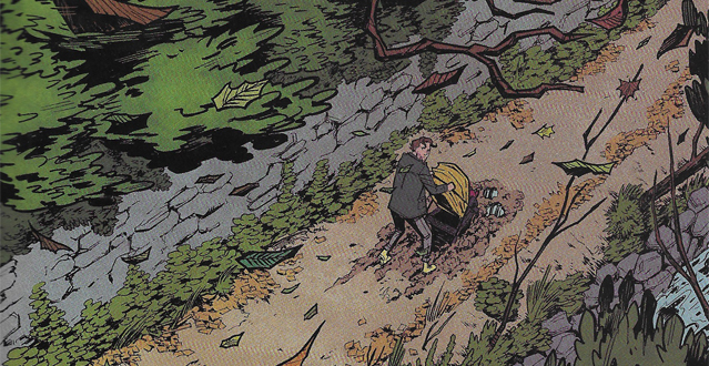
The book centres around a group of parents whose children attend the same nursery in a small Irish town. Certain things are seen to be off, both with the characters and the setting, and the tension racks as it goes along. I found the writing to be very dense and it took quite a while to read. Some may say this makes it good value for money? There are characters who have a lot to say and the setup reminds me of the show Motherland (which I enjoy greatly).
I think it works and it’s an effective hook. One thing to note is that the language is much coarser than I was expecting. That fits with the Motherland too comparisons as well, though you won’t find references to the occult or Cthulhu that show!
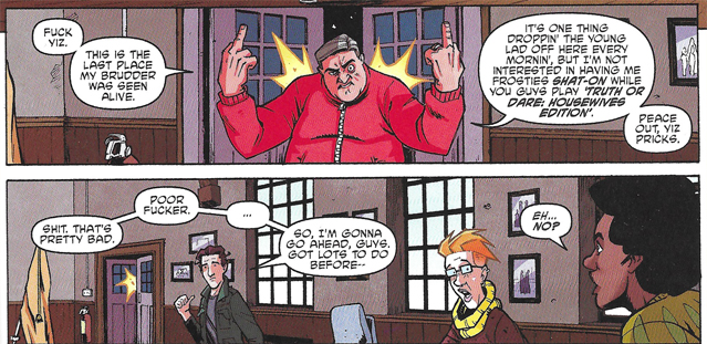
Roche has keen chops when it comes to page layout and storytelling, once he gets past the verbose parts. But overall his style here feels a bit flat and mediocre. It comes from the cartoony school, but his faces lean into angles rather than curved forms (hi Transformers). The colours are a mixed bag, sometimes they seem to be trying to pop and emphasise mood over realism but for the most part they blend into each other. This may be supposed to just be the mundanity of real life but it is also at times very flat and also I perceive slight texture in them that looks like a mistake.
EDIT: having compared my print edition to the Digital in doing this review I feel the colour read better with a backlight- something they should probably take into account.
The others in our group had similar feelings: Kelvin did not like the characters and didn’t make it all the way to the end! Jake thought it would be period piece from the 70s looking cover but got no strong feelings from the first half. He also put it down before reaching the end. Paul gave us some positive vibes, he found it an enjoyable alternative to his covid symptoms and read it quickly. The parenting jokes were very on the nose for him! Finally Dan tore into it, finding the artwork annoyingly plain and that very little happened. He said the ‘mad old lady trope’ seen later on had been handled better in Once And Future.
Overall then, a pretty sorry state of affairs from the gang. An attempt by this creator to get away from big robots and install some of the world around him into a horror comic. I’m afraid to say it just didn’t grab our attentions.
Since then Roche has been seen in the pages of 2000AD drawing a young Marlon ‘Chopper’ Shakespeare skysurfing the Big Meg, a place I feel his work is better suited.
-Tom ⭐⭐
-Paul ⭐⭐⭐
-Jake ⭐⭐
It gets an extra star for the Scarfolk Council styled covers.
-Dan ⭐⭐
-Kelvin 🚫
Adaptations can have mixed results. Some stories are even deemed unfilmable, or in this case unillustratable. When in bookshop Mr B’s Emporium earlier this year I mentioned Ryan North and Albert Monteys’ graphic novel they were surprised it had been attempted! Of our group, Paul and Jake had already read the source novel but the rest of us had not. I felt the need to rectify this when I had finished the GN and I honestly couldn’t see what they were all worrying about!
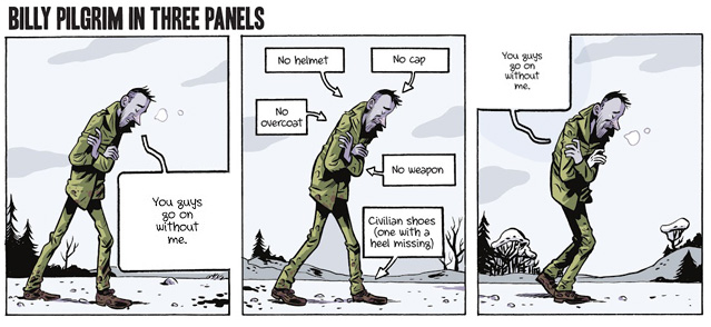
Yes, Slaughterhouse 5 is a challenging story: it jumps about through the lead’s life; it begins with the author explaining just what this book you’re holding in your hands is; it features aliens shaped like a hand stuck on top of a plunger; and most importantly, it deals with the horrors of war. But this graphic novel could not have handled all that any more straightforwardly. And I don’t mean to belittle it with that comment, nor to gloss over the pages where Monteys changes up his style to ape a different aesthetic. It is just a perfectly executed piece of graphic fiction.
It helps for me that the European style is just up my ally. Monteys’ line is slick with a cel shaded colour style, his cast have exaggerated features and the panel style is often a very regimented grid. You happily read the captions and the speech balloons, all the time easily following the action as it plays out.
But it’s the action that readers have been furrowing their brows at for the last fifty years, and so for this book to so gently guide the reader through the life of Billy Pilgrim is to be applauded. It also helps that non-linear storytelling and even the concept that all time exists as one single moment has been fed into popular fiction during that time. I’m thinking specifically of the character of Doctor Manhattan from Moore & Gibbon’s Watchmen, for Vonnegut’s Tralfamadorians experience time in exactly the same way the blue superhero does.
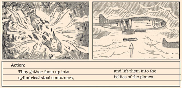
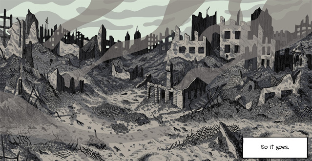
That is not the only heady topic to be found in the book and it is a set text for some students. Even a philosophical discussion. Vonnegut’s writing is often anti-American and it is spelled out at the beginning as his anti-war story. In the book, when someone dies the line is always So it goes, and no more devastating a instance of that is the bombing of Dresden. It is no spoiler to bring this up here as it is partly the theses for the piece. Kurt was there, and so places his fictional character there too. Through Billy, he is able to externalise his experiences.
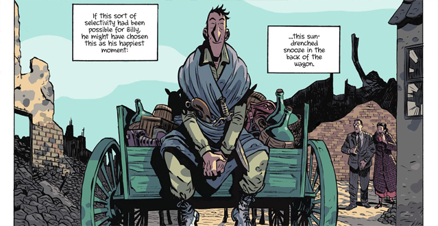
Vonnegut then gifts Billy the ability to move through time like his aliens do. If things are too awful in the present, he can instead be somewhere else. For someone who has experienced such horrific trauma, it’s possible that those events would feel like they were happening constantly. If that was the case, imagine being able to relive the better times constantly instead.
Now, why in summing up do I feel I have lost the spark of when speaking about the work the creative team have done adapting the story? Partly it is the homework aspect. Like when I picked Don Quixote some time ago, the sheer weight of this American Classic limits my ability to be enthused. I wouldn’t recommend it to anyone without a passing knowledge of the source book, like me not even knowing what the five referred to (it’s the fifth slaughterhouse, not, for instance, five people in a slaughterhouse).
But for someone looking for a new interpretation of the work I don’t think it could have been done better, and I highly encourage people to check out other works by Ryan North like Squirrel Girl (with Erica Henderson) and also Albert Monteys’ Universe, which is itself quite mind-bending too.
This review is finished, so it goes.
-Tom ⭐⭐⭐
It was an enjoyable graphic novel but I can’t view it as a standalone work.
-Paul ⭐⭐⭐⭐
Comics is the perfect medium for this story and Ryan North had the CV to do it well.
-Jake ⭐⭐⭐⭐
It’s too all over the place for me. I like non-lineaer but the weird whimsy was too much.
-Dan ⭐⭐⭐
I don’t love or hate it but it felt like a worthy read.
-Kelvin ⭐⭐⭐
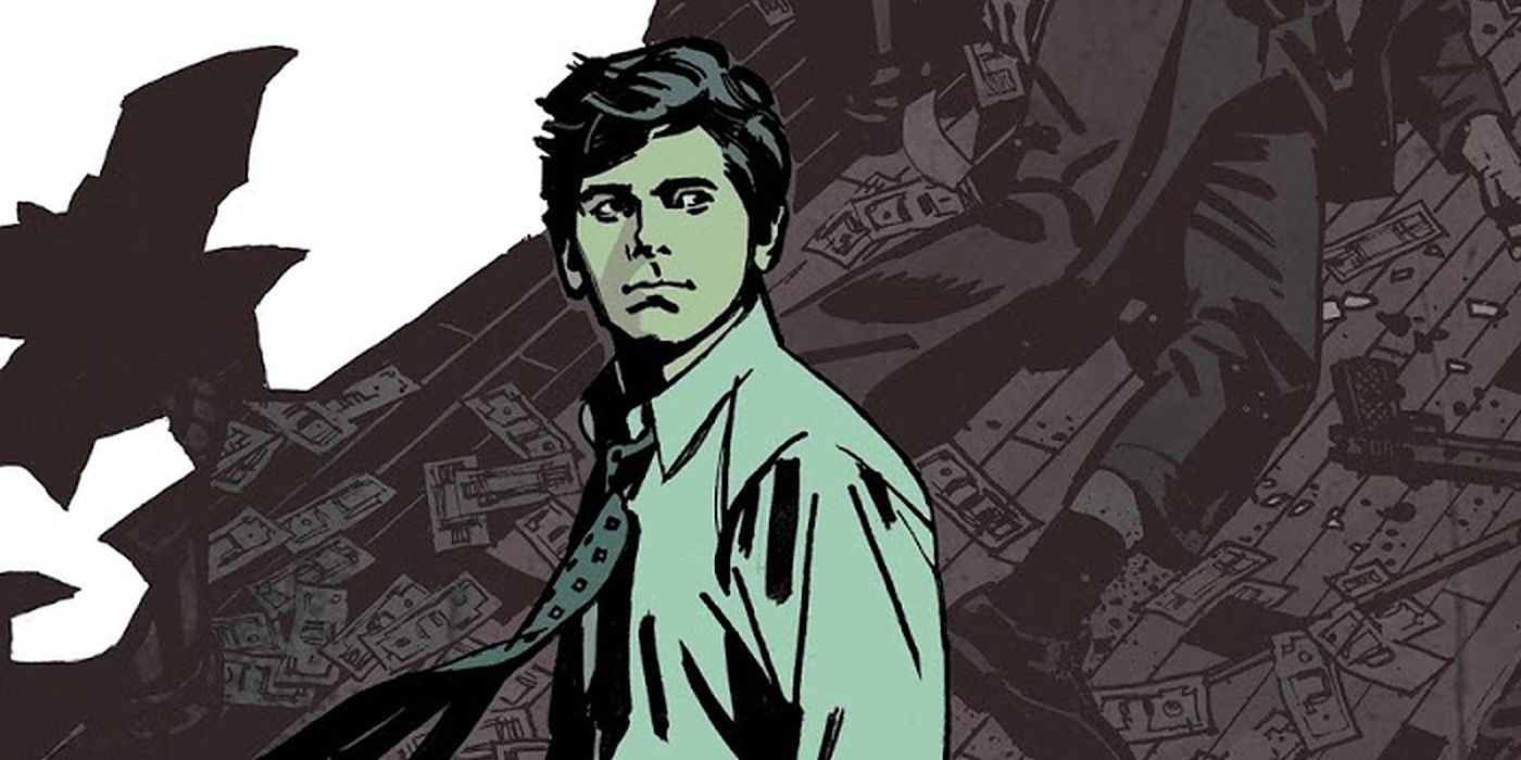
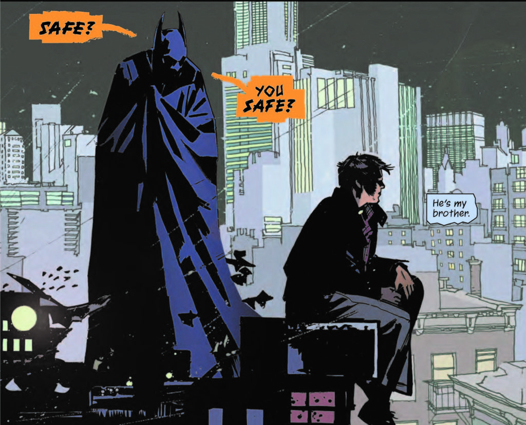
In tribute to John Paul Leon I picked this rather strange tale of Batman. I expected to at the very least enjoy JPL’s great art, and was optimistic that we’d also get an enjoyably original Batman tale.
I have to confess, I have no idea when this meetup occurred nor do I have much recollection of what was said. I’ve scanned through my notes and have been able to glean that essentially we were all finding it a bit of a drudge to read. And I totally concur.
When hit with difficult, cursive handwritten styled lettering in dense blocks of text as someone who is currently reluctant to read anything I just shut the book. It wasn’t the font, as I’d been practising calligraphy, but the blocks and blocks and blocks to grok. It turns out the rest of the gang felt the friction too.
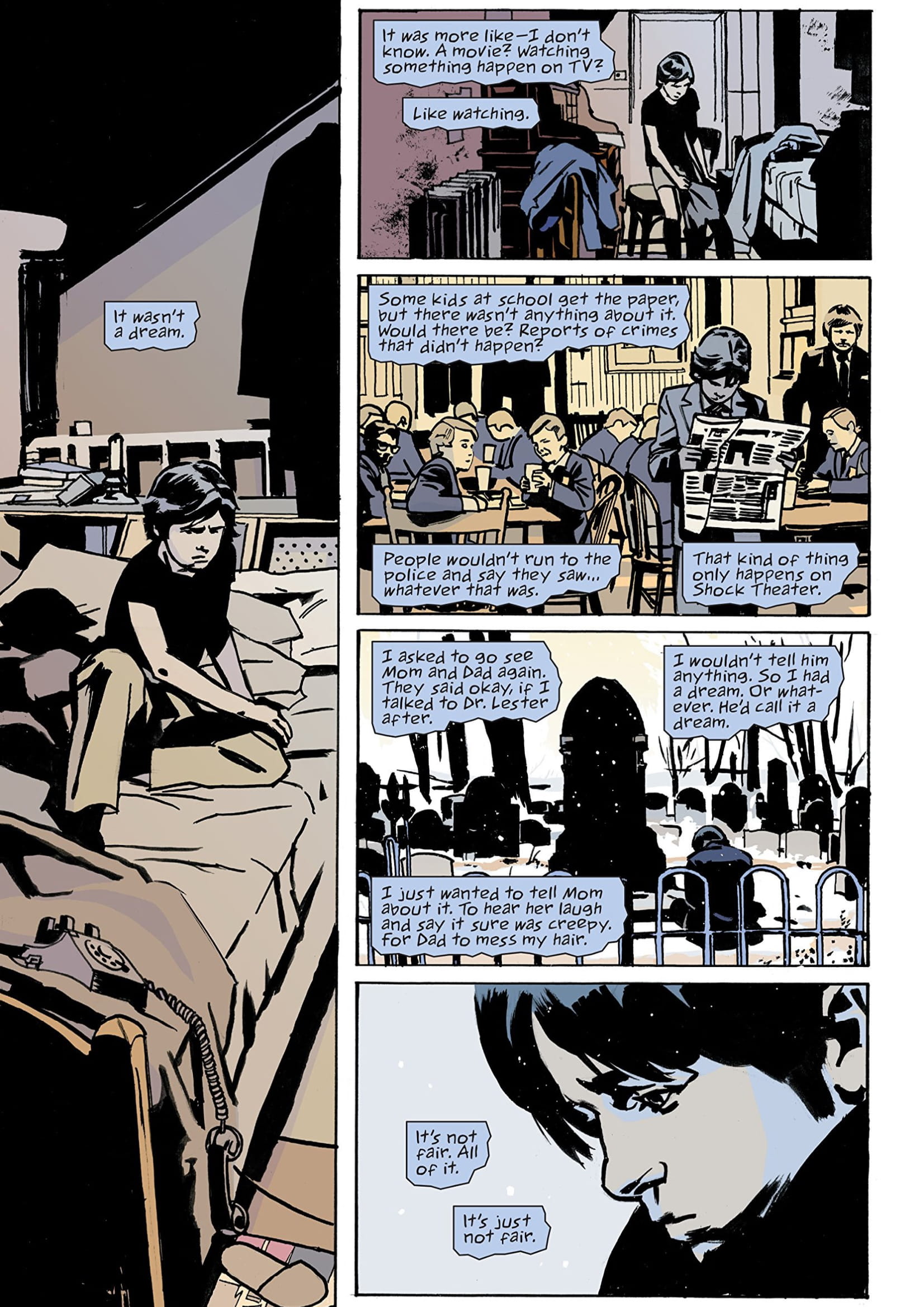
But ok, the story’s going to be good right? Kurt Busiek? He can write? Ooh this Batman is bonkers and… some kind of ghost avatar of Bruce’s splintered mind?
That could and should have been an interesting proposition but it turned out to be rather hokey.
And I don’t really have much to say on it. It’s taken me months and months to get round to writing this up but I really struggled. I can’t describe how ho-hum the story and dialogue is. But the artwork, if you’re a JPL fan, is good. There are some lush panels. They’re dark, oppressive and melancholic.
Some of the more fun moments were when JPL depicts from a specific Batman era. From Golden, Silver, Bronze and modern. The others hated the muted colours. I felt it suited the mood. Overall we felt disappointed in pretty much the same ways. And we all gave it 3 out of 5 stars each. Which means “meh”.