I can’t believe it’s a year since we read Scarenthood by Nick Roche. This review is really late. And also: I’ve not had another book since. What’s up with that?
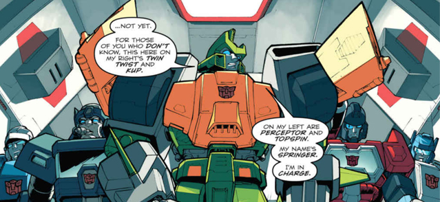
Roche is a creator mostly associated with drawing IDW’s Transformers comics, specifically the Wreckers Trilogy. Like many British comics readers of his (my) generation he grew up reading the UK weekly and was part of the fan culture that survived its demise in 1992. What a dream to have made it and drawn them professionally!
But everyone wants a piece of the creator owned pie and so here’s a new title with his name coming from IDW.
I didn’t know anything about the in advance, not even that it was pitched as an ongoing story, of which this was just volume 1. I see no evidence of any further issues though so it may just end here. The following review may suggest why.
The book centres around a group of parents whose children attend the same nursery in a small Irish town. Certain things are seen to be off, both with the characters and the setting, and the tension racks as it goes along. I found the writing to be very dense and it took quite a while to read. Some may say this makes it good value for money? There are characters who have a lot to say and the setup reminds me of the show Motherland (which I enjoy greatly).
I think it works and it’s an effective hook. One thing to note is that the language is much coarser than I was expecting. That fits with the Motherland too comparisons as well, though you won’t find references to the occult or Cthulhu that show!
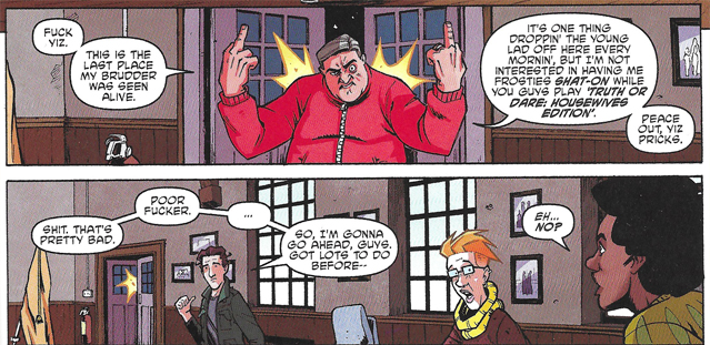
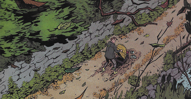
Roche has keen chops when it comes to page layout and storytelling, once he gets past the verbose parts. But overall his style here feels a bit flat and mediocre. It comes from the cartoony school, but his faces lean into angles rather than curved forms (hi Transformers). The colours are a mixed bag, sometimes they seem to be trying to pop and emphasise mood over realism but for the most part they blend into each other. This may be supposed to just be the mundanity of real life but it is also at times very flat and also I perceive slight texture in them that looks like a mistake.
EDIT: having compared my print edition to the Digital in doing this review I feel the colour read better with a backlight- something they should probably take into account.
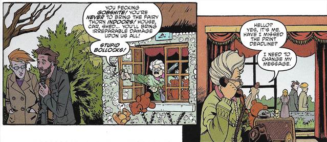
The others in our group had similar feelings: Kelvin did not like the characters and didn’t make it all the way to the end! Jake thought it would be period piece from the 70s looking cover but got no strong feelings from the first half. He also put it down before reaching the end. Paul gave us some positive vibes, he found it an enjoyable alternative to his covid symptoms and read it quickly. The parenting jokes were very on the nose for him! Finally Dan tore into it, finding the artwork annoyingly plain and that very little happened. He said the ‘mad old lady trope’ seen later on had been handled better in Once And Future.
Overall then, a pretty sorry state of affairs from the gang. An attempt by this creator to get away from big robots and install some of the world around him into a horror comic. I’m afraid to say it just didn’t grab our attentions.
Since then Roche has been seen in the pages of 2000AD drawing a young Marlon ‘Chopper’ Shakespeare skysurfing the Big Meg, a place I feel his work is better suited.
-Tom ⭐⭐
-Paul ⭐⭐⭐
-Jake ⭐⭐
It gets an extra star for the Scarfolk Council styled covers.
-Dan ⭐⭐
-Kelvin 🚫