It was always going to be about Bryan Talbot’s art.
From Luther Arkwright through Nemesis and Alice in Sunderland, we’ve all been fans of his chunky, muscular and detailed lines. There’s an inherent sense of sweeping grandeur to everything Talbot draws - no matter how intimate a story or how weird the subject.
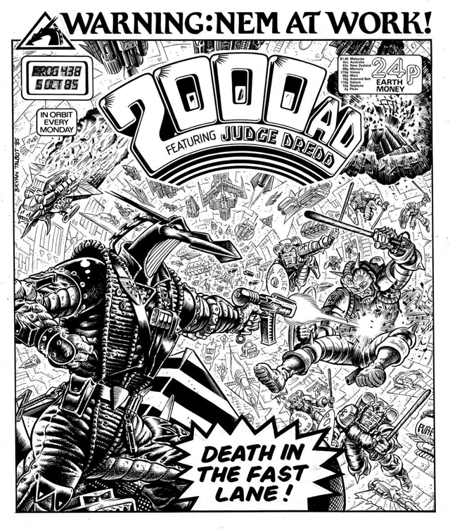
I can’t help but think of Talbot as an artist first and foremost. To this end it regualrly slips my mind that he cut his comics ‘teeth’ writing and drawing the dense, complex Luther Arkwright saga in the 80s. I loved Arkwright’s underground, punky ‘zine’ feel - the thin, black & white issues felt dangerous and illicit, lacking the production polish of mainstream books. Talbot’s art in Luther Arkwright was simply exquisite.
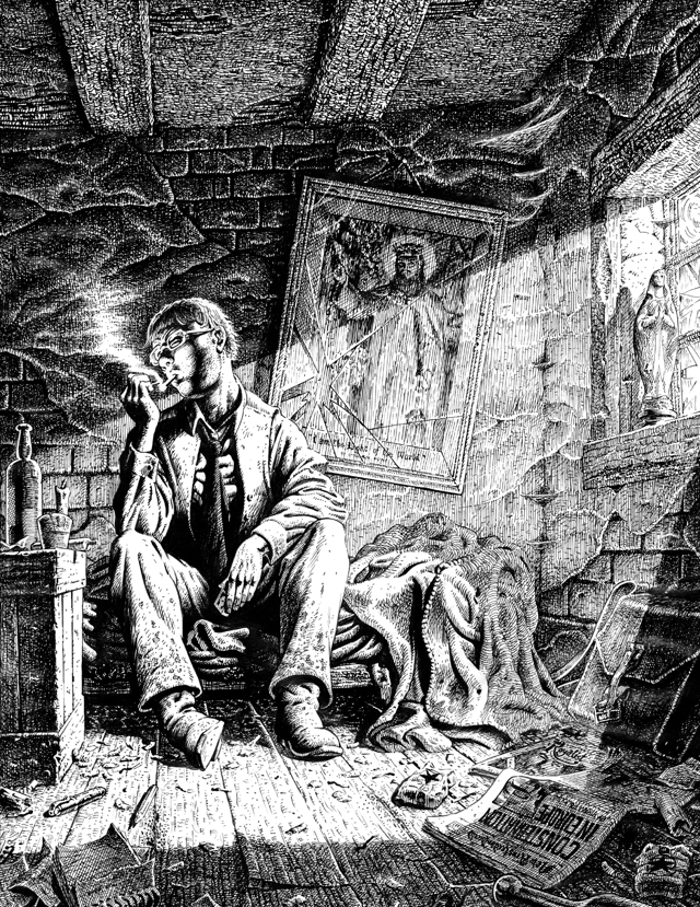
Do stop and look at that panel a little longer before moving on. It’s wonderful.
But what about Grandville?
For me, it’s something of an oddity. I don’t gravitate towards anthropomorphised animal stories - they’re often twee, sentimental and irritating. Only WE3 by Grant Morrison and Frank Quitely ever hit the spot for me. That was probably down to the general nihilism of the story itself.
I might have cried at the end of WE3. But don’t tell anyone that.
I can’t say that Grandville made me shed a tear. I’m not sure it made me feel anything to be absolutely honest. Which is a bit sad really.
Grandville is a far more pulpy and populist take on weaponised fauna than WE3. Somehow it manages to be both adult in theme and vaguely childish at the same time. I’m not quite sure how to take it.
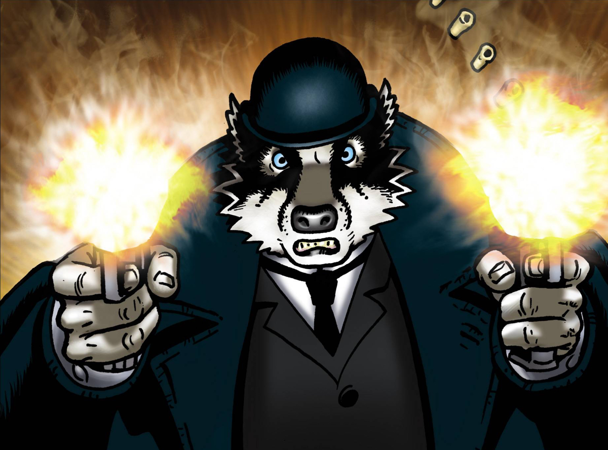
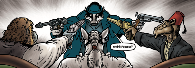
Talbot’s approach to anthropomorphism is basically to wedge a proportional animals head on a human torso, chucking in the odd tail or appendage where necessary.
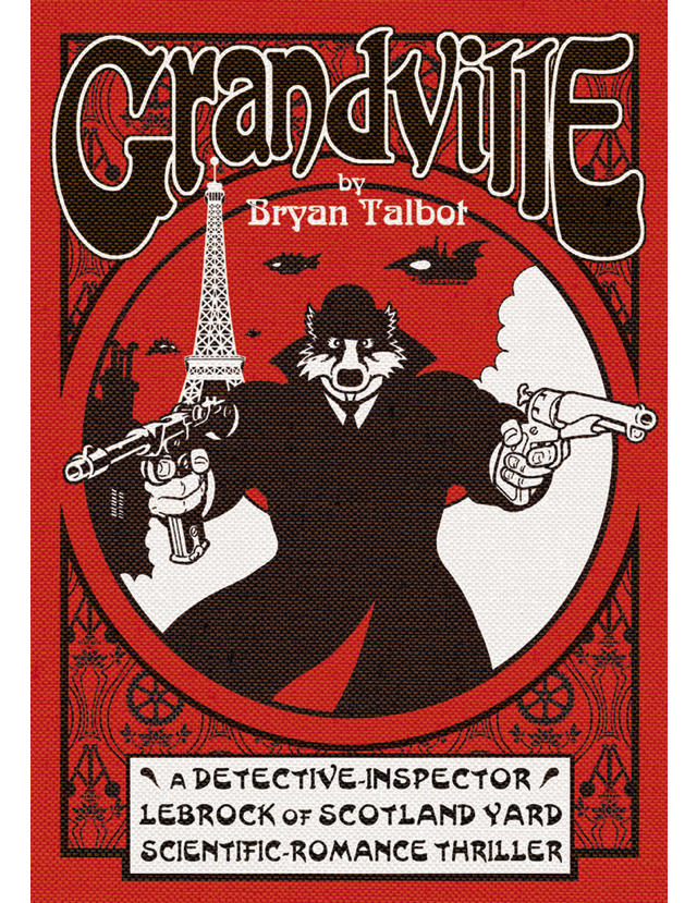
The resulting chimeras are gently disturbing, awkward and, in some cases, uncomfortably sexualised. The lead character - a (man)badger (badger(man)?) called LeBrock <groan> - is all glistening torso and coiled muscle hidden under a Victorian great coat.
It’s like Beatrix Potter on steroids and seemingly aimed at those who found Mrs Tiggywinkle ‘strangely attractive’.
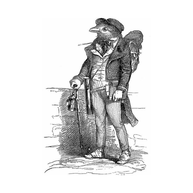
A little bit of idle research on the interwebs reveal that Talbot drew artistic inspiration and, indeed the series name, from the 18th century French caricaturist Jean Ignacio Isidore Gerard. Gerard was most commonly known by the pseudonym J.J. Grandville. Grandville (the artist) created exquisite caricatures depicting the same chimeric creations as Talbot’s almost 150 years later. Grandville the comic book is a very obvious homage to Grandville the artist.
There’s poo everywhere but no pets. Who’s pooing in the street?
– Tom
And how I wish Talbot had stuck firmly to his Grandville-aping and retained the detailed line art. The launch of the first volume of Grandville in 2009 sees Talbot smack in the middle of his digitally-enhanced art phase. We were all a bit sad that his typically gorgeous line work had been smothered with digital colour and splashy PhotoShop effects. There’s a gaudiness to it all that feels slick and inelegant. Worst of all, it feels cheap. But not in a good way.
Tom felt that things improved at the point a colour ‘flatter’ was brought in (about half way through the run). Jake, being a diehard Talbot fan, could see the positives and relished the scenes where Talbot’s steampunk sensibilities, honed on Nemesis and Arkwright, ran free.
Less Tarantino more Guy Ritchie
– Jake
The story itself is thin and full of ham-fisted cultural references that fall completely flat more often than not.
Jake was particularly uncomfortable with the obvious attempt to link 9/11 with a similar terrorist atrocity in the book by using the phrase ‘ground zero’. It’s a heavy-handed trick and almost totally unsuccessful. We all would’ve preferred the story to stick closer to it’s pulpy roots and just tell us a damn good tale.
Tom made it past the problems with the story and could enjoy the book for what it was. It did remind him of other ‘FuzzPulp’ books on the market such as Blacksad, which, with heavy heart, he stated was ‘probably better than this’.
Tom’s Blacksad reference is an interesting one as we all agreed the book feels like a European comic - something from a specialist Italian or French publisher. The casual violence, overt sexuality and weird pacing, especially the denouement that wraps up a huge global conspiracy in 2 pages of tightly-packed WTF, all contribute towards the sense that the book’s English translation was sorely lacking.
Everyone in this book hates the English. I can totally understand that.
– Dan
So, long story short, it’s a disappointing but enjoyable romp. Tom and I won’t be buying any more of the (rather pricey) hardbacks in the series but Jake might give the rest a go.
And yeah, it’s another one of my choices with a red and black cover. I guess I have ‘a type’ after all ;-)
Glad I’ve read it. Won’t read any more.
- Tom ⭐⭐⭐
Did he just cut off a chimpanzee priest’s ear with a flick knife? Yes, yes he did.
- Dan ⭐⭐⭐
It tries to be like Alan Moore and fails
- Jake ⭐⭐⭐