Dalston Monsterzz

Preamble

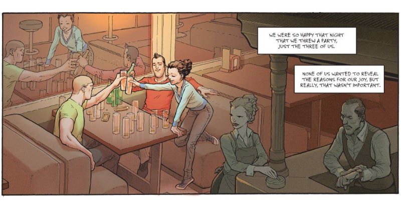
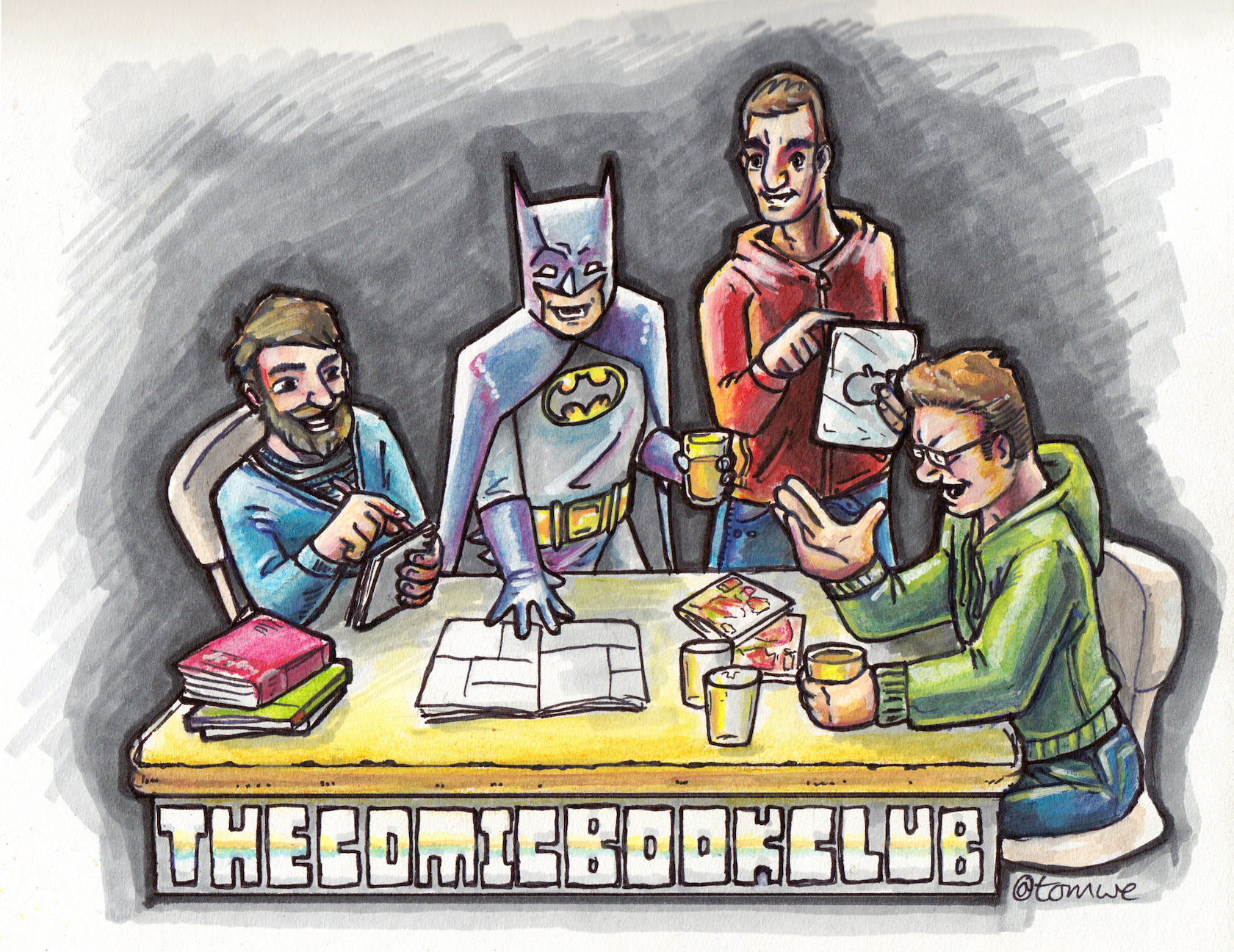
A rather unusual Comic Book Club meet up this time around, what with everyone under lockdown due to the spread of COVID-19. Instead of our regular pub-based get-together (I miss you so much cheesy chips!) we tried out a virtual meet-up via Houseparty.

Although not entirely successful due to network connections reaching breaking point we all managed to get our thoughts across. We had a good few laughs, Jake nailed his G&T, Tom dug out a beer from somewhere and Kelv made a glorious return to the fold after more than a year’s absence.

Welcome back Batman :-)
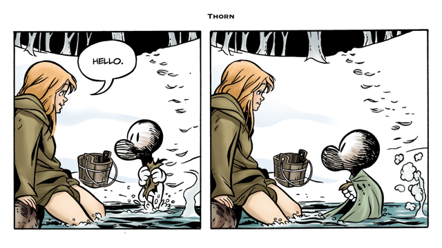
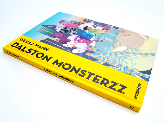
Dalston Monsterzz

So, this one was my choice. I spotted Dalston Monsters on some random recommended list and immediately loved the strong graphical vibes I was getting from the cover. The accompanying hyperbolic blurb made it sound super cool. It came across a bit like a trendy YA novel mashed up with raw, underground punk styling. I was very much looking forward to something a bit… new.

Sadly, I don’t think that was entirely what we got.

London calling

Nothing says cool urban quite as much as a gas tower

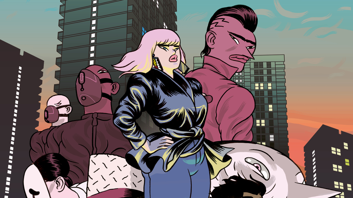
This is definitely a London-centric book. Dalston is a real place which Kelv, one of our resident Big City ‘specialists’ along with Mr Hayes, described as up-and-coming and ‘chock full of hipsters’.

The book plays up this aspect, setting out a landscape populated by influencers, trend manipulators and monied real estate barons busy buying up everything in sight. Meanwhile the youth are, as ever, bored out of their minds and have turned to petty crime, hollow socialising and increasingly outlandish gangs to pass the time.
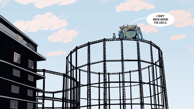
Monster magnets

On top of all this urban upheaval, throw in some vaguely Tim Burton-esque monsters (The candy-striped stilt legs and gaping tooth-filled maws feel almost like direct homages) strutting across the skyline as if they’ve always been there.

I don't think your friends like me

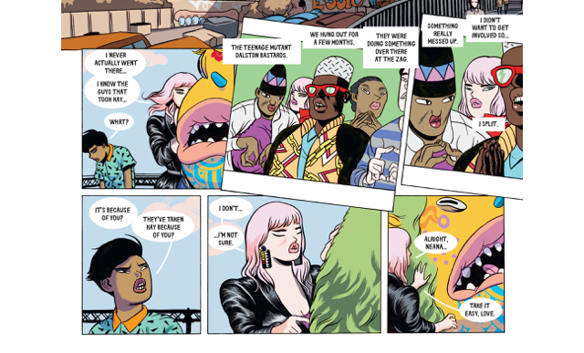
Some seem to have a direct connection with these mysterious beasts, whereas others treat them as a nuisance - much like a fox that rummages through your bin bags at night.

“This feels like an art school project or a side hustle to the agency day-job” - Kelv

Some of the gangs mentioned previously have ‘tamed’ these monsters and use them to propel themselves over the rooftops of Dalston. Seeing these bandy legged beasties striding between buildings has the potential for some seriously exciting set pieces but these don’t ever seem to arrive with the impact their introduction promises.

The brick wall of disappointment

Of the 4 of us only Tom avoided the ‘brick wall of disappointment’ after making it about 10 or so pages in. At this point in the book both the art style and broad narrative had bedded in and it was clear how things were going to play out. Tom blitzed through it super-quick, put it down and then promptly forgot about it. The rest of us didn’t find it quite so simple.

Jake’s issues seemed to stem from recognising many of the archetypes set out in the book and feeling rather uncomfortable that he adhered to many of them himself. You’re so much cooler than that Jake - stop beating yourself up mate ;-)

“For a millenial thing it was a bit Gen X to be honest” - Jake

Kelv’s initial excitement over the cover styling soon dissapated as he struggled to engage with any of the characters. None of them felt like they had any depth or meaning.

In your/their face

It’s kind of impossible to talk about Dalston Monsterzz without mentioning the seriously quirky art. The overall look is chunky, solid and pretty dynamic. There’s a fair amount of movement in between panels and Tom really liked the flow of the pages as they see-sawed between talking heads and weird monster-driven action.

But then there are the faces. Needle noses and puffy, pronounced mouths make every character look like they’ve just removed their face from an active wasp’s nest.

The gangs of London

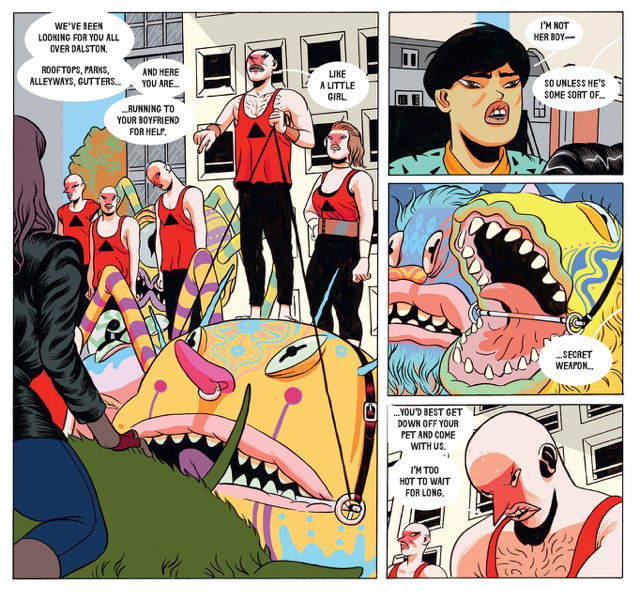
These visual tics are just so prominent that they become incredibly distracting. It’s hard to look at anything else on a page when your eyes are drawn towards each and every bizarre face present. Jake eventually came to terms with the noses, Tom got past it after some initial reticence and Kelv just couldn’t get it to click. I spent the entire book wishing the faces would go away as I found them really quite distressing.

Over familiar

Probably the biggest problem we all had with Dalston Monsterzz is that it looks and feels like so many other books of this ilk. We struggled to find anything that made it stand out from the pack.

“Reminiscent of a whole bunch of other stuff although I can’t think of the names right now!” - Tom

We’ve read a fair few Nobrow books in the CBC - Nobrow being the publisher - and it almost feels like Dalston Monsterzz is hewing dangerously close to some kind of ‘house’ style. From the beautiful binding, high quality printing and embossed cover to the colour palette and lettering, everything screams ‘Guardian reader favourite’.

A beautiful book as always. Nobrow have the know-how

In the end, at the end

So, in the end I don’t think that we could really recommend Dalston Monsterzz. Tom definitely enjoyed it more than the rest of us, giving it 4 stars. The rest of us couldn’t summon up enough enthusiasm to give it anything more than 2.

Maybe Dalston just isn’t as cool as it thinks it is?

“Anyone want to take a stab at explaining what actually happened at the end? No?” - Dan

Silver Surfer: Black

What a rush! What a high! With the strength of Kirby, Buscema, Moebius and Lim behind him, Tradd Moore’s craft cosmic has reached giddying heights in Silver Surfer Black.

To my knowledge this is the first Marvel Universe title to have been given the Treasury treatment in a very long time, showing just how much confidence they have in the book. And rightly so, every page deserves time pored over. It’s a thing of beauty, and Dan said as much… before totally slamming the story it illustrates. Being dropped right into an ongoing epic was not how he wanted to start the book, nor was he looking for the writer de jour Donny Cates’ new cosmic character to be the obstacle to be overcome. Dan’s approach then was to just turn off from reading the speech balloons and simply enjoy the visuals. All that is, apart from the repeated shots up between Surfer’s legs.

Hotch crotch

Jake enjoyed the story although called it meandering, and I was pretty keen on it myself, though it does fall into some pretty standard superhero tropes. Cates obviously has some grand plans for the surfer and is taking him in a new direction. I heard on one comics podcast that his powers could now be compared to that of DC hero Deadman’s, but there was no evidence of that here. What we do get is some new powers, some insane throwdowns and appearances from other iconic cosmic entities.

Of course, the tale of the surfer began originally in The Fantastic Four trilogy of issues 48-50, with Marvel legends Stan and Jack at the height of their creativity pitting the FF against “God” in the form of celestial being Galactus. The Surfer is the Herald of Galactus, searching for planets for his giant master to consume. That story was one of the first US comics I ever read, in the form of a UK newsstand pocketbook. For the purpose of this review I revisited it, in colour for the first time. Other than the blatent sexism in the writing of Sue Richards, I believe it holds up as a classic.

Back in …Black, it was inevitable that Galactus would show his enourmous head at some point, and this was a highlight of the story for me thanks again to Moore deliving what Kelvin called “fucking incredible art”.

I Hunger

Cates makes a point in the backmatter of the collection that he rewrote the last issue after he had heard of the passing of Stan Lee. He wanted to deliver the best ending possible, and also made reference to another notable Surfer story: Parable, by Lee and French Master Moebius, quoting directly from that story to bolster the Surfer’s morale.

I think this collection is worthy not only of the Kirby/Lee legacy but also of the treatment given it by Marvel. They knew this series would look the biz blown up and, by the power cosmic, they were right.

Mind bent

-Tom ⭐⭐⭐⭐

I might look at it again, but I’ll never read it again
-Dan ⭐⭐⭐

Enjoyable but ultimately a bit style over substance
-Jake ⭐⭐⭐⭐

Utterly bonkers and trippy. I loved how utterly hokey it all is, Just how cosmic Marvel should be.
-Kelvin ⭐⭐⭐⭐

Ken Games

My relationship with digital comics has soured of late. In early 2013 I bought my first iPad and, after my LCS chastised me for not collecting my pull-list every week, I embraced digital completely. I enjoyed the instant hit, the promotions, the access to vintage back-catalogue with Marvel Unlimited. But then I began to find it was just too much screen. Like many of us I spend all day staring at a monitor and our phones are constantly in our hands, so I felt the draw back to paper comics, and mainly TPBs as well. When I was recommended the book we are reviewing this month back in 2017, the fact it was digital-only made me hesitate.

The publisher Europe Comics takes books popular in the Franco-Belgian market and translates them to attract an English language audience. They strive to show off the variety in European comics, both the titles themselves and the creators working on them, and to drive them into the market where superheroes are no longer the be-all and end-all. There is content for everyone, assuming of course you like digital comics. And yes, some of the books have found print publishers off the back of the extra exposure and that’s what I was holding off for with Ken Games. At the time of writing this still hasn’t happened, but the revival of Augie De Blieck Jr.’s comics podcast Pipeline brought the title back to mind and I thought it was enough waiting!

Three books, three stars, three colours, three puns

So: Ken Games. The name was peculiar enough, but no mention of Barbie’s platonic male friend was to be found. Instead, the in-story explanation for the title tells us the name refers to Sansukumi-ken: East Asian hand games of three gestures and its most popular form Rock, Paper, Scissors. Look, right there, the three books in the series have those subtitles as well. And, oh my, the lead characters from who’s perspective they are written have nicknames to match. This cleverness from the writer was bollocks to us.

And the negative opinions didn’t stop there, sadly. Jake was very pleased he’d managed to snag it via a digital tryout, not having to spend any pennies and Dan only read the first of the three books. For the most part they took against the subject with Jake disliking poker, Dan not a fan of boxing and neither thinking the way the story handled Luc Besson style assassins being very successful. They also didn’t care about the characters and found the sexual violence dirtying. That final point caused some debate as both Jake and Dan had read a particular scene one way and I another. On reflection I’m pretty sure we all agreed I was right, but there’s no denying the sexual content of the books, not least of which the moment we learn the reason the girl is know as Scissors.

Colours set the tone

I was right to have tried waiting for a physical edition as reading what would be oversized artwork in the European market on an iPad4 was a struggle. Toledano packs a lot of panels into the pages and has fun with variations of panel shapes to match the story. Chess sequences have the rigid square panelling of the board and boxing sequences are choppy, breaking the page bleed to match thrown punches.

Toledano’s characters are quite stylised with Dan noting a bit of Frank Quitely and a bit of Tony Moore. I quite liked that though, and the sense of space and timing of the panel progression worked well. Strangely, a fourth zero issue put out sometime later uses a much different art style, focussing on a secondary character before the plot of these books (none of us read that).

The mood shone through in the colouring with appropriate palettes for each character and although shaded it was less like the harsh sculpting you tend to see in Big Two comics. There’s also some fun with the lettering in the fight, game and assassination sequences showing off each of the character’s skills.

Jagged panels and sums

The plot threads through each of the character’s lives as the story progresses and is pretty brutal to the leads and supporting cast as well. There are standout moments in each book, particularly the conclusion to part two but I enjoyed the third part least; it all came apart somewhat in the conclusion.

I felt overall it was a solid read and pretty easy on the eyes. I’ve been a bit down in this writeup, but really if you come across this series in a digital sale or as part of a subscription give it a go, especially if you like boxing, poker or the afore mentioned Luc Besson movies!

-Tom ⭐⭐⭐⭐

Strange and utterly Euro, I won’t burn it, but then it is digital. We’ve read worse.
-Dan ⭐⭐

Bizarre and little bit boring. Not the Barbie fantasy I was looking for.
-Jake ⭐⭐

Doomsday Clock

WARNING! There might be a few spoilers for the original Watchmen series below. If you haven’t read this seminal classic graphic novel then more fool you!

The one-word summary review

A special one-word review of Doomsday Clock part 1.

  • Dan: Arse ⭐⭐
  • Jake: Uurgh ⭐⭐
  • Tom: Wank ⭐⭐

If you’re still not 100% sure what we thought of this travesty then please, dear reader, continue onwards to …

The full review

So, it appears that DC are determined to strip-mine Alan Moore’s Watchmen opus for all it’s worth. A few years back we had the dull and redundant Before Watchmen prequels focusing on key characters from the original 12-part series.

Now DC are using Doomsday Clock to kick off the process of tying the previously discrete Watchmen universe into the larger DC continuity.

The actual DC doomsday clock

I’ll be honest here - I’m not really familiar with the ins-and-outs of current DC continuity, nor do I particularly care for the convoluted mish-mash of ever changing origins. I couldn’t tell you the difference between Rebirth, New 52, Flashpoint or any of the other multiversal crisis’ that shook our favourite heroes to the core.

Of the three of us, Tom was most likely to know how things stand in the DCU. He knows a fair bit about the various continuity shakeups at DC. In contrast, Jake has been experiencing hero-fatigue before and has fallen out of love with DC.

Who’s watched the Watchmen?

Before talking about Doomsday Clock we need to acknowledge the long shadow cast by the original series. Jake, Tom and I had all read the original Watchmen at least once before. I don’t think that any of us wanted to take on the job of reviewing Doomsday Clock without a refresher of the source material.

I’d hope you don’t need me to tell you quite how good Watchmen really is. It can be quite a challenging read thought and Tom had originally found it a bit of a chore to grind through the 12 issues, complete with detailed back-matter. Jake embraced Watchmen’s inherent complexity and has always held it in high esteem.

“For me, this was sunk by the fact that the TV series is really, really good” — Jake

Over the years I’ve bought a fair few copies, only losing them to loans (“You have to read this!”), floods, fires and general forgetfulness. It has shaped my comic book reading to this very day and will continue to be somewhat of a high-water mark for comic book quality.

Tick Tock goes the Doomsday Clock

The first thing that struck all of us was the cover to this collected edition - it’s proper awful. It’s peculiarly uninspiring cover that, unfortunately, sets the tone for what’s to be found inside.

That’s not specifically an art thing - Gary Frank’s complex, Gibbons-aping detailed line work is one of the high points of the whole shebang. Mr Frank had been sharing panels and pages on Twitter and I was really enjoying his detailed lines and tight compositions.

Some lovely line work from Gary Frank

It’s pretty clear that Frank was picked for this gig as his work bears a superficial resemblance to Dave Gibbons’ beautiful art work. It’s not quite as distinctive as Gibbons though - there’s a lack of personality, charm and individuality there. Frank is a very good DC house artist and, from that perspective, he’s the perfect penman for this project.

New blood

Although some original Watchmen characters appear in this volume, the narrative is led by two new characters - Mime and Marionette. These two are small time criminals from the Watchmen universe, sprung from incarceration to serve some larger nebulous purpose.

Marionette and Mime

I can’t say I’m a fan of their design and there are suggestions of certain… abilities that don’t tally with the WU. Tom thought Marionette was a little too close to Harley Quinn in both design and personality but quite enjoyed her arc. Jake thought they were both a bit rubbish.

“Well that was as bad as I expected it to be” - Dan

Sidenote: I wondered whether Mime and Marionette had been mentioned in the original Watchmen, in the copious back matter or some offhand reference. Turns out this is not the case. However it appears that they are, like the original Watchmen cast before them, updates of old Charlton characters.

So, points for effort there, just not for execution.

You have to earn your keep

And this is the case throughout. Nothing really feels earned. Geoff Johns goes out of his way to try and shoehorn as much of the original in but it feels like lip-service and clunky homage.

Doomsday Clock borrows everything from character designs and script beats to whole layouts (Hey there claustrophobic 9-panel layout ol’ buddy!). It even goes so far as to replay whole key sequences shot-for-shot, panel-for-panel.

Ronch Ronch

The original Watchmen cast get a bit of a DC makeover too. There’s a new Rorshach in town, complete with iconic ink blot mask and a backstory so shoddy you have to wonder how anyone thought it would be a good idea. There are flashes of snappy dialog from Nu-Rorschach that almost capture the WU vibe, particularly when they’re interacting with Batman/Bruce Wayne. Jake thought Nu-Schach was OK, Tom not so much.

The original Rorschach

The new Rorschach

Ozymandias is also still knocking around although his character has undergone some rather radical personality changes. I wasn’t buying it. Tom was fairly certain Viedt had died in the original book and was surprised to see him return. His weird lynx pet thing, Bubastis, also makes a comeback after being disintegrated at the end of Watchmen. As a cat-person I was pleased to see Bub back up and running.

Unsurprisingly we see very little of the only real superhero in the Watchmen universe, Dr Manhattan. It appears Doc is/was being saved for the second half of the series. It makes sense that DC would save the big guns for later on as it’s already been made clear that Doc M’s omnipotence is the catalyst for the next reshaping of the DCU.

Dr Manhattan - He's in it for a bit but not much

The Comedian’s in it a bit too. He’s still a proper bastard but it’s nice to see him again.

Old faves and greatest hits

And it gets worse once the story dimension-hops to the DC side. Johns rolls out the same old faces that we see in every big DC spectacular and, to be perfectly honest, it’s incredibly dull.

I don’t think that I can articulate quite how bored of The Joker I am - it’s time to let that clown go. Similarly Lex Luthor’s constant reinvention is running thin. Yes, I can see how Luthor and Veidt might be considered mirror-images of one another but it’s just tired, uninspired comic book writing.

Jake was pretty quick to make the point that this is most definitely a DC book with some Watchmen characters wedged in. And therein lies another hefty problem - the two universes just don’t mesh. Moore’s world was a deconstruction of the superhero myth and a place where there was but one omnipotent super being. The DC universe is full of ‘em.

“This is the lift muzak version of Watchmen” — Tom

All of this is basically in service of a story that’s just designed to stuff some fo the greatest comic book characters into a world they were never meant to inhabit. I can’t help but sense a cynical, money-driven exercise, creatively bereft and devoid of any reason to exist other than to wring more money of Big Al’s legacy.

It gets precisely nowhere in trying to make the DC universe more relevant, cooler or more important.

Oh, and Doomsday Clock. DC. The clue’s in the title.

Bone Vol 1

In the CBC we try to steer away from reading anything too familiar.

It forces us to steer away from the easy options and the old favourites when we are running short of ideas. It’s in the rules.

So I can definitely say that I’ve never read Bone before.

Bone tired

Then I started reading Bone volume 1. And I started remembering.

Way back in the day I’d purchased a ‘Banned Comics’ Humble Bundle (You do Humble, right? If not you really should do - there’s some great stuff on there!). It appears that the first volume of Bone was included in that pile of comics alongside more obviously spicy stuff like Black Kiss! Weird.

Here’s the Comic Book Defense leagues run down of why Bone was banned in several schools in the US

Anyway, I digress. It turns out I have read Bone before. Or, more accurately, I have tried to read it before. I didn’t get very far. Which is why I thought I hadn’t read it in the first place. Oh dear…

Bone-headed

Bugbear number one: The names - Fone Bone, Phoney Bone, Bone, Boneville. I’m annoyed just thinking about them. Tom and Jake weren’t quite so irritated by this as I was. Apparently Smith started writing/drawing this when he himself was a kid which could explain a few things.

I don’t really get the Bonevillians either. The cartoony look just puts me off straight away. Are they Moomins? They sure look like Moomins. Maybe we can just leave it at ‘inspired by’ and be done with it.

Character design based on shapes made by used chewing gum?

Jake rather liked the styling stating that ‘cute things under threat is basically my thing’. Tom loved the look too as it plays to his strong animation sensibilities.

The colour version is for those who can’t cope with black & white books

Tom

I’m starting to feel like a grumpy old fart at this point.

Bone dry

So I’m not a fan of our cast, how about the script?

Most reviews seem to consider Bone a stone cold classic. The book comes laden with plaudits left, right and centre.

I couldn’t help but feel that it was pretty thin gruel laddled over the top of some cutesy, twee croutons. It’s a mish-mash of epic tales such as Lord of the Rings and American newspaper cartoon strips such as Peanuts or Garfield.

Jake wasn’t quite certain where it was all headed during volume 1 but didn’t feel like reading it was a chore. He wondered whether Smith had a plan at all or if things would just continue on as a series of vignettes with some vague backstory tying it all together.

It’s a fluffy work of some depth

Jake

Tom, however, was well aware of exactly where the story would go. It turns out Mr Evans is a Bone superfan and brought all 9 volumes of Bone to the meetup. Tom was of the impression that the story became a bit more cohesive in the later volumes and that Smith definitely had a plan for where it was going to go. Jake confirmed that things came together a lot more, story-wise, after the cow race.

It’s got a cow race in it (I don’t consider that a spoiler BTW). That should tell you all you need to know about what I thought of the story. Feel free to skip to my score if you’ve had enough of my moaning.

A land of adventure spread out before them

For something that falls squarely into the category of ‘funnybook’ not many of the jokes hit home for me. There’s a handful of clever visual gags - a mysterious enemy who’s speech bubbles disappear underneath their heavy cowl - and a couple of (married?) rat creatures who indulge in some amusing banter.

I was vaguely interested in what the big bad wanted with the ‘one with the star’ but not enough to actually bother reading past the first book. In that, I was the only one as both Jake and Tom devoured the entire run (books 1-9) with gusto.

Just me then? Yup.

A Thorn(y) problem

So, there’s one final thing I’d like to talk about. Early on in volume 1 we’re introduced to Thorn, a human girl, who lives with her grandma in a cabin in the woods. So far, so classic fairytale setup, amiright?

From the moment they meet Bone is clearly infatuated with Thorn. Initially Thorn appears oblivious to Bone’s fawning and awkwardness around her. Then Smith introduces some weirdly sexualised elements that sit at odds with the cartoony nature of the book. It’s almost subtle - a slim outstretched leg, a hint of cleavage, bare shoulders shrugging off a blanket.

Maybe I'm just getting old but this is weird

By ‘normal’ comic book standards it’s all very innocent. But I couldn’t help but find this coquettish behaviour uncomfortable and out of place.

Once again Tom and Jake were quick to point out that, as expected, Thorn does become a key player in the story. I’d like to think that she becomes more than just a stereotypical ‘girl-in-the-woods’.

TL;DR

Everybody loved it apart from me. No change there then :-)

Completely biased. I already have an ingrained love of this book
- Tom ⭐⭐⭐⭐⭐

Is Bone always naked?
- Dan ⭐⭐

You have to respect the single-mindedness behind it
- Jake ⭐⭐⭐⭐