Mage: The hero discovered

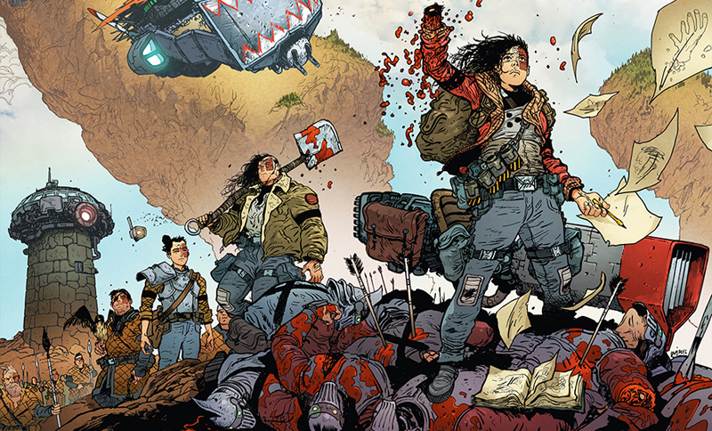
Like a fair few of my comic book reading brethren, my first experience of Matt Wagner’s work was through his epic Grendel saga.

The ever-changing rota of artists, including Wagner himself, lent Grendel an unpredictable, underground aesthetic that veered from precise black and white to day-glo 80s futurism and dark, disturbing surrealism.

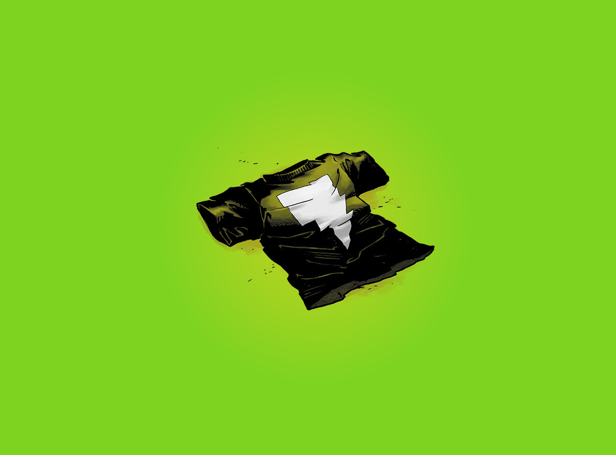
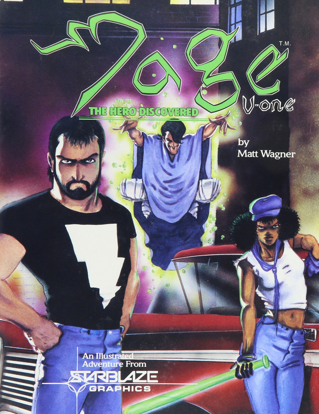
It was while reading Grendel, first published by Comico and later by Dark Horse, I saw that Wagner had another long-term project simmering away on a back-burner. Ads in the back of my Grendel monthlies had some bloke in a neat lightning icon t-shirt waving what looked like a glowing, magical baseball bat. The book was called Mage. I was curious, and that t-shirt was awesome, but not enough to follow it up. As the years passed I continued to hear bits about Mage, often couched in glowing terms like ‘a masterpiece’ and ‘the single greatest comic book about magic baseball bats ever printed’.

I figured I’d probably give it a go sooner or later. It took 20 years but here we are.

The ultimate 90s collection from Starblaze

Not really knowing what I was buying into I ended up with a couple of rather garish and cheaply printed US collections sourced from EBay. This may have been a shrewd fiscal decision on my part but the overall quality was pretty shabby. They smell like the 90s too…

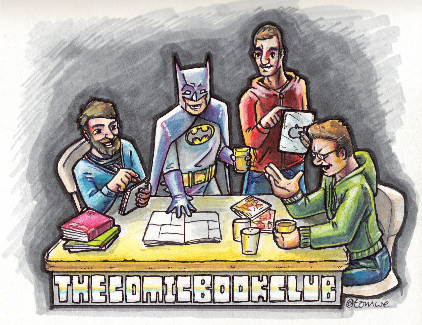
Tom actually had the whole run of single issues re-printed by Image in the early 00s. They weren’t the best quality, printed on stiff, crunchy paper and oddly bound. They were also digitally re-coloured using a sharper, more acid palette than the originals.

Jake had never heard of Mage before and hedged his bets by going digital. His digital versions fell somewhere inbetween Tom’s gaudy 00s floppies and my shiny 90s softback volumes.

Artistic values

So, I open up the first volume, take an involuntary mouthful of air and think:

“F**king hell! This looks awful!”

I was really rather broadsided by how loose, scruffy and unpolished Wagner’s art is in Mage. It’s clear that this is right at the very start of his comics career and that, although obviously talented, he’s still finding his way with composition and pacing.

Tom was onboard with the raw styling but bemoaned the dodgy digital colouring in his reprint editions. The cheap shiny paper in my collections exacerbated some rather eccentric colouring decisions in the earlier versions too. Jake wasn’t too fussed either way. The art style seemed vaguely familiar and he really enjoyed the expressive hand lettering throughout.

American mythic

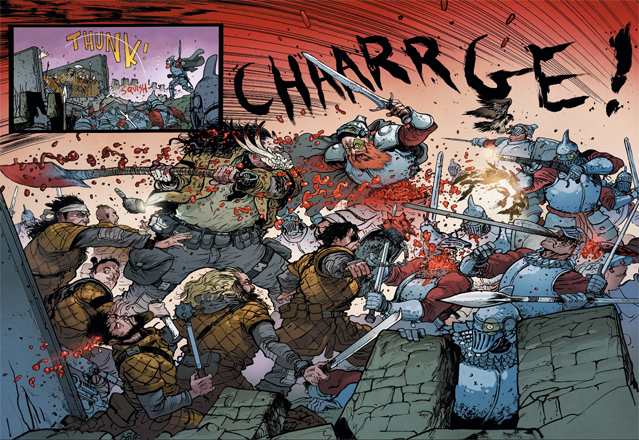
The story itself is a bizarre mash-up of Arthurian myth and blue collar Americanisms. While fairytale whimsy isn’t really my thing, I’m a sucker for people smacking trolls with magically-imbued sports equipment so I tried to get on board with it. The disparate pieces didn’t quite come together for Jake - the fantastical parts sitting too jarringly at odds with the grittier real world elements.

There’s also a heck of a lot of exposition gumming up what should be a relatively simple story. Wagner tries to flesh out his characters beyond their clichéd fairytale roots but it doesn’t quite get there. Where a more experienced storyteller might have made something more dynamic, Mage starts to drag and never quite escapes its own self-importance.

Character assassination

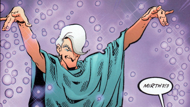
Aside from the main protagonist - Kev Matchstick - a couple of the supporting characters drew mixed opinions. Tom and I found Mirth, the magical hippyesque Merlin-figure, excruciatingly annoying in his language, mannerisms and general smugness. Jake was a little kinder, citing Mirth as the only thing actually pushing Matchstick onwards towards some kind of character development.

Not Mirth the effort?

Kev’s ‘Foxy Brown’ blaxploitation sidekick Edsel, the initial wielder of the magical baseball bat, comes across as a clumsy anachronism and rather out of place in this day and age.

Who is Kevin Matchstick?

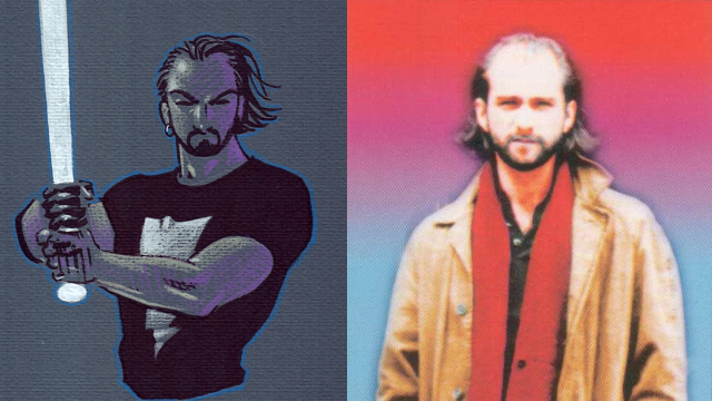
And what of Kevin, the titular Mage himself? It’s been suggested that Mage is intentionally autobiographical and that Kevin is, to all extents and purposes, Matt Wagner. They certainly look alike.

Matt Wagner or Kevin Matchstick?

It’s hard to shake the feeling that Mage is just Matt Wagner’s life with some added Pendragon. Jake really couldn’t warm to Kevin, finding him an unpleasant character who acts like a spoilt teenager throughout. Lets hope Jake and Matt never meet in person.

Rounding it all up there’s a seriously weird bit at the end of volume 1 where Kev confesses to Mirth that he killed a dog. It’s an uncomfortably personal anecdote that feels like a genuinely guilty confession used as a narrative device. Given the autobiographical nature of Mage it leads me to wonder whether Wagner actually did kill his own dog.

Jeez, that’s a horrible thought. I still want a Mage t-shirt though. They’re mint.

Why can’t he draw necks?
- Tom ⭐⭐⭐

Did Matt kill his own dog?
- Dan ⭐⭐⭐

Wagner doesn’t do enough to earn the right to play fast and loose with all these mythological tropes
- Jake ⭐⭐⭐

Extremity

It’s fair to say that when I’m looking for a book to pick, I look to the art first. In the case of Extremity I was looking to Daniel Warren Johnson’s (DWJ) Instagram posts and in this case I was blown away. He had some fantastic fan art of Transformers and Star Wars, two franchises close to my heart! He has even drawn a mini-comic called Green Leader that you can read online for free and as of yet he has not been sued by Disney. It’s that good.

Transform and roll out!

I heard of his webcomic Space Mullet via the 11 O’clock Comics Podcast, who did a great interview with him prior to working on Extremity (here), and was keen to see if his storytelling matched up to his artistic chops. Space Mullet I decided would be a harder sell to the group, not least because it is incomplete: the Dark Horse Edition is only half the story and due to his paid endeavours he is yet to wrap up the online serialisation. I was fortunate that the timing of my choice coincided with the release of the second Extremity TPB so the option was there for people who wanted to read the whole thing in that format. Dan it turned out had read the first issue before as part of a Humble Bundle, but had very little recall as it was jammed in with a whole bunch of other stuff from that deal. Jake was lucky enough to find a comixology sale in time for our meetup so he was able to complete the story as well.

Travels through space, has a mullet

Reading the book it’s immediately clear how strong DWJ’s handle on the medium is. There’s no rules to his page layouts; he knows when to work a grid, when to go dense and when to open up for a grand reveal. And oh those splash pages are gorgeous to behold! All of which is rather sickening when you realise he only started working in comics earlier this decade.

Did I say it was gory? Well, yes it's gory

Jake and I were waiting for Dan to cite the Paul Pope influence on the art style and although he did, it was as a compliment. He loved the grungy character designs, especially Jerome with his Death Spade and mask of teeth. Jake pointed out that Pope’s Batman 100 featured a mask of teeth as well. I called out the manga influence in the speed lines and character faces but later also learnt that specifically Appleseed is a big influence for him. The technique of rendering in a distorted manner can be seen in that Manga. I found that particular touch to be a visual boon on top of DWJ’s ability to draw just the right moment in each panel, emphasising weight, impact and reactions in the characters. There’s also a fantastic use of drawn sound effects on almost every page, be it a small toss as a book is discarded, the WH-TONG of a knockout hammer to the head or SPLUTCH as a monster is cleft in two. It’s just another part of what makes this a real comic-booky read.

No arachnophobia here

In this book DWJ has built a fantastic world. It appears to be a long distant future of our own, and there are some nice Easter Eggs that show this to be the case. Dan thought it was a labour of love. Just the creator with his excellent colourist Mike Spicer putting together this tight twelve issue story with no fat and a whole lot of unique touches. Jake saw echoes of Mortal Engines with its Steampunk cities. Extremity is definitely a Post Tech world. Despite his usual dislike of giant robots, Jake thought this story earned its use here. The robot is just one combattant in the over-the-top action, joined by flying lizards, battering ram sky ships and other creatures from the depths of legend.

I read the two volumes on full tilt, it is very easy to follow the flow and get caught up in the action. By the time I got half way through the second volume though I was in need of going back and starting again. There is so much good stuff it would be a crime to miss it! Dan was concerned that the ending came around too quickly. He knew the final moments were upon him due to the length of the book but thought there was still much more that could be said. Jake thought there was lots of opportunity for other stories in the same world. Maybe DWJ would return for more spin-offs after his next project. Perhaps a Tales Of… with other creators drawing their own versions under his guidance.

KA0BOOM!

*I am giving this book full marks due to the sheer exhilaration of the read. As a fan of science fiction, coming of age stories and rampaging monsters I can barely fault it. I will be looking immediately to DWJ’s next project: MURDER FALCON!
-Tom ⭐⭐⭐⭐⭐

“This is the definition of what creator books are. Making the thing he wanted to do, all fun, double page spreads, throwing Krull, Star Wars and Game Of Thrones all into the mix. More comics should be like this, just end it when it’s right and do something else. He should be very proud of what he’s made.”
-Dan ⭐⭐⭐⭐⭐

It’s a full-on fantasy thing. I rarely read books a second time but I will in this case, there’s so much to discover. It lacks humour and for that I won’t give it 5 stars but this is not a photocopy of something else, it’s a bunch of indulgence.
-Jake ⭐⭐⭐⭐

Author’s note: While formatting this article it occurred to me I completely forgot to mention the fact we have a female lead here. I tend to gloss over the specifics when I write reviews but wanted to point to this aspect in particular given the number of action heroines appearing in SF today. Thea is a complex character coming into leadership with conflicted turorship from her grieving father, and a brother who appears to be forging his own path. She is a girl whose story is worth following!

Thea at rest

Rust: Visitor in the field

It’s pretty rare that we get an almost complete consensus on a given book given our wildly varying tastes and interests. I can proudly say that my latest selection, Rust: Visitor in the field by Royden Lepp, managed just this.

To a man, we all agreed that this book is very, very brown.

Rust is so slathered in brown-ness that all of us found it hard to get past the monotony of the sepia colour scheme. There’s no respite from the mud-brown tones over 100 or so pages. No clever splash of contrast colour to draw the eye, no secondary palette to refresh the senses. The brown just goes on and on and on and on…

The palette

The vibrant Rust palette

We were browned out after page 2. Not a great start.

The art

We were mostly in agreement on other aspects of the art in Rust. I couldn’t help but find it derivatively angular and not very exciting. I’ll admit to kinda liking the design of the steampunk-style giant robots. No one else did though.

Hmmm. Bland.

Dan

Jake rounded on the artist’s (over)use of a single Photoshop motion blur effect and a lack of dynamism in general. He wasn’t very impressed with some of the faces, one scene depicting dinner around a farmhouse table eliciting the statement “That’s one of the worst faces I’ve ever seen”.

Tom spotted that the whole thing is laid out and designed like an animated cartoon, betraying Lepp’s origins as an animator.

When Tom, an animator himself, pointed out that the book is essentially set out as an animation storyboard it suddenly became clear why there are so many redundant panels or overlong sequences for minor actions.

The action in Rust feels drawn out and in slow-motion as if Lepp can’t break free of detailing every change of camera-angle in a sequence lasting a few seconds. Unfortunately, what works in animation frames is lost in comic book panels as the reader wades through treacle before anything happens.

Rust is full of slow-motion action

Tom also took issue with another of Lepp’s apparent hangovers from his animation past. He felt that every character, from small-town farmhand to giant war robot, was copied from a 3D reference model, posed each time. To Tom this is a ‘lazy’ approach resulting in visually consistent but mechanical, lifeless art.

I’m of the old-skool that says you draw everything by hand - especially if it’s hard

Tom

The story

The book itself is a remarkably brief and ephemeral read. We all blitzed through it in under 20 minutes, finding little of substance or originality to hold on to.

There are many hints of other, better, books such as Astro Boy and Big Guy and Rusty the Boy Robot, it was hard not to want to sprint to the end and read those instead.

Jake persevered and read volumes 2 & 3, mainly because they were cheap digitally and just as quick to read as this one. At the end he still wasn’t convinced. And everything is still brown.

I first found it on some dodgy pirate site. It was vertical scrolling for 15 mins and then it just ends. I was a bit drunk

Jake

The summary

Too short, too brown, too little substance and too much like a lot of other, better things. Maybe read if you find them all cheap on Comixology and you really like brown.

Note: Kelv couldn’t make the meetup but provided a brief summation of his thoughts and a score at a later date.

The scores

- Dan ⭐⭐

- Tom ⭐⭐

- Jake ⭐⭐⭐

- Kelv ⭐⭐⭐

The Shadow Hero

The (Western?) World’s first Chinese superhero! Gene Luen Yang creates an origin story for a forgotten, subversive character from the Golden Age. The Green Turtle! It’s fair to say that he has found a golden nugget from that era.

AUTHORS NOTE: I am embarrassingly behind on write ups. The others have kept up pretty well but I’ve spent the past year just not bothering. So here is a listicle version of everyone’s thoughts on the book. These are the literal notes from the night, which I’ve edited for any faux pas.

Classic

Jake

  • Felt quite grounded.
  • People who become superheroes.
  • Breath of fresh air and uncynical compared to Mark Millar.
  • Didn’t know any background - a mystery until the end.
  • Doesn’t need the revival story - works as it’s own thing.
  • Felt like a story working for itself.
  • Funny.
  • Great characterisation.
  • Loved his mother.
  • Not a character you see in comics much.
  • Family relationship: heavy on that like Ms Marvel.
  • Bit cartoonish, didn’t love the art but didn’t put me off.
  • Serves the story.
  • The whole sequence of pushing the boy into chemical concoctions - funny.
  • Thing not normally fond of.
  • Gangster thing again not one of my favourite things. Don’t like them…
  • …but in the background. Father gets killed and he turns into a super turtle.
  • An uninteresting character but didn’t need whistles and bells.
  • Liked him - innocent.
  • Fight scenes with tortoise giving instructions - brilliant/great.
  • Having read the 40s character and the struggle of it being Chinese…
  • …looking back over treatment, seeing the back a lot and similarities.
  • A really sweet thing.
  • Hope it’s a standalone.
  • Series of 5 issues is enough.
  • Loved setting of 40s World.
  • Brought it to life.
  • Cute romance but not necessary.
  • Not a lot to say really.
  • Read in one lunch time - easy.
  • Unexpected and quite pleasurable.

:star::star::star::star:

A solid 4 stars.

@tygertale

Mother's dream

Dan

  • A lot like Jake…not a massive amount… not because awful or hated it.
  • When I looked at it, wondered whether I would connect.
  • Remarkably accessible.
  • Extremely funny in some parts.
  • Not lol’d at things that are culturally different just funny situations - witty.
  • Art - not my scene.
  • Chew - people very much like the same in that.
  • Interested to know from anyone who insight into Chinese families if the archetypes are real or how much blown out of proportion?
  • An archetype that must exist for a reason.
  • A lovely, unlovable woman.
  • Father loves her genuinely.
  • The kung fu uncle loves her.
  • Son does even she is weird and stand offish.
  • As long as not through a lens that is weird for people not aware of it…
  • …as in I map my own experiences to it, like in divorcing parents I cannot stand infidelity.
  • But relationships here are so unfamiliar that I’m forced to look at it from outside.
  • Bizarre why he puts up with her - no emotional feedback but still devoted.
  • Making her smile but is heartbreaking.
  • Jake says that felt really real: drawn on something.
  • Honest, not stretching too far or too clever.
  • A yarn with a different spin.
  • Fave: “She’s talking about his testicles…”
  • “Really made me want to watch Big Trouble In Little China which can only be a really good thing”.
  • What’s with the obsession about the mother’s bosom?!?

:star::star::star::star:

Really interesting little thing. Didn’t stress. Didn’t want to burn it which is usually how I feel about Kelv’s books…

@dandineen

Green Turtle

Tom

  • I would’ve read it again myself… except Kelv had to borrow my copy!
  • Missed first time: we see the Dad’s shadow, Turtle fulfilling the promise.
  • Interested to read it.
  • Both creators have books on Tom’s list.
  • I think this is fantastic.
  • Boxer’s and Saints - I will definitely go and read.
  • Charlie Chan’s Art of Hok Chye.
  • Hadn’t heard of this one.
  • Thoroughly enjoyed it.
  • Really do have an issue with the big heads.
  • Will follow up on writer but not artist.
  • Just a style thing, calms down to a degree, settles on just the Mum.
  • A little too close to Rob Gilroy’s Chew which most of us don’t like.
  • Only the art holding Tom back
  • Read in 2 passes, as most of us - wanted to read it.
  • Not been able to watch much telly, but more time to read and this one was wanted.
  • Great touches how bullets scoot around.
  • Despite disliking how he designs people, storytelling approach is very good.
  • Dad death is a full page panel.
  • It’s dense yet reads really, really easily.
  • Jake loves all the silhouette work.
  • Wondered if the Tiger spirit is in the mother (Me: “No…!”)
  • Even though the dragon has a nice rivalry, the others weren’t needed.
  • 40s types superhero archetypes.
  • Really, really thoroughly enjoyed it.

:star::star::star::star:

If not for the art, it would’ve been a 5.

@tomwe

Golden Bravery

Me

  • Art and culture feel genuine.
  • Tiger mum - hateful.
  • Humbleness isn’t a thing.
  • Hate how she treats son and husband.
  • Pride makes her horrible.
  • Genuine feelings.
  • Real calligraphy.
  • Easy to read.
  • Back story intriguing. Love the subversiveness.

:star::star::star::star:

I didn’t really like the art either but enjoyed the story immensely.

@chao_xian

Cover

Black Hammer Volume 1

We are once again with Dark Horse for my most recent pick. I am feeling there is something about the publisher that allows its books to slip below our immediate purchase radars. In this case I became aware of the book as it was announced, being a long time admirer of the artist Dean Ormston, but I laid off buying in the hopes it would make a good choice for the group!

Black Hammer TPB cover: A page from Harke & Burr

As it turns out it was only Dan who also knew of it and although he initially seemed excited at the choice his review was mostly a downer. The cover especially he called a nightmare (above left), and not in the way you would want a horror artist like Ormston’s work to be perceived! I think he was over-reacting personally, as although it lacks the punch of some of the series’ later covers I don’t honestly see the problem.

The back-matter of the book gave us a bit of an insight into the book’s art though, it turns out Dean had a stroke after completing the first issue and it took him a year to get back on track. Whether this had a detrimental effect on his drawing is to be perceived by the reader but in Dan’s case he was thinking of early 2000 AD painted work and felt this was not the artist he remembered (above right, a page from Harke & Burr).

In fact, I’m surprised Dan ever thought he would enjoy this book, as writer Jeff Lemire is not his cup of tea either. He said he was bored to tears by breakout Vertigo book Sweet Tooth, and this was just more Americana.

“It’s a thing. A Jeff Lemire thing. It’s not my scene, but I’m glad Dean is on the mend”
-Dan ⭐⭐⭐

Golden Gail through the decades

Kelvin dug the way the series pulled established superhero character tropes together in a new pastiche and became more absorbed in the story than he expected he would be.

The series stars a Captain America, a Mary Marvel, what I believe to be an amalgam of both Adam & Doctor Strange, Madame Zanadu, The Martian Manhunter and an android in the tradition of Vision and The Tornado. Finally, the titular Black Hammer takes his roots from Thor and the creations of Jack Kirby.

We all loved Gail, the character who mirrors the Billy Batson / Shazam / Mary Marvel legacy character, her brattish behavior giving the series great comedy. Kelvin observed that the characters formed a dysfunctional family, with the de facto head and lead character Abe trying to tell everyone to act as normal as he appears to be- but that is impossible in an inverted world like the one seen in this story.

“Despite the artwork I really enjoyed it and want to know what happens next. I’m worried it’s all going to go horribly wrong”
-Kelvin ⭐⭐⭐⭐

The Colonel brings the Weird : Dragonfly & a man of the swamp

In contrast to Dan, Jake is big into Lemire, namechecking Essex County, Underwater Welder and Sweet Tooth as particular favourites. But he was less aware of each of the Black Hammer character’s sources. He was worried Lemire might be trying to do too much at once with quite so many ideas whirling around, handling each character’s origin in five or so pages made it all so synopsyssy. There are some huge themes handled in the Colonel Weird and Madame Butterfly chapters and some of the subtext passed me by.

This book is just the beginning of the story and we all wondered just how long it was planned to go. Some of Lemire’s work tends to build small and only in the long game pan out to a truly exceptional story.

“The strength is in the small town setting and all the broken relationships. They all come together for support but then stab each other in the back. It’s too early to judge this as a complete story”
-Jake ⭐⭐⭐⭐

Lemire's own take on the heroes

Black Hammer was more than enough to keep me entertained though, and I enjoyed both the moody, autumnal art and the strong character writing. The idea of taking established superheroes and filing off the registration plate has been done quite a bit but this book has a unique enough voice to stand out.

My disappointment in my pick was that we only got so far into the world of the characters, and for this book club I want to feel we get a complete story to review and feel satisfied with even if we don’t enjoy it.

-Tom ⭐⭐⭐⭐