It’s pretty rare that we get an almost complete consensus on a given book given our wildly varying tastes and interests. I can proudly say that my latest selection, Rust: Visitor in the field by Royden Lepp, managed just this.
To a man, we all agreed that this book is very, very brown.
Rust is so slathered in brown-ness that all of us found it hard to get past the monotony of the sepia colour scheme. There’s no respite from the mud-brown tones over 100 or so pages. No clever splash of contrast colour to draw the eye, no secondary palette to refresh the senses. The brown just goes on and on and on and on…
The palette

We were browned out after page 2. Not a great start.
The art
We were mostly in agreement on other aspects of the art in Rust. I couldn’t help but find it derivatively angular and not very exciting. I’ll admit to kinda liking the design of the steampunk-style giant robots. No one else did though.
Hmmm. Bland.
– Dan
Jake rounded on the artist’s (over)use of a single Photoshop motion blur effect and a lack of dynamism in general. He wasn’t very impressed with some of the faces, one scene depicting dinner around a farmhouse table eliciting the statement “That’s one of the worst faces I’ve ever seen”.
Tom spotted that the whole thing is laid out and designed like an animated cartoon, betraying Lepp’s origins as an animator.
When Tom, an animator himself, pointed out that the book is essentially set out as an animation storyboard it suddenly became clear why there are so many redundant panels or overlong sequences for minor actions.
The action in Rust feels drawn out and in slow-motion as if Lepp can’t break free of detailing every change of camera-angle in a sequence lasting a few seconds. Unfortunately, what works in animation frames is lost in comic book panels as the reader wades through treacle before anything happens.
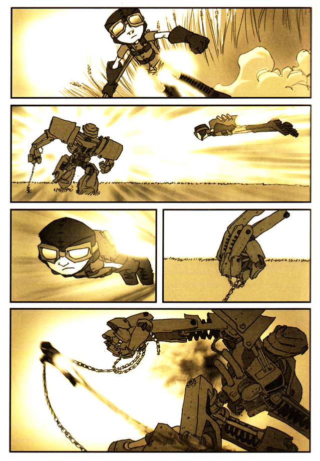
Tom also took issue with another of Lepp’s apparent hangovers from his animation past. He felt that every character, from small-town farmhand to giant war robot, was copied from a 3D reference model, posed each time. To Tom this is a ‘lazy’ approach resulting in visually consistent but mechanical, lifeless art.
I’m of the old-skool that says you draw everything by hand - especially if it’s hard
– Tom
The story
The book itself is a remarkably brief and ephemeral read. We all blitzed through it in under 20 minutes, finding little of substance or originality to hold on to.
There are many hints of other, better, books such as Astro Boy and Big Guy and Rusty the Boy Robot, it was hard not to want to sprint to the end and read those instead.
Jake persevered and read volumes 2 & 3, mainly because they were cheap digitally and just as quick to read as this one. At the end he still wasn’t convinced. And everything is still brown.
I first found it on some dodgy pirate site. It was vertical scrolling for 15 mins and then it just ends. I was a bit drunk
– Jake
The summary
Too short, too brown, too little substance and too much like a lot of other, better things. Maybe read if you find them all cheap on Comixology and you really like brown.
Note: Kelv couldn’t make the meetup but provided a brief summation of his thoughts and a score at a later date.
The scores
- Dan ⭐⭐
- Tom ⭐⭐
- Jake ⭐⭐⭐
- Kelv ⭐⭐⭐