Mister X: Eviction

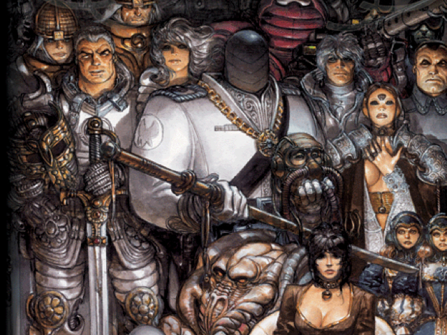
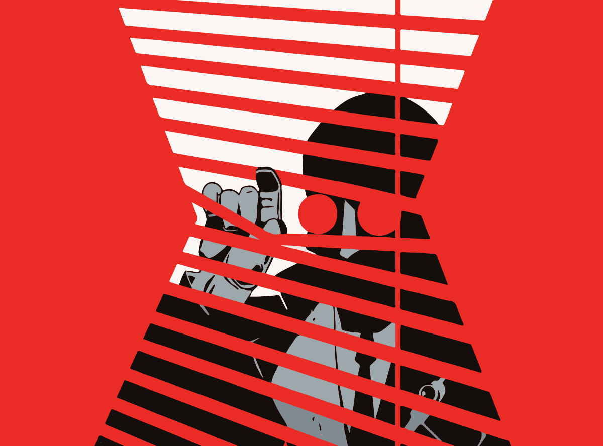
Radiant City - a city so experimental, so radical in concept, that its psychetecture slowly drives its inhabitants mad. The mysterious Mister X has returned to the sick city he designed to try and make amends.

The mysterious Mister X returns to Radiant City

Modern fiction has a long-held obsession with cities and the madness they induce. Therein lies Mister X: Eviction’s biggest problem - We’ve seen all of this before. And better. Much, much better.

It’s Warren Ellis’ urban-insanity epic Transmetropolitan with all the anarchic joy surgically removed, Chandler’s trench coat noir without any snappy hardboiled dialogue or Metroplis’ stark retro-futurism filtered through a cold, dull palette.

Disclaimer: Kelv had a few things on his mind before our latest get-together and was upfront in admitting he’d not managed to get all the way through. We’ll let you off this time Kelv :-)

What he’d managed to read had piqued his interest to a degree but he was most certainly not gripped by the stop/start structure. As Eviction is a collection of short stories based on characters Motter has worked with for almost 30 years, there’s no introduction to anyone. Things just started and, by the time any real nuance or characterisation appeared beyond ‘mysterious’, the whole thing was over.

Even the presence of giant demolition robots can't lift the story

Wake me up when it gets going

Most frustrating were the lengthy flashbacks that often entailed a page or two of small panels with loads of ‘typewriter’ text. Both Kelv and Jake were regularly derailed by these interludes finding them less than helpful in maintaining a sense of momentum in the storytelling.

The hardboiled noir-ish approach felt tired to all. One story in the collection about a kidnapped spoilt heiress was such a noir archetype that the whole thing felt redundant as soon as it had begun. We knew the story beats, and could easily predict where it would end up.

Mister X is mad like an accountant is mad

@tygertale

Draw your way out of this one Deano

Dean Motter’s simple, clean art had received rave reviews by a number of high-profile comic creators. Tom simply saw lesser versions of an art style perfected by other artists such as Matt Wagner and Will Eisner. He was deeply unimpressed with the design of the characters, the execution and the styling throughout the book.

I couldn’t help but agree with Tom’s assessment, although both Kelv and I found some joy in Motter’s graphical panels where his architectural background shone through.

Motter's more-graphically influenced panels are far stronger

Utilising the stark, minimalist style that define the Mister X books there are also some genuinely lovely splash pages and great covers to be found. Unfortunately these flashes of inspiration just accentuate the disappointment when faced with the loose, flat, confusing art that makes up the rest of the book.

There must be something…

So, in a book devoid of memorable moments, drenched in cliché and puns, that tells stories we’ve all heard a thousand times, were there any redeeming factors?

Not really. There’s one moment at the end which, whilst being the denoument of a very rushed conclusion, made me laugh out loud. I won’t spoil it for you.

See, smoking and drinking are good for you!

@dandineen

But that was pretty much it.

Mister X sans Motter

Kelv, Tom and Jake thought that Mister X might well stand a better chance in the hands in the hands of a creator other than Motter. This theory seemed to be borne out by a another anthology of Mister X stories by creators other than Motter which Jake enjoyed far more than Eviction.

Kelvin was excited to learn that the original Mister X series from the 90s was drawn by the Hernandez Bros. and thought he might give that a go instead.

Tom was not the only person to wonder whether the Hernandez Bros. had done more than just draw the original, with the unspoken suggestion being that Motter was nothing but the originator of the concept and occasional contributor.

All this was summed up neatly (if a little harshly) by Jake:

Dean Motter - Riding on the coat tails of more talented creators for the last 30 years

@tygertale

Ouch!

And so to the scores:


Dan - :star::star:


Tom - :star::star:


Jake - :star:


Kelvin - :star::star::star:


Wonder Woman Earth One by Grant Morrison and Yanick Paquette

On the night of the EU Referendum we took our mind off things to review Wonder Woman Earth One, Grant Morrison’s attempt at a feminist opus.

Hercule defeated

Jake started us off by commenting on how extremely light the book was, both physically and in terms of the contents itself. Although Grant Morrison goes to town on the Greek legends, he expected a deeper and darker storyline. This was super-light from the guy that did All Star Superman. I initially found it odd when Jake exclaimed that by about halfway through the book he’d “got fed up with all the women”, but then I realised he’d meant the barrage of pinup babes. “Then this man comes along and it’s all right” he said ironically. Story wise things got better once they moved on from Paradise Island, and entered what he coined the modern world.

Man appears

Here it turned into a bright, colourful TV show where WW’s buddies show up and Rebel Wilson is her BFF. A spark lit for Jake, but only briefly. The structure to the whole story was disappointing. There was no jeopardy: the trial that Diana faced didn’t work and the appearance of Medusa was ineffectual. Steve Trevor is turned to stone but you know he’s going to be turned back and fine. Jake wanted an adventure but didn’t think there was one.

Rebel Wilson as Beth Candy

Yanick Paquette’s art worked in some places for Jake. The thick black lines sometimes employed didn’t sit well though. The Greek motiffs were good and he liked Hercules’ enslaving of the Amazons and his subsequent defeat at their hands. He felt the art was beautifully composed but lacked real impact.

This Earth One graphic novel wasn’t enough of a shake up compared to Batman Earth One which Jake enjoyed (but I hated btw).

As research Jake downloaded Wonder Woman #1 from the 40s. This also had Hercules receive a good beating and an appearance of WW’s fat friend. This original Wonder Woman was quite enjoyable for an old comic. However Grant Morrison’s Wonder Woman Earth One isn’t vintage.


:star::star::star:

Overall I enjoyed it and read it quickly. Not all good but not all bad. Light Grant Morrison.

@tygertale


Tom said he liked the book as a physical thing. It felt grand and the texture was nice. Stealing Dan’s font bitching role, Tom made a good point about the cover’s messy typography. You can barely see the words “Wonder Woman”. Jake however pointed out that you can’t fail to figure who it is from the image. That got Tom to say a couple of things on it: that she’s clearly chained up but her expression is almost scowling. I felt it perhaps verging on mocking. By choosing to stay in the chains when she could easily break out, she is demonstrating that she is the one empowered. A riff, I feel, on the many images of Superman depicting his obvious strength by breaking his chains. This is much subtler. “The chains are for show. She could break out them at any moment - she’s in control” Tom noted.

Cover

Tom was not happy that the very first pic of WW within the book is also the very last. This also jarred with me when I read it.

First and last

Tom then revealed something amazing that gave this book some clearer context. Dan Didio had long ago promised to Greg Rucka that he could do his dream Wonder Woman story. But then it didn’t happen. I then frantically checked the flannel panel to see if Eddie Berganza is the editor on this book. Sure enough his name is there. We spoke about the fact that Greg Rucka has been given the Wonder Woman post-Rebirth gig, but that he would only accept if Berganza was not involved. Mark Doyle (of the Batman books!) is the current Wonder Woman editor.

Otherwise Tom coined the book the Yanick Paquette Show. He had really raised his game over the years since Tom saw his stuff in the New 52 Swamp Thing. Dan likened the art at the beginning of the book to JH William III. But Tom also made the obvious comparison to Adam Hughes and his poor imitation Terry Dodson. This time Paquette is almost reaching Bryan Hitch levels of detail. Stunning work but it took a long time. It’s clear that Paquette poured his heart and soul into this, but Tom prefers Cliff Chiang or Liam Sharpe’s take on Wonder Woman. Having also been shown Nicola Scott’s literally lovely Wonder Woman by Tom, I’m inclined to think that is my favourite portrayal that I’ve seen so far.

Regarding the characters, Tom pointed out that Beth Candy had already been revamped by Rucka into a black woman. They’ve reverted back to white for the Rebel Wilson. He thought it was interesting that Steve Trevor, a black soldier, was exposed to truth serum. This was a theme that occurred in Marvel’s first black Captain America story Truth.

Although Tom enjoyed it, the story didn’t feel like a Grant Morrison tale. “Almost anyone could have written it” Jake said. He certainly has a point. Tom has said that the Wonder Woman Rebirth is already better than this as it begins a telling of Diana’s Year One.


:star::star::star:

Didn’t deliver the expectations of a Grant Morrison story.

@tomwe


Dan set out what was his understanding of the book. An attempt by Grant Morrison to create a true feminist version of Wonder Woman. A woman who stands on her own as a character, in mythology and in her own graphic novel. No longer seen as just 1/3 of the DC Trinity. “So why are all the creators on this book all men?!?”. I got what Dan was saying but I felt suddenly uncomfortable and self-conscious of the fact that we 4 men were sat in the pub criticising the weak feminism of the book. But Dan wanted to see a Kelly Sue DeConnick or a Fiona Staples involved, creators associated with strong feminine characters. As much as I’d agree I find it highly unlikely DC could get it sorted under Eddie Berganza. There’s your answer Dan.

He also noted that all of the quotes on the back of the book were a out Grant Morrison and not the book itself, making one wonder if the book didn’t get good reviews or if the editorial team just didn’t care.

He didn’t feel that there was commitment to this topic. A Grant Morrison tale that was frothy, weird (how is Grant Morrison not weird? - Kelv) and clouded. It felt like a Grant Morrison vanity project. Mistreated or not seriously which hurts the whole thing. Lazy or not allowed.

The art was interesting at points in a JH Williams III kind of way but didn’t like the cheesecake. For a book about strong empowerment there was a lot of T&A. Dan was not a fan of the art - very “comic booky” he said (I think he meant mainstream superhero).

The story starts out in a sci-fi lipstick lesbian utopia. Dan likes all of these things but not in Wonder Woman Earth One. It was just not very interesting. “Where’s the crazy shit?” he lamented. “Where’s the crazy sperm that messes with your head?”. I suspect that’s a different book altogether Dan.

Dan did like the interesting race swap for Steve Trevor. He smirked and grimmaced at the scene when Diana hands him the S&M collar. But he wasn’t convinced by the “mansel in distress” schtick. He wasn’t really in distress. He got a bit ill. As for Beth Candy, it was irksome for Dan that Amazons had never seen a fat woman.

To judge this as the book it aimed to be, is it a good feminist comic? Dan suspects “no”. Is it actually a good comic? “It’s all right”. According to Honey, his 12 year old girl, she found it “Boring. Why did nothing happen?”. For Dan feminism is done better in comic form in Bitch Planet and Saga.


:star::star::star:

Disappointing.

@dandineen


Oppression by man

It’s rather damning I think that no one here really hated it or liked it that much. And it’s the first book that we have scored unanimously. So should you read Wonder Woman Earth One? If you want.

The Comic Book Club 1st Anniversary Limited Special Exclusive Variant Non-Slabbed Edition

A year ago today, I got together with a small bunch of friends who I knew had a passion for comics. I had an idea that if my wife was reading a book a month from her book club, I could do the same with a Comic Book Club.

Meeting up

The gatherings have been a tremendous success. We have had such a good time not just discussing the books we’ve picked but on comic book topics in general. So much so I’ve even started up a Slack team where we also discuss comics with more of our chums who live further afield.

Slack has given us a chance to chat about things like lamenting DC’s many, many failings or the latest controversies in the 4 weeks in between our meetups (by which time we’d normally forget to bring it up), and to hear more opinions (and jokes) from some very funny people

Several bowls full of chips with our drinks have also added to the pleasantness when we do meet IRL. We’ve turned into typical village life old men. Always going to our favourite pub, sitting in our favourite spot and always eating our favourite grub.

Meetup

“I absolutely hate it”

But the real fun is when we each have our say on the book one of us has picked for that month to read. We either gush over a brilliant choice or absolutely hate it while enjoying being able to express our views.

Choosing a book though can be slightly wrought with anxiety. For me it is at least. My club mates are clearly people of good tastes (musically less so maybe) with brilliant shortlists kept ready to pluck a great book from. I feel a pressure to pick a decent book and I am terrible at it. It doesn’t help that I am not as knowledgable with the comic book scene as the others. There was a time I was deep in it, when I worked in a comic book shop for my Saturday job as a teenager. But nowadays I avoid reading up on comics as it is full of spoilers or details of books I don’t want to read. Or worse: too many that I want to waste money on.

There’s more to life than Batman!

Otherwise though I am really lucky with this small group as we could easily have ended up all having terrible book choices as I do. And that would render the club slightly pointless in terms of reading. I can make my bad decisions on my own after all. What’s really great is that the club has opened me up to a whole world of books that aren’t just Batman or X-Men. These have been books that would not have been purchases I would have made otherwise. And though there have been some I have not enjoyed, the ones I did have been revelations to me.

The Metabarons is a clear example.

The Metabarons

Precious time

What started out as a slight excuse to buy myself a graphic novel a month has become the one point in my (quite barren) social calendar that I look forward to the most. Dan, Tom and Jake are great company and I am really pleased at how well this little idea I had has turned out.

Long may it continue.

Sing No Evil by JP Ahonen & KP Alare

With a face melting power chord, our first year of comicbooks is wrapped up by Sing No Evil (or Perkeros to give its original name), a Finnish OGN by creators JP Ahonen & KP Alare. This story of a metal group’s attempt to make it in a battle-of-the-bands scenario divided our members once more and showed how our personal experiences and tastes have a significant impact on what we like to read.

I discovered Ahonen during Inktober (the annual October drawing challenge begun a few years ago by Jake Parker). He had drawn chibi Metalhead comic strips and I loved them so much I had to see what else he had done. When I realised he had a wealth of comic art under his belt I immediately ordered the only one in the English language and it then waited over half a year for my next turn at picking.

sketch1 sketch2

The book begins with a terrific gig scene, an explosion of metal you can feel through the pages. Dan was transfixed and transported- like a mad teeth-gritted five-day speed fix, sweating in the moshpit of a Birmingham club. He said to him the book was everything Hip-Hop Family tree had been to Jake.

Sadly, the rest of us felt spoilt by the opening. Jake thought the band Perkeros were likely crap musicians and had no charm. The main storyline was over-familiar and he said he would have preferred it if the book had no words at all.

I would almost agree with that myself; Ahonen’s art was the main draw for me, I think he is a world-class talent. Each of the characters are unique and the world is expertly realised; albeit it’s a world where we have a bear and a badger as drummers. We all would have loved to see more animals! Bear was a standout character, being not anthropomorphised as such but simply a bear with a desire to rock out! We also liked Lily (who was handled better than the one-dimensional girlfriend), but the guru Kervinen wasn’t as profound as he thought he was, he was just annoying. New addition to the band Aydin was a very cool character, he quips at one point “you see worse on Kebab lines at 4am”.

words

The colours throughout are predominantly warm brown hues with accents of green (barring one tiny section towards the end). I liked the palette but Kelvin found it a dirge consistent with his opinion of the book as a whole. He felt he was “doing a Dan” by having an extremely negative reaction to the book (HATED IT!). He blamed it on his own youth as a raver not a goth and found the story and music pretentious. He wasn’t the only one to draw comparisons to Scott Pilgrim, another comic that mixes the story of a band with coming of age/self awareness and fantasy elements. But Kelvin said he was always able to forgive the Pilgrim character for his dickisness whereas Perkeros’ Aksel’s own self-loathing and destructive tendencies just painted him as an irredeemable twat.

bear

The book does feature some fantasy elements throughout and significantly changes gear in the last chapter, however I felt it did not earn the change in tone; that the build-up had been too thinly seeded. I understand the desire to shock and surprise but it just didn’t quite sit right for me. That said, the action itself was handled masterfully with wonderful touches like a pizza cutter as a melee weapon and some amazingly well choreographed punches. With all of Kelvin’s complaining, he had to give it up to Ahonen for the accuracy seen in the fight. Blocks, bodyslams and stabs. But then it all fizzles out again.

Overall, I feel this is a great looking little book, let down by a tired concept that then isn’t lifted enough by its twist. However, I am certainly going to look out for whatever the authors do next.

:star::star::star:

Tom


:star::star::star::star::star:

I acknowledge its flaws but it really hit home for me

@dandineen


:star::star::star:

Great gigs, awful title. It was a Super-Cliché

@tygertale


:star:

It is my anathema. Neughhhhh! Bored.

@chao_xian

Patience by Daniel Clowes

A cosmic timewarp deathtrap to the primordial infinite of everlasting love.

This was Tom’s first taste of Daniel Clowes, and he loved it. He had no idea what to expect before reading, possibly a ‘slice of life’ thing, like Ghost World. What he got as he sat reading it in Heathrow’s Terminal 3 was a time travel murder mystery into the heart of darkness.

The surroundings of Terminal 3 added to the experience - being in a no-man’s land environment of an airport waiting room enhanced the feeling of dislocation experienced by the main character as he ricochets through time in an attempt to prevent the murder of his pregnant girlfriend Patience.

Tom sped through this book, admiring the ‘gorgeous colour pallette’ as he went before being taken aback by the shock ending.

He thought it was the best written story he had read this year and gave it the full five stars. Tom says he will definitely be reading more Clowes. I recommend he tries kinky murder mystery David Boring, or if feeling brave, the fully twisted Like a Velvet Glove Cast in Iron.

Kelvin was immediately excited that the Club was reading something brand new this month. Having read some of Clowes’ earlier books he was familiar with the representation of a very particular urban American milieu. So he wasn’t really expecting a bleak sci-fi comic.

He too enjoyed the colour, but it was Jack’s misanthropy that really worked for him - ‘I can relate to him,’ he said big laugh *. Kelv thought the theme of police injustice caught the zeitgeist, with Tom adding that he thought one of the villains was rather Trump like. I don’t know if these are deliberately drawn on recent events, but it’s clear that Clowes’ cultural radar is as well tuned as ever.

Having read (and enjoyed) Dan’s pick last month, the dense, epic Metabarons, Kelvin was relieved by the relative speed with which he read Patience. He rated it four stars. Brevity was a blessing for Dan too, not because he found it gripping but because he ‘hated every bit with a passion.’

By the time Dan had reached the opening spread he was suffering from ‘font trauma’, counting nearly ten different offending typefaces. He found the art malformed, misshapen and ugly. The colour palette of clashing pinks, reds, yellows and oranges he thought gaudy.

Worse was the storytelling. While the rest of us had been carried away by the narrative, Dan found it static, criticising the pacing as well as Clowes’ attitude and approach to the story. Where we had been surprised by the ending, Dan had spotted the murderer from their first appearance. Not that he cared - he was just glad it was over! Zero stars. Another winner for Dan!

Which left me, floating somewhere in the middle. I’ve read pretty much everything Clowes has written - he was the one author I continued to read after giving up on comics in the mid 90s. We debated whether Clowes was one of the ‘masters’ of the form (to rank alongside the likes of Steve Ditko, Jack Kirby and R. Crumb. I think he is - he has a distinct aesthetic that has been widely imitated, and every one of his books is written in an instantly recognisable voice.

However I didn’t think Patience was up there with his best. Unlike Kelvin I wasn’t surprised to see him trying sci-fi as he’d done this brilliantly in 2011’s Death Ray. Like that book this is ohsobleak, and at times the misanthropy on display was a little too much, even for me.

Although I didn’t agree with Dan’s assessment of the art, it’s not as attractive as some of his other books. I loved the gaudy colours, but found the drawing style a little too loose, compared to the exquisite draughtsmanship of a book like David Boring.

I struggled to rate this one, but on the night chose to rank it alongside his other work, settling on three stars. That Patience elicited so many different reactions, from extreme love to total hatred and shades inbetween, I would have to conclude that Clowes has actually achieved something really great here. So sod it, I’m going to bump my rating up to a four.

Jake Hayes