Madi

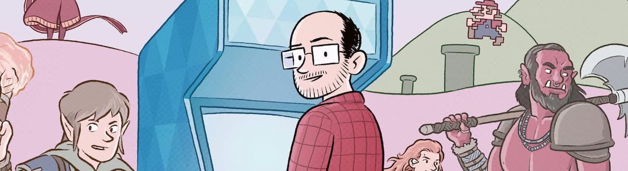
Are comics better than movies? How many artists is too many? Is oversized the right size?

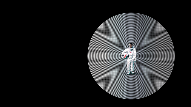
The June edition of The Comic Book Club are here to answer these pressing questions. This month we have all been reading Duncan Jones’ sci-fi fable, Madi.

Let’s get into it!

Kickstarted

There are a fair few different versions of Madi available. Tom was in early on the Madi Kickstarter campaign and got a very nice oversized hardback for his trouble. The rest of us picked up the less-snazzy and far more normal-size trade paperback. Tom’s deluxe hardback definitely has the Wow! factor and make our standard versions feel a bit… dowdy in comparison.

On a material level at least Tom was pretty pleased with his Kickstarter reward. The Kickstarter was a success and the the final product arrived only a little later than scheduled. Apparently Tom had feared the worst after being let down by the non-arrival of a Great Big Hawaiian Dick from a previously-backed KS project.

“I like it. It’s really thick”
Tom

The book of the film

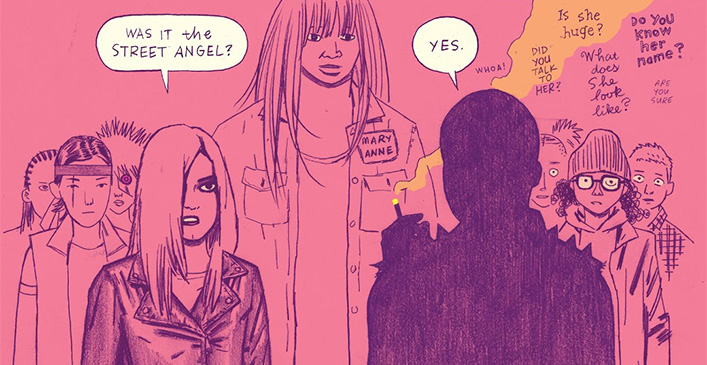
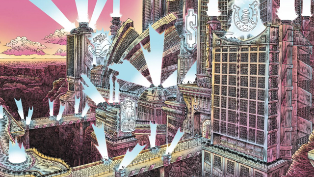
According to the blurb on Z2 comics, Madi’s publisher, the book is “the third and final story in the ‘Mooniverse,’ an anthology of independent stories that take place in a shared future.”. While we’d all agree that it shares common themes, styling and tone with both Moon and Mute none of us spotted any direct links or references beyond a few possible background easter-eggs. That doesn’t mean they’re not there though.

I think that, on some subconcious level at least, we were all wondering why Madi was a comic book and not the third movie in a trilogy. More often than not reading Madi certainly felt like working through an illustrated adaptation of an early-draft movie script.

A sliver of the rather huge Madi deluxe hardback cover

Kelv saw the whole thing as a storyboard, with sparse, snappy dialog dotted across pages and clearly intended to be spoken not read. Tom commented on the cinematic wide shots dotted throughout the book, used cinematically to establish new locations and deliver a blast of visual spectacle.

Meanwhile, Paul noted Madi’s script-like qualities as the story moves through its three act structure, punctuated with showpiece action scenes. He also mentioned the huge array of characters, most of whom would’ve warranted but a few seconds of screen time in a 2 hour movie. Placing them on the page seems to elevate their importance and meant Paul spent a lot of his time trying to keep track of them all.

“This book is a square peg hammered into a very round hole”
Paul

I can only agree with everyone here. Many of the sequences in Madi have a kinetic, filmic quality to them. They feel like they were intended to play out on screen rather than on paper. Once you notice it, it becomes difficult to shake off. At worst it’s kinda distracting…

Too many cooks?

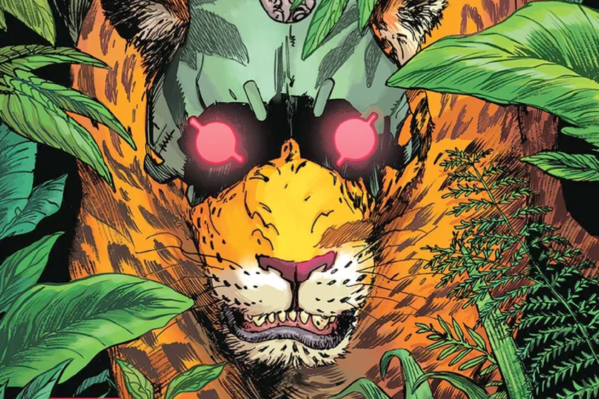
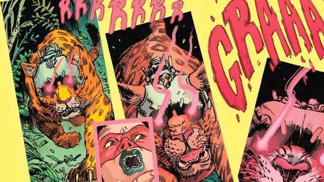
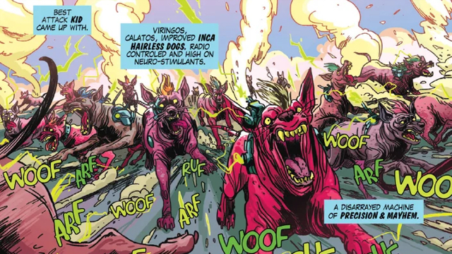
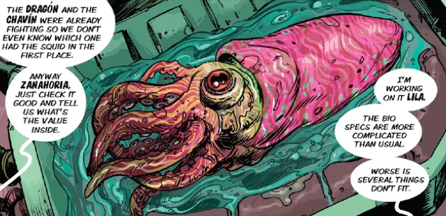
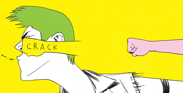
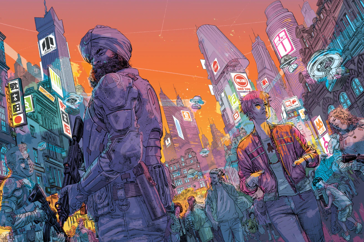
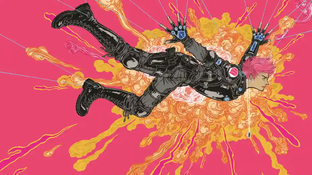
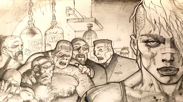
One of the most interesting things about Madi is how the artist switches every 6-10 pages or so. This very quickly becomes quite challenging to read as each new sequence lurches into a radically different art style from the last. Although there’s a broad sense of consistency in character design the wildly-varying art styles still make for oddities and non-descript faces, especially among the huge cast of ‘secondary’ characters.

Naturally, given the wide and varied tastes among CBC members, we all gravitated towards different artists. I was a fan of the strong opening section set in a future Camden Lock by Dylan Teague. It felt very Euro, like a feature strip from Heavy Metal. Kelv wasn’t so keen but could still appreciate the detail in Teague’s artwork.

Tom singled out a sequence set in Vegas drawn by James Stokoe as his least favourite. Personally I really liked Stokoe’s scruffily detailed art.

Future Vegas as drawn by James Stokoe

Jake wasn’t familiar with a lot of the artists but did recognise those with a strong 2000ad connection, primarily Glenn Fabry and Simon Bisley. He wasn’t too fond of the chopping and changing styles, finding it a distraction from the narrative.

Kelv pointed out that, due to the size of the book, it would’ve been a gargantuan undertaking for a single artist to complete. Perhaps the mix’n’match approach was dictated more by the need for a timely delivery than an intentional artistic direction?

Simon Bisley's 'approval' sketch for his Madi sequence. If it had all looked like this...

The one thing we could all agree on. art-wise, was that a fight sequence illustrated by Bisley was really disappointing.

“I used to be a Bisley fanboi but now I wish he’d just grow up a bit”
Dan

Once upon a time… in the future

Overall Madi is a big ol’ mish-mash of ideas pulled in from numerous classic sci-fi, cyberpunk and horror sources.

As far as I can tell, the plotting and story is by Duncan Jones. Well-regarded comics scribe Alex De Campi providing the finishing touches.

At the time of reading only Kelv had seen both Moon and Mute. Everyone had seen Moon and were unanimous in our appreciation of a bona fide slowburn sci-fi classic.

The film poster for Moon

Kelv hadn’t really gelled with Mute and so was a bit worried how he’d feel about another story set in the ‘Mooniverse’. As mentioned above, the first few pages didn’t grab him but, once past those, he felt Madi found it’s groove and he blitzed through the rest.

“Oh no! This might be pants!’
Kelv

Jake thought it somehow worked as a strangely grounded near-future sci-fi fable in the vein of 90s 2000ad spin-off Crisis.

“I usually forget stuff but this… I couldn’t remember anything about it after my first read through”
Jake

Ironically the script-like qualities made it an easy read as there’s minimal dialog and limited exposition. Somehow it does also manage to meander as well, despite being propelled forwards by the aforementioned big-time action sequences.

The denouement featuring repeated body-swapping and personality switching was pretty exciting and delivers a pretty decent pay-off, especially for one of the supporting characters who gets his well-deserved time in the spotlight.

Wrap-up

As a not-that-original mashup of many, many different influences I think I can say that we all liked Madi but didn’t exactly love it.

As a hefty graphic novel it’s a fast read despite it’s size, and is chock-full of interesting imagery and exciting action sequences. Due to the wide array of artists, and a story that just feels shaped and structured to appear on the big screen, Madi can’t help but feel like a bit of chimera.

Jake and Tom are planning a re-read. Kelv and Paul probably won’t. I suspect I’ll just flick through and look at the best bits.

Scores

  • Dan - ⭐ ⭐ ⭐
  • Tom - ⭐ ⭐ ⭐
  • Jake - ⭐ ⭐ ⭐
  • Kelv - ⭐ ⭐ ⭐
  • Paul - ⭐ ⭐ ⭐

That’ll be a solid ⭐ ⭐ ⭐ then :-)

The Seeds

The Seeds is a landmark release for a number of reasons:

  1. It is a team-up between superstar creators Ann Nocenti and David Aja.
  2. It is Aja’s most high-profile project since his legendary Hawkeye run with Matt Fraction.
  3. It is the latest release by the Berger Books imprint.
  4. But most significantly of all, it is my first pick since joining Da Comic Book Club.

(For context, Dan suggested my coming along in the early days when we worked together with Kelvin, but geography and my inability to drive from Cardiff to anywhere at the time never mind Bradford-on-Avon got in the way. Now in the Zoom era, such boundaries are meaningless. And I now have a licence.)

CBC NOTE: Welcome to the crew Mr McGarvey!

The Seeds tells the story of… something? Set in an alternative near-future dystopia set in a stylised world where society is splintering along lines of those addicted to tech as the world crumbles and those who have turned their back on digital modernity, the narrative takes place against the backdrop of nature beginning to behave oddly as flora and fauna mutate. And the bees are swarming ominously.

And there are also aliens, I guess?

A recurring theme in all of our verdicts is that clarity of storytelling was not a prominent feature in this book.

Lovely art, the problem is reading it

Dan went first and noted he read the first two issues when they came out, and was surprised to see the complete graphic novel appear two years later. He initially bought the issues because of David Aja and his art, and praised the “Ryan Hughesy” cover. He kept going over the cover and appreciated its texture. He particularly loved the image of alien with seeds coming out of his eyes.

Then he started reading it and remembered why he didn’t follow up after two issues. As glorious as Aja’s monochrome, single tone “greeny stuff” was, and as wonderful as the design and layout was, he did get quite lost. It was hard to tell who was who, especially with the aliens, even the ones who you think would stand out for having their junk out.

“Strangely enough my levels of knob recognition are not up to scratch.”

Dan was particularly annoyed by the thin characterisation. The two main human characters were a female journalist woman with glasses and a cool woman in wheelchair, and such physical defining features are a poor shorthand when you don’t give either character a personality.

Ultimately, it was lovely to look at, but Dan would chop out pictures and frame them and never read it again.

⭐ ⭐

Classic Karen Berger

Tom’s first comment was that a distressed cover is annoying as you are not going to be able to sell the book on. He appreciated that it had a dimpled cover, rather than spot varnish. This made it feel like a file, something a bit retro from on office, which fits in with the old-school journalism angle. He added that originally the story was just about the reporter but editor Karen Berger said that’s not good enough and they shoved aliens in it.

As much as he found it weirdly compulsive, Tom was banging his head against wall wanting to understand what was going on. In that sense it was like a Classic Karen Berger Vertigo book, with a lot of story and words going on in one issue. He found it unsettling and unnerving, but was not sure he liked it.

Reading it through for second time gave a better handle of the story, but he was still confused by a bunch of stuff happening. The bit on Mars didn’t seem to have much to do with the overall narrative.

Tom said he really love the artwork style and artwork itself, and wondered how much of it was photo referenced. It was realistic but not photo realistic. The use of a nine-panel grid throughout the book called back to Watchmen, but that decision to make the panel progression as clear as possible just added to the sense of it being overwhelmed by the amount of story.

Tom didn’t have a lot to say about it overall. It was hard work in a good way, but he didn’t come away with a happy feeling.

Another middling book from Berger Books.

She knows what she likes obviously, perfect example of the stuff she’s put out before, so what you would expect.

⭐ ⭐ ⭐

Urban grit and alien shit

I found the first two parts interesting as I’m a sucker for both grimy sci-fi and neo-noir, so the blending of these styles was always going to be in my wheelhouse. Initially it made me think of one of my favourite 90s films, Dark City, with its combination of urban grit and mad alien shit.

However, the more I read on, the less I understood. The world-building threw in lots of interesting elements, but ultimately raised distracting questions. I gave the example of journalists working of retro computers with green letters on a black screen. This was as contrived a stylistic choice as the 1940s stylings in Kelv’s beloved Batman: The Animated Series, but it pulled me out of the narrative rather than created an intriguing mood or aesthetic.

Retro tech just doesn’t cut it in a story heavily based around modern smartphones.

I was a bit more positive about it than everyone else, despite my reservations about the overly opaque and elliptical storytelling, but much like everyone else that was down to the art.

⭐ ⭐ ⭐ ⭐

BoJack Horseman

Kelvin loved the artwork as well. It felt like Hawkeye without the colours.

He read The Seeds in two parts. Initially he picked it up and thought it would be horribly depressing, an apocalyptic not quite future where basically humans are awful, and thought “I can’t read this”. He stopped in the first issue, then came back and read the whole thing on a day off.

He got what everyone else was saying about not knowing what was going on, but did like the Bojack Horseman cameo in the bar. The dialogue in that panel was very Bojack Horseman. Unfortunately this was the most interesting character in this book, as he couldn’t care less about the cynical bespectacled journalist who doesn’t brush her teeth but has a heart of gold and uncovers the truth.

He noted that it came out in June 2020, mid-pandemic, and that there was a reason why Animal Crossing was the best-selling game of 2020. He was really looking forward to post-Covid where he didn’t have to read depressing shit until at least the Third World War.

⭐ ⭐ ⭐

Science people doing bee stuff

Jake questioned what was all the seeds stuff about, as he didn’t get that at all? Which doesn’t bode well for a book called The Seeds. The story didn’t follow through on its apparent premise. There were some science people in the background doing some bee stuff, but they just disappeared. It felt like the creators had an idea, got halfway through, then decided it wasn’t interesting and wanted to do something else but they had already called it Seeds.

There was a lot of elements thrown in all the way through, like the talking bird, that didn’t serve a purpose. While some people would love the mystery of it all, for the book to work there has to be some meaning. He didn’t think the creators had worked any of it out. They just wanted to write some cool stuff in the genre, and they achieved that.

By the end, Jake felt he didn’t know anything at all about what had happened, of if any of the characters had achieved anything.

There were no characters in it at all.

Despite this, he quite liked it, if you take it for what is - a pretentious book. It looked lovely. He felt kind of sad he hadn’t bought the book. It doesn’t work on the iPad.

He also loved the artwork, and would be happy to read anything by the artist, but probably won’t read anything more by the writer.

The artwork reminded him more of V For Vendetta than Watchmen, with all Aja’s art being reminiscent of David Lloyd. Sometimes it does feel like he has a photo and just ran it by a filter, but if he has drawn it by hand, then he’s a genius.

It was a thing; Jake was pleased to have read it. The narration device made it difficult to get into, with internal thoughts, but not internal dialogue.

⭐ ⭐ ⭐

Gamish

In the depths of my past, my first salad days was as a video game journalist. I fell into it really. A lucky break. But just like my game playing ability, I was rubbish at it. Despite that I still love videogames. I’m also fascinated by its history. Oh what’s this? A graphic novel about the history of videogames? Two of my favourite things combined? Just how would this fail to please?

Buying the book from the creator means you can request for a personalised sketch.

I picked this book when I saw it reviewed in The Guardian and it just Super Mario jumped at me. I also kinda knew in the back in my head that Hip Hop Family Tree was an epic fail of a pick last time I went for a non-fiction book for the gang. This was a bit of gamble, particularly as Tom doesn’t play videogames. I’d hoped that the medium might have given him some insight into the joys of videogames and that tastes are much more widely catered for these days.

Well… I was waaaay to optimistic 😅.

The others weren’t so interested in the history of gaming. A couple of them are also into games, but don’t really care that much for how these things came about. Well to an extent, because they’ve seen High Score on telly and it’s a pretty cool documentary. I think the words “worse than a TED Talk, more like a wikipedia page” were mentioned.

And I can see why, as it’s really dryly delivered. The cartoonish style divided opinion further: I didn’t mind it, Tom thought it was really “on-model” and professionally approached. Dan and Jake hated the marshmallow heads and pale palette.

Buying the book from the creator means you can request for a personalised sketch.

Despite the shortcomings the other identified, I thoroughly enjoyed it! I loved the consistency in the art style so that jumping from one game to the next wasn’t jarring. I had no strong opinions on the look or colour myself, the delivery of content was a bit academic - reflected in the huge appendix.

But I liked the insights and also found a list of games to check out. Jake noted a few himself too.

I liked how the problems with racial stereotypes and the depiction of women were touched upon (the others complained it was a bit lightweight, but I feel the whole book was quite a whistle-stop and in keeping with that).

I also liked how the psychology of games was looked into.

Ultimately it made me want to play some games, which the others did too. Except for Tom.

Me

4* I love games history and the thinking in some of this was fascinating.

Jake

2* Too wordy and not nicely coloured. Thanks but no thanks. Will still take something away from it.

Tom

2* Obvs a lot of work and like looking at it.

DAN!

3* I don’t hate it. I think it has its place. It could have been worthwhile.

Manu

Manu is most definitely an ‘indie’ book.

From the dinky but lovely A6 format, to the ‘direct from creator’ purchase path and the personalised salutations inside the cover, Manu (and its sibling books Lima and Trujillo) screams ‘self-published passion project’.

For some unknown reason I don’t usually buy indies. In the old days - late 80s, early 90s - I may have felt the thrill of rebellion, like I was pushing back against ‘the big two’, by buying books from Dark Horse, Image and Comico. But those were never real indie books, however exciting the idea of ‘creator owned’ seemed at the time. I just wasn’t ever one for titles and publishers that were more… rough around the edges, a little weirder than my standard tastes.

To be honest, I haven’t changed much over the years. My pull-list is pretty much all Image (who’d have thought it!) and the odd edge-case Marvel or DC books. I’m a creature of fairly dull and predictable habit.

Suprise Motherf**ker!

Manu started as an interesting curve ball to throw to my fellow Comic Book Clubbers. I originally planned to pick Dracula Motherfucker - yet another Image book! - but there was a nagging suspicion in the back of my mind that the rest of the crew almost expected me to pick it, probably due to its delightfully sweary title. So I didn’t.

I’d inadvertantly stumbled on the Kickstarter for the sequel to Manu, Puno a few days earlier. The Kickstarter had a few weeks left to run but the creator, Gustavo (Gustaffo?) Vargas, had already self-published a number of books in his cool-looking Aztec-flavoured cyberpunk universe. What the heck, we’ll read those instead!

The easiest way to get hold of his books - Manu and two previous books; Trujillo and Lima - was direct from Mr Vargas’ website. I was only intending to buy Manu, but when I realised I could grab a bundle of all three books for under £15 it seemed like too good a bargain to turn down. And all the money went directly to the creator, which felt pretty good.

Tom is a little more au fait with the indie world and he leapt straight in snapping up all 3 books. Jake followed suit but went for the digital bundle instead. Kelvin also grabbed hard copies which arrived just in time for the meet-up after a slight shipping mixup. He got a free artist’s sketchbook out of it so there wasn’t much to complain about there!

The rule of three

So we all had the same three books. However, it appears we’d all formed very different ideas about the order in which we should read them.

Kelv started with Manu as it clearly states ‘Volume 1’ on the cover. He was initially intrigued by the premise and was excited to get stuck in.

Jaguar attack!

“When they all started talking it went downhill from there”
Kelvin

Unfortunately Kelv found himself struggling with some stilted and unnatural ‘Hardboiled’ language that kept breaking his flow. The art was cool, the setting was full of potential but he just couldn’t find a connection with any of the characters.

So he moved on to Lima and happily Kelv immediately had a better experience. The story made more sense, the art was just as kinetic and visually appealing but the writing felt smoother and more accomplished. Even so Kelv still couldn’t completely figure out what was going on in the story but that mattered less now he wasn’t fighting with the dialogue.

And finally Kelv gave Trujillo a go. Sadly he gave up pretty quickly on this one and didn’t make it all the way through. It just didn’t click for him.

⭐ ⭐

“A lovely bit of self-publishing. Love the format”

The Kelvin sequence

Tom also read the books in what I am now calling the ‘Kelvin sequence’:

  1. Manu
  2. Lima
  3. Trujillo

Happily Tom’s experience with these books was more positive, taking the non-linear nature of the reading sequence as a narrative structure akin to movies like Pulp Fiction, where time is jumbled about and flashbacks fill in details at a later date.

“Has everyone read these in a totally different order?”
Tom

Tom was the first, but not the last, to pick up on the 2000ad-ness of the setting, art and writing. It definitely feels like all three books might’ve been written with an 8-page episodic structure in mind. They’d look right at home in a prog nestled between Dredd and Strontium Dog.

Release the hounds!

Tom had fewer issues with story and dialogue than Kelv, relishing the hard-edged, profanity-laden back and forth between the various protagonists. He too felt like Trujillo was the weakest of the three books. Tom appreciated how each book introduced characters and concepts that are revisited and expanded upon in the other volumes. He could definitely see some fascinating world-building going on and the potential for really crazy, weird sci-fi action in the upcoming books.

⭐ ⭐ ⭐ ⭐ ⭐

“I’m really rooting for the guy as a creator. Really happy to have found him!”

Smash cuts and non-linear narratives

Jake completely disregarded the Kelvin sequence. He started with Lima, then moved on to Manu and finally finished up with Trujillo.

He too was immediately taken with the world building and loved Lima’s pacey, exciting street-level first act. He thought the violence was particularly shocking and found some of the cinematic ‘tricks’ employed later on in the book to be particularly effective.

“Loved the smash cut to the torture scene”
Jake

At the end of Lima Jake’s hopes were high. Moving on to Manu he couldn’t hide his disappointment - tonally it felt like a totally different book! Jake made it part way through before he realised that the two books were connected. Although the threads were a little clearer he felt as though things had jumped a little too far forward. He wasn’t interested in the distant, damaged girl from Lima - he wanted more techno-street-gods, corporate espionage and cyber-squids!

Cyber squid

Unfortunately Jake didn’t make it all the way through Trujillo either. There were too many guns and gangs for his tastes - Jake don’t do crime :-)

Jake purchased the digital versions of the books and was full of praise for the art, and in particular the colour, as it really shone on his iPad.

⭐ ⭐ ⭐

“I look forward to seeing the art with a story that isn’t his own”

It’s a love story really

I elected to read the books in what I thought was the official, chronological or ‘proper’ order - Trujillo, Lima & Manu. I’m not 100% sure where I derived that order from. It may just mirror the order of publication as set out on the website.

The first thing that hit me was that the setting is pretty cool. It’s maybe not quite as unique as I first thought - I get some hefty Shadowrun RPG vibes from the mix of tech and magic - but that doesn’t mean it didn’t feel fresh and unusual. It’s just nice to see cyberpunk set somewhere else other than Tokyo, Berlin or LA!

Cyber squid

I enjoyed both Trujillo and Lima as books in their own right. Both were pretty easy to digest and weird and creepy enough to keep my interest all the way through. I absolutely loved the Cronenberg-esque animal/computer interfaces and really wanted to see more of it.

“Guinea pig drug mules would make the best stew’
Dan

The art is great and steadily improves over the course of the three books. There’s a distinct progression in the detail levels, with Manu showcasing some dynamic line work and some fluid, exciting layouts. It reminds me of Nick Pitarra’s work on the Manhattan Projects - full of exaggerated forms and gangly, slightly bulbous poses. It really worked for me.

Story-wise, Manu is the most intriguing of the 3. At it’s core it is a very simple story about a complex relationship and hinges on the mundane question “Why don’t you ever stay over at my place?”. I liked the fact that a dark, gritty near-future sci-fi book had essentially been remade as a romance. It did take me a while to pull together the narrative threads from the previous books but, once I got there, I enjoyed the fact that the story built up over time. I’m curious to see where things go from here.

⭐ ⭐ ⭐ ⭐

“Bring on the cyber-jaguars”

TL;DR

There’s some great stuff in these three books. The art is sharp, clean and dynamic and is backed up by some fascinating world building that may yet pay greater dividends in upcoming volumes. The format is tight and delightfully well put together. Although we weren’t unanimous in our positivity for these books I think we can all agree that supporting slef-publishing creators is a wholly worthwhile. Go grab the books for yourselves and see what you think :-)

Street Angel: Deadliest Girl Alive

Sometimes choosing a book for CBC is as simple as paying attention to your friends:

Been reading this comic this weekend. Just saw it randomly in a bookshop window display on instagram. Zoomed into this all like ‘what is this perfect comic for Dani!?’ It is SO COOL and wall to wall bad ass girls. it’s by @jimruggart off’ve CartoonistKayfabe! Totally recommend!

— dani abram (@bintykins) 7:08 AM · Sep 28, 2020

Yup, I’m that lazy. Actually, I’d heard of Street Angel before. Back in the depths of time I had much more commuter bandwidth to listen to podcasts and often Jim Rugg’s work would come up.

This particular book is a chunky collection of the later Street Angel strips, mostly put out by Image Comics, and they stand apart from her 2005 debut due to the colour and mix of art styles. When Rugg and Maruca’s Homeless Ninja was first on the stands it was a small press floppy on pink paper. Back then, it stood out compared to the wall of superheroes. Now pink is often the go-to colour for minicomics.

The mix of styles is a blessing and a curse. Opening the book Dan was excited by the appearance of a bandana wearing cat, only for this immediately to be followed by a very cartoony dog. That pretty much did it for him. Jake pointed out one of the dog’s last panels was as deep as it’s likely to get for a cartoon dog: stood in the shower with the water beatind down, trying to wash away his experiences with the Street Angel. Regardless, from this moment on Dan was not going to like the book!

Cat vs dog

The rest of us enjoyed the strips a lot more. Each story has something different going on, resolving in and around Wilksboro (the world of Street Angel) while she herself remains a constant: she’s homeless; she’s hungry; she’ll kick your ass. I compared her to a character in a British humour title, like The Beano or The Dandy. She doesn’t change, her personaliy remains the same. She has an adventure and then it ends. Repeat. This is in no way a bad thing, in fact Kelvin loved being able to pick it up and flick through to wherever, still enjoying the story without worrying about over-complex plots. Throughout the book there are people who know who she is, and they know much better to stay out of her way than the poor saps who feel the end of her blades.

Living up to the hype

Rugg shows off his expert design skills in the book too. In 2015 he won the Best Publication Design Eisner Award for Little Nemo: Dream Another Dream. Here he has an inventive flair for page layout, FX typography and action. I personally love the pages where he draws Jesse (her real name) with multiple fists or swords or arms, fighting, stabbing or eating in a flurry of motion. My very favourite though is one page-turn where the facing page, which you see first but is technically second shows only a fist, and then your eyes follow the action to the other side where she punches Some Guy. You’ll have to buy it to see what I mean!

killer page turn

This book does require an appreciation of Underground comics in order to get on with it (see Dan’s reaction) and the first volume even more so. But maybe this book is also a way into that material for the uninitiated. I disliked the Bleeders story the first time but it grew on me the second read. Maybe I was in the right mood, or maybe the strip had just clicked with me by then. Jake said something similar; he learnt not to overthink it.

It has some genius moments, and as Kalvin found you can pick it up and leaf through at leisure. It’s almost a coffee table comic, like a collection of Beano strips or the other things that Rebellion have started putting out.

One other thing I noticed is that bad language is missing throughout. The flow of the dialogue is not modified but the swears are special-character replacements. This may well make it more suitable for the teenage readers that it surely will appeal to, at least from the point of view of a parent! This is the audiance I think would enjoy it most: teenage reader just dipping their toes into Underground graphic storytelling.

We found the classificaion of the back “Teen, Girls and Women” to be a little limiting, but given Dani’s reaction that got me to buy it in the first place, it could well be on the money.

-Tom ⭐⭐⭐

I really don’t get it! Couldn’t discern an actual story. Did anything happen? It felt like being shouted at by my teenage daughter.
-Dan ⭐ (for the cat)

A nice, quirky, indie thing. It’s vapid but my kind of vapid.
-Jake ⭐⭐⭐⭐

Asian myths have hobos who are zen and can fuck you up! This feels like a cartoon - it’s candy pop escapism and I love it!.
-Kelvin ⭐⭐⭐⭐⭐