Snagglepuss

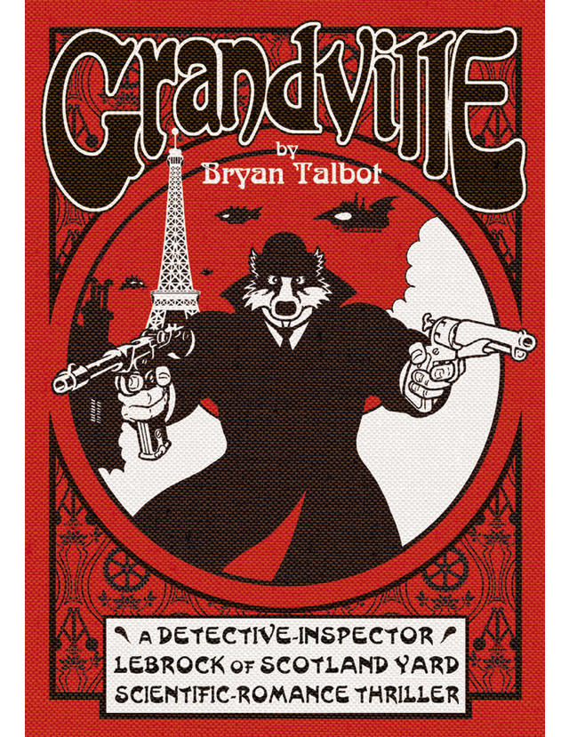
Of late our choice of books had been steering very much away from Big Two books and I wanted to see if we had missed anything, without stepping too deeply into the ongoing plots of shared universe comics. Back in 2016 DC Comics started an initiative called Hanna-Barbera Beyond, where they took characters like Scooby Do, The Flintstones, Wacky Races and Johnny Quest and reimagined them as modern, edgy characters. It sounded like a huge disaster waiting to happen, and yet three years later word was there had been some true gems.

Two hits, two misses?

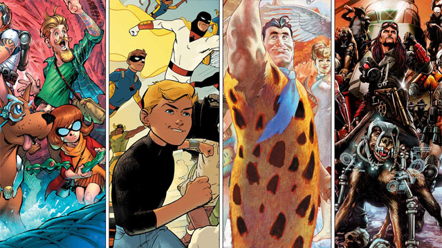
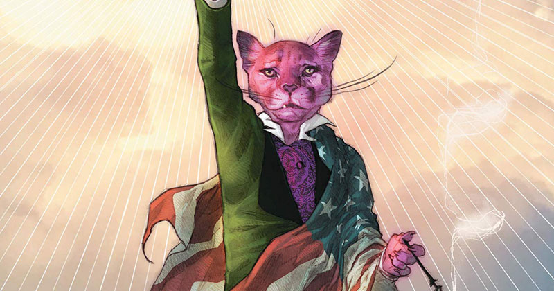
I plumbed for one of the shorter series: Snagglepuss. He was a character I remembered as an ensemble show second stringer, possibly on Yogi’s Treasure Hunt but Hanna-Barbera made so many cartoons it’s impossible for me to be sure. But I certainly recalled Mr Puss’ catch phrase Heavens to Murgatroyd! and the way he finished sentences with …even!

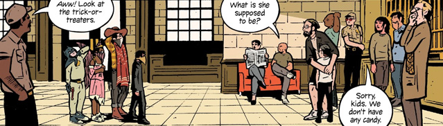
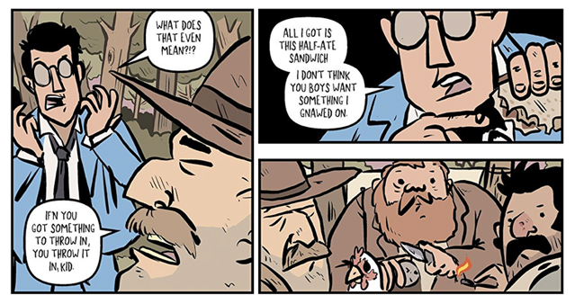
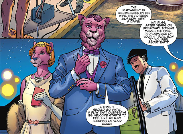
I really didn’t know what to expect with this book and it’s certainly not a comic for children. Russell has taken the point at which Snagglepuss started appearing on TV in 1959 and worked backwards in the real history of the United States, focussing on the political paranoia and the prejudices towards gay culture. Jake found the McCarthyism plot and the way Puss had been turned into Tennessee Williams a little heavy handed but is more familiar with that period than I and liked the references. He was able to get it all without the full glossary found at the back of the collection. For me that was a nice touch!

Snagglepuss attends the final performance

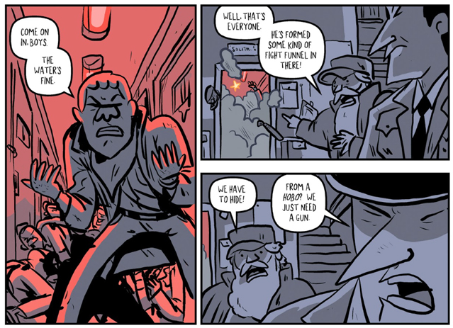
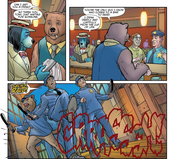
Dan also rather enjoyed the story. He was pretty upset by the section on the Stonewall Riots, I realise now we were actually discussing the event almost 30 years to the day. The book positions Puss as an important figure within the LGBT community of the time but he is not present when the police raid begins. Sadly other characters in the story are not so lucky. The book’s plot really comes together afterwards and comes to a satisfying conclusion, which is to be expected when that is the point Russell began!

Huckleberry Hound at the Stonewall Raid

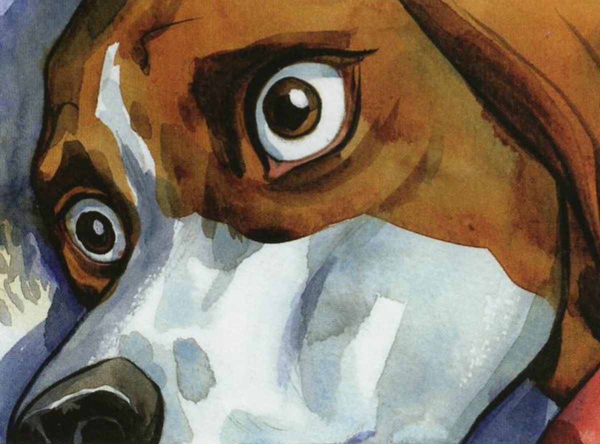
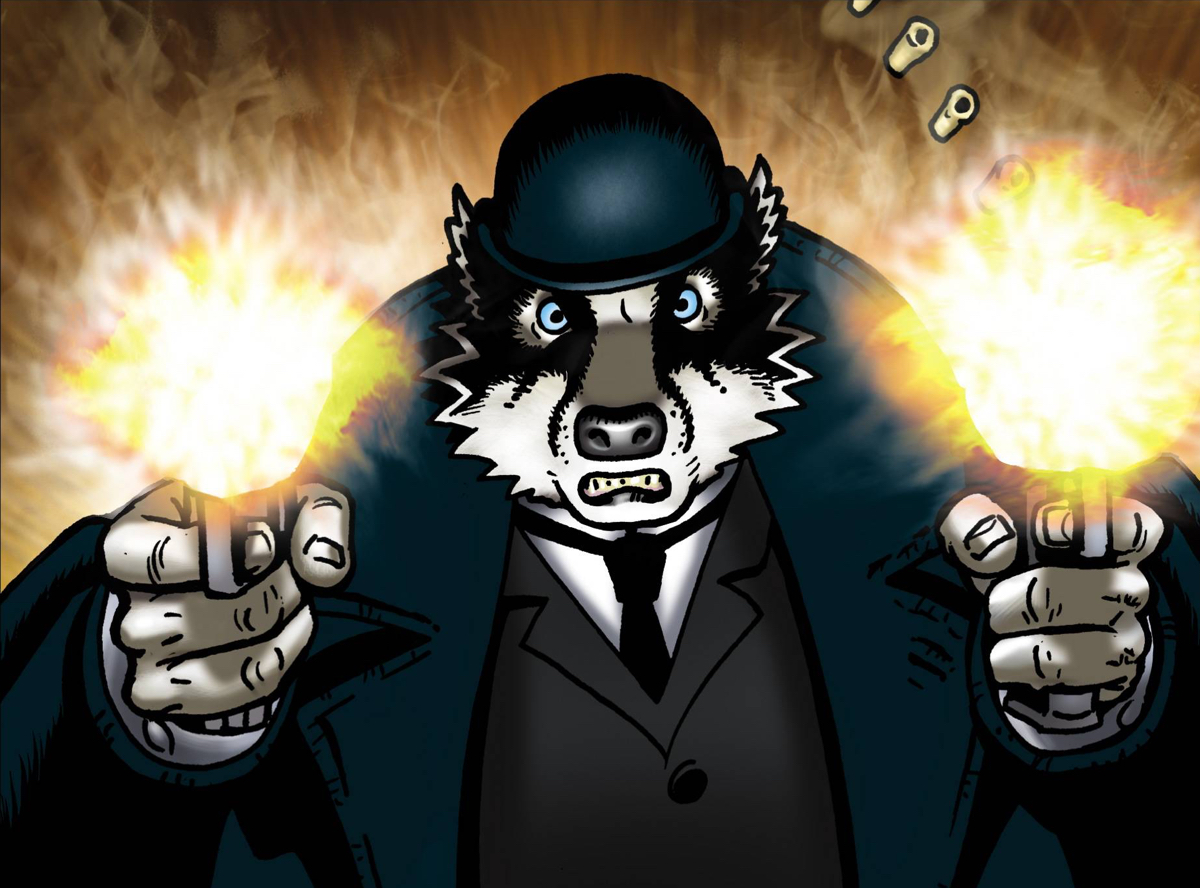
None of us were too enamoured with the art. Dan called it vanilla, like a whole series drawn by a fill in artist and Jake took particular dislike to the depiction of Marilyn Monroe. At least Feehan can draw horses well! But the series covers and even the short story that begins the book are much more to my liking. The proportioning up of standard cartoon aesthetics, particularly in the groinal region, do not help matters either.

Overall, this is a successful book and one that will resonate more with American readers or those with an interest in US culture of the 1950s. Mark Russell also wrote the Hanna-Barbera Beyond Flintstones series, which Jake had read. He thought that book did a more elegant job of grafting social tension to the original cartoon. It also has Steve Pugh on art, which is a win for me.

-Tom ⭐⭐⭐

Here we see how subversion in art gives society direction, as art must be subversive or it dies on its feet. We need the freaks and the weirdos, else we live in dullness.
-Dan ⭐⭐⭐⭐

The LGBT aspect was handled nicely, which you can’t often say. A well-constructed arc with good character voices.
-Jake ⭐⭐⭐⭐

Beasts of Burden - Animal Rites

Another talking animal book Dan? Yup. Get over it.

Once again, we’re back on the realms of me trying to find new CBC picks from random internet lists of ‘The 17 best comic books you’ve never heard of’. Beasts of Burden came up a few times and the premise sounded intriguing. I was never going to turn down the opportunity to read a mashup of Lassie and the X-Files.

One (very positive) review also mentioned that they believed Beasts of Burden vol 1 contained the single most affecting panel in comic book history. That’s quite a claim. I want to see this panel. I mean, I think I want to see this panel. Maybe I don’t.

We’ll come back to it a bit later. Skip to the end if you just want to know about that.

WAIT!I've written a whole review!

Still here? Good. Lets talk Beasts of Burden!

It’s written by Evan Dorkin and illustrated by Jill Thompson. I’d heard of Dorkin’s Milk & cheese but never read it as it looked too… cartoony for my particular tastes. Tom had the same vague recollection as I about M&C ads in the back of 90s Dark Horse books. Jake had never heard of the guy or anything to do with a talking milk carton and a block of sentient Gouda. That’s probably for the best.

Jill Thompson is most well-known for her work on Neil Gaiman’s epic Sandman series. Jake wasn’t a fan of Thompson’s line-led Sandman stuff and cam in with fairly low expectations. Tom and I knew the name but couldn’t really conjure up any real opinion one way or another.

So it was a genuine pleasure to discover that Thompson’s art in BoB is really rather lovely. Her dreamily watercolour panels capture the essential daftness of the books premise while still maintaining a sense of unexpected gravitas. The animals - dogs, cats and others - are beautifully portrayed, treading a fine line between photo realism and subtle cartooning.

Jill Thompson's animal art is rather beautiful

The few human’s that appear in the book don’t fare quite so well under Thompson’s brush - they often feel rushed and just a bit… wonky. However the focus of this book are the animals and it’s there that Thompson’s art shines.

Hits the sweet spot between hyper-real and cartoony

Tom

Dorkin’s stories that underpin the visual spectacle has its moments too. Both Jake and Tom felt that it dragged a little at the start. Jake complained of an overly wordy first few pages giving him ‘the fear’ for the rest of the volume. However, once issue one’s mcguffin is revealed things quickly pick up and the volume rattles along nicely.

Or should that be ‘nastily’? For a book that feels like it should/would sit squarely on the YA shelves Beasts of Burden goes to some pretty dark places. Of particular note are a pack of zombified dogs, rendered in disgusting detail. For Tom, these undead canines played on his childhood fear of dogs and made this chapter a bit tricky to get through.

Lovingly rendered zombie canines!

Jake referred to the structure as following a ‘storybook’ approach - short, sharp chunks of story with bite. The formulaic approach of intro, setup, investigation, twist and denouement felt right given the intended audience and established themes. The shocks and twists were genuine and (mostly) earned which made all three of us old dogs happy.

Still, just like the A-team, nothing stays dead in the world of BoB. Our various protagonists frequently appear to have been sent to the great kennel in the sky only for it to be later revealed they somehow survived. Nothing is permanent in Beasts of Burden. Nothing really sticks.

Or maybe it does. I think it’s about time I talk about that panel.

I stared at this beautiful, horrifying image for a good 5 minutes. It genuinely stopped me in my tracks. Dead. I love it and hate it at the same time.

It was, is, a genuinely astonishing piece of art that gives me pause every time I think about it. The first time I saw it I had to gather my thoughts of the floor before I could move on through the book. That’s quite an achievement in a pulpy funny-book about talking animal detectives.

I don’t believe either Tom or Jake had quite as strong a reaction to it as I but they were both struck by the power and elegance of Thompson’s execution.

A hidden gem
- Tom ⭐⭐⭐⭐

I far prefer animals to humans so this works for me
- Dan ⭐⭐⭐⭐

Joyful, surprising and really quite funny
- Jake ⭐⭐⭐⭐

4 Kids Walk Into A Bank

It had much promise: a set of well-designed covers, an excellent score on goodreads and a collection of respected writer’s quotes. Sadly, while BKV said “Exploding with ambition and love of the medium”, Rosenberg and Boss’ ambition sadly failed in the execution.

Nice covers, chaps!

Having grown up in the 80s, all three of us have a background in the culture being referenced in this book. We like D&D, we like video games, we like OTT action movies. But right now there’s a proliferation of this stuff in the media; superhero movies are being set in the past for the retro-factor, tv shows are aping the horror tropes of the video nasty and certain writers who have already been mentioned are also drawing on the era and doing it much better. That’s the key sadly: we thought this was a bad comic.

Jake specifically called out the writing of the lead character Paige, a “12 year old girl” who speaks and acts in no way like one. Our group are all fathers to daughters and felt we all knew how a girl would act! By the end of the book she wasn’t even drawn as a girl, and Dan complained that the skin tones used were salmon pink.

Oppressive panel layout

The other 3 kids are rounded out in a typical stereotype fashion although Jake said they had doubled up on geeks. We found the antagonists weird plus the joke of the very little mentioned foreign exchange student just came across as racist.

As I said the creators were clearly were trying to do something clever and each issue is structured with a fantasy sequence at the beginning. But it comes across as very trying. Dan was bothered by the use of facsimiles to real things: “Flight Attendant Roxy” and “Man Him”. He pointed out that in Quentin clear-influence Tarentino’s Reservoir Dogs the side conversation is actually about Madonna.

Spot the toys

Even the book itself makes a joke of the fact its half way done before we see “The fucking bank. Finally!” but we were all well over it already by that point. The action ramps up in the final issue and caught us off guard but we felt it was an ill-advised ending, and the final pages were once again badly executed.

The bank!

I don’t recommend this book at all. Tyler Boss tries his hand at aping Chris Ware’s layouts in places and mostly has an art style reminiscent of Batman: Year One era David Mazzucchelli, but he’s got a long way to go yet. And that’s also a point worth making: this is actually what began as a college project. From what I have heard publishers Black Mask Studios seem less interested in providing editorial guidance and more in simply giving a platform for new creator-owned products. In this case we thought a bit of a helping hand might have gone a long way to moulding the book into a more satisfying finished piece.

Despite our opinions, Rosenberg has gone on to write for Marvel and Tyler Boss has work at both Image and Archie. It’s quite likely they both look back at this book as “something they once did”. For me, it’s “something I once read”.

-Tom ⭐⭐

Tries to walk the line between homage, pastiche and satire but fails to recognise when it’s turned into a circle and tipped over. The coda was bollocks. Have these creators spoken to anyone real recently?
-Dan ⭐⭐

If this book had a really good editor it might have worked. Kids robbing a bank would have worked but this doesn’t. It’s a missed opportunity.
-Jake ⭐⭐

Grandville

It was always going to be about Bryan Talbot’s art.

From Luther Arkwright through Nemesis and Alice in Sunderland, we’ve all been fans of his chunky, muscular and detailed lines. There’s an inherent sense of sweeping grandeur to everything Talbot draws - no matter how intimate a story or how weird the subject.

Nemesis the warlock - 2000AD cover

I can’t help but think of Talbot as an artist first and foremost. To this end it regualrly slips my mind that he cut his comics ‘teeth’ writing and drawing the dense, complex Luther Arkwright saga in the 80s. I loved Arkwright’s underground, punky ‘zine’ feel - the thin, black & white issues felt dangerous and illicit, lacking the production polish of mainstream books. Talbot’s art in Luther Arkwright was simply exquisite.

The artwork in Luther Arkwright is just exquisite

Do stop and look at that panel a little longer before moving on. It’s wonderful.

But what about Grandville?

For me, it’s something of an oddity. I don’t gravitate towards anthropomorphised animal stories - they’re often twee, sentimental and irritating. Only WE3 by Grant Morrison and Frank Quitely ever hit the spot for me. That was probably down to the general nihilism of the story itself.

I might have cried at the end of WE3. But don’t tell anyone that.

I can’t say that Grandville made me shed a tear. I’m not sure it made me feel anything to be absolutely honest. Which is a bit sad really.

Grandville hardback cover complete with textured moiré effect

Grandville is a far more pulpy and populist take on weaponised fauna than WE3. Somehow it manages to be both adult in theme and vaguely childish at the same time. I’m not quite sure how to take it.

Talbot’s approach to anthropomorphism is basically to wedge a proportional animals head on a human torso, chucking in the odd tail or appendage where necessary.

The resulting chimeras are gently disturbing, awkward and, in some cases, uncomfortably sexualised. The lead character - a (man)badger (badger(man)?) called LeBrock <groan> - is all glistening torso and coiled muscle hidden under a Victorian great coat.

It’s like Beatrix Potter on steroids and seemingly aimed at those who found Mrs Tiggywinkle ‘strangely attractive’.

Mexican stand-off

A little bit of idle research on the interwebs reveal that Talbot drew artistic inspiration and, indeed the series name, from the 18th century French caricaturist Jean Ignacio Isidore Gerard. Gerard was most commonly known by the pseudonym J.J. Grandville. Grandville (the artist) created exquisite caricatures depicting the same chimeric creations as Talbot’s almost 150 years later. Grandville the comic book is a very obvious homage to Grandville the artist.

Caricature by J.J Grandville

There’s poo everywhere but no pets. Who’s pooing in the street?

Tom

And how I wish Talbot had stuck firmly to his Grandville-aping and retained the detailed line art. The launch of the first volume of Grandville in 2009 sees Talbot smack in the middle of his digitally-enhanced art phase. We were all a bit sad that his typically gorgeous line work had been smothered with digital colour and splashy PhotoShop effects. There’s a gaudiness to it all that feels slick and inelegant. Worst of all, it feels cheap. But not in a good way.

Tom felt that things improved at the point a colour ‘flatter’ was brought in (about half way through the run). Jake, being a diehard Talbot fan, could see the positives and relished the scenes where Talbot’s steampunk sensibilities, honed on Nemesis and Arkwright, ran free.

Less Tarantino more Guy Ritchie

Jake

The story itself is thin and full of ham-fisted cultural references that fall completely flat more often than not.

Jake was particularly uncomfortable with the obvious attempt to link 9/11 with a similar terrorist atrocity in the book by using the phrase ‘ground zero’. It’s a heavy-handed trick and almost totally unsuccessful. We all would’ve preferred the story to stick closer to it’s pulpy roots and just tell us a damn good tale.

Tom made it past the problems with the story and could enjoy the book for what it was. It did remind him of other ‘FuzzPulp’ books on the market such as Blacksad, which, with heavy heart, he stated was ‘probably better than this’.

Tom’s Blacksad reference is an interesting one as we all agreed the book feels like a European comic - something from a specialist Italian or French publisher. The casual violence, overt sexuality and weird pacing, especially the denouement that wraps up a huge global conspiracy in 2 pages of tightly-packed WTF, all contribute towards the sense that the book’s English translation was sorely lacking.

Everyone in this book hates the English. I can totally understand that.

Dan

So, long story short, it’s a disappointing but enjoyable romp. Tom and I won’t be buying any more of the (rather pricey) hardbacks in the series but Jake might give the rest a go.

And yeah, it’s another one of my choices with a red and black cover. I guess I have ‘a type’ after all ;-)

Credo!

Glad I’ve read it. Won’t read any more.
- Tom ⭐⭐⭐

Did he just cut off a chimpanzee priest’s ear with a flick knife? Yes, yes he did.
- Dan ⭐⭐⭐

It tries to be like Alan Moore and fails
- Jake ⭐⭐⭐

Rock Candy Mountain

Happy New Year from The Comic Book Club! My last choice of 2018 was Kyle Starks’ eight issue miniseries Rock Candy Mountain from Image Comics. I knew nothing about the series going in; I liked the title as it made me hum the tune featured in O Brother, Where Art Thou? whenever I read it. Pretty quickly I realised Starks was also the creator of Sexcastle, a book The Club had read on the side at my suggestion before. Sexcastle was very much a one man creation whereas Rock Candy Mountain has the addition of colours by Chris Schweizer.

gun-chucks!

Rock Candy Mountain is about hobos, hobo life and one hobo’s quest to find the titular mountain. See, he knows the way. It is very much a comedy book with some fantastic laugh out loud moments, crazy characters and artwork that falls squarely in the ‘cartoony’ category. Starks packs a huge amount of content into his issues and the action keeps on chugging along throughout, picking up pace in the second collected volume as we learn more about the protagonist Jackson and why he is on his quest.

Everyone knows Jackson

Dan was apprehensive about the book and found the art off-putting. Cartoony really isn’t his thing and he took a particular dislike to Jackson’s nose which annoyed him intensely. He read volume one without paying much attention but luckily came out thinking he’d enjoyed it! He thought the brown colour scheme was very much the colour-way of the Deep South, matching that found in Jasons Aaron & Latour’s Southern Bastards. When your overall theme is Sweaty Brown it’s easy to make things pop with other colours such as token non-hobo Pomona Slim’s blue suit and the burning reds of The Devil. Yes, The Actual Devil features in this comic.

The Actual Devil

Jake said the book was a quick read too and had time to return to the first volume after having completed the second. He found Starks’ portrayal of ultra-violence didn’t mesh with the style of the art and also had an issue with Jackson’s nose. He thought the set pieces in book two worked better but overall wasn’t too interested in the quest aspects of the story. He would have liked to have seen more of Pomona Slim and for his arc to have been rounded out better.

Mulligan Stew

For me the cartoony art is bang on the money and I see a touch of Pixar artist Scott Morse’s style in Stark’s drawings. The storytelling is clear and the comedy right-on. The only aspect I didn’t like falls into spoiler territory so quit reading now if you’re looking to read yourself: la de dum de dee filling a line with junk just to make sure you don’t accidentally read the next section de dum de doo. The flashback section which opens the second book was a great way of filling the character’s backstory but I feel using Hitler and the Spear Of Destiny is rather old hat and has been seen lots of times before. Here it’s a mcguffin and the Deus ex Machina which gives Jackson a way to defeat his foe. Maybe that’s just Starks’ writing style - play off the recognisable in a humorous way. It certainly worked in Sexcastle, which was the most nineties action movie ever.

Fist-fights aplenty

“A great romp. Funny, bloody & satisfying.”
-Tom ⭐⭐⭐⭐

“Enjoyable! The brownest book since Rust (other colours are included).”
-Dan ⭐⭐⭐

“I Loved the trains; I’m happy I got to read this.”
-Jake ⭐⭐⭐⭐