The Complete Don Quixote

Gan?
Here!
Dineen?
Here!
Hayes?
Here!

Good! Right, if you will open your set text to page one we will begin our look at the 400 year old novel “El ingenioso hidalgo don Quixote de la Mancha”, I hope everyone can read Spanish…

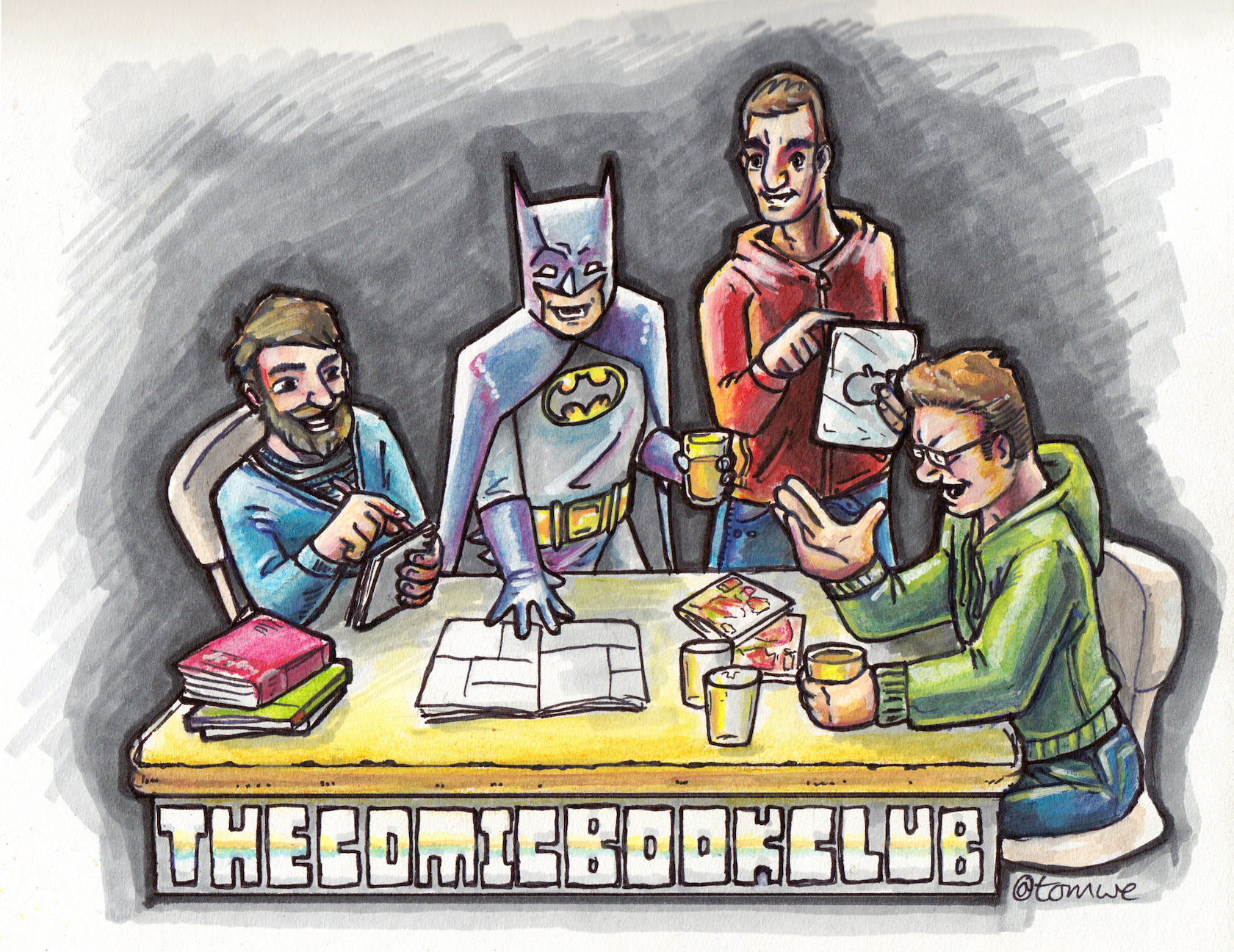
Sadly that is how some of us felt approaching my next pick, “The Complete Don Quixote”, as adapted by Rob Davis. I had been looking for more indie books for the club and came across Davis’ OGN The Motherless Oven. However, after adding that book to my list of possibles I found he had also adapted the classic novel by Miguel de Cervantes and so went for that. When I announced Quixote to the group Dan made a face and Jake had the sensation of being assigned homework.

I knew little about Don Quixote, my previous experience limited to stories of Terry Gilliam’s attempts to make his own adaptation, The Man Who Killed Don Quixote. In fact I had the image of the Don himself in my head but nothing else. Davis writes on his website he heard from many who had attempted to read the original work and failed, and so he wanted to be able to offer a version that could be completed (a sly jab at Gilliam for not completing his).

Davis' Quixote vs Picasso's

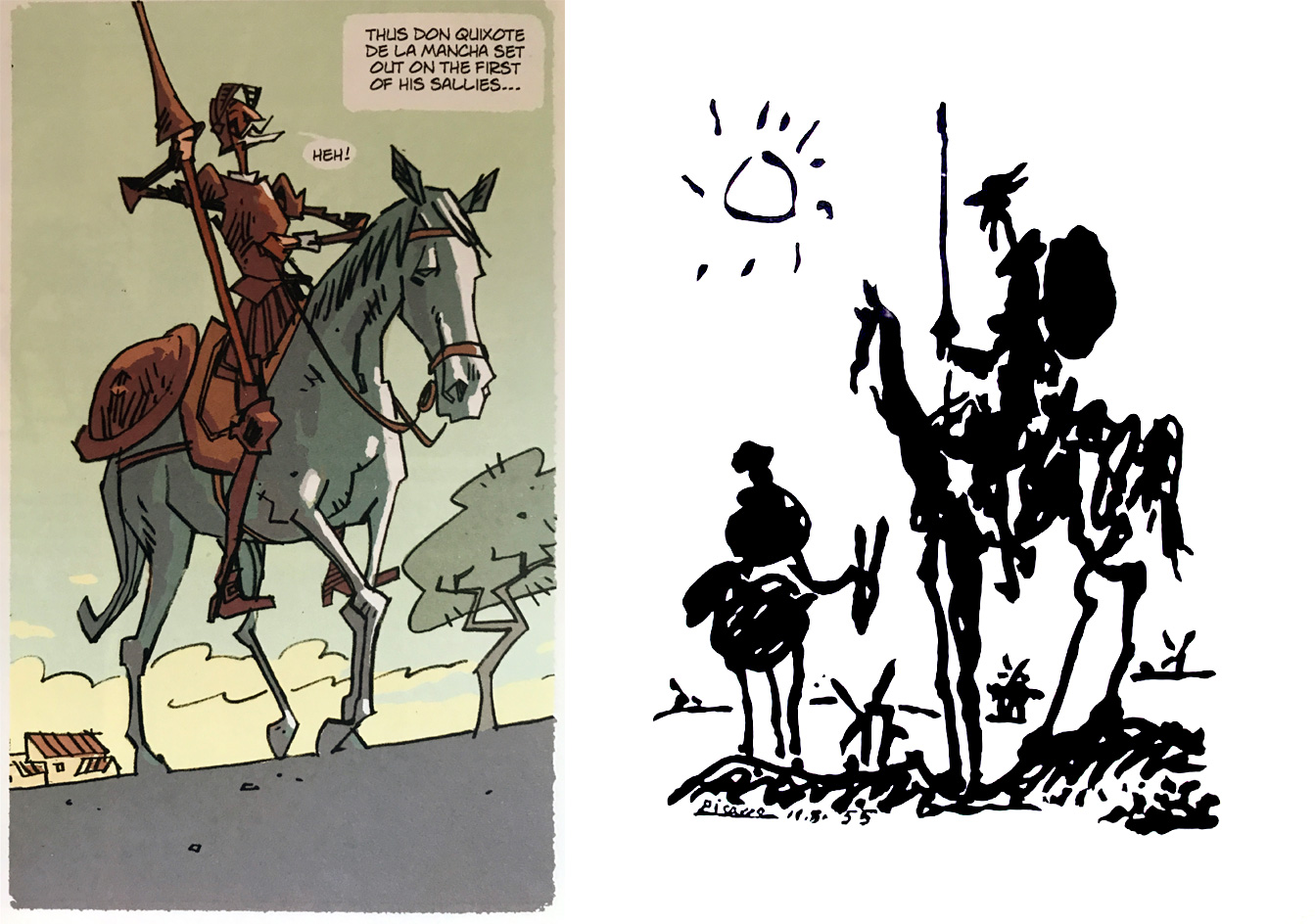
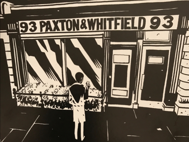
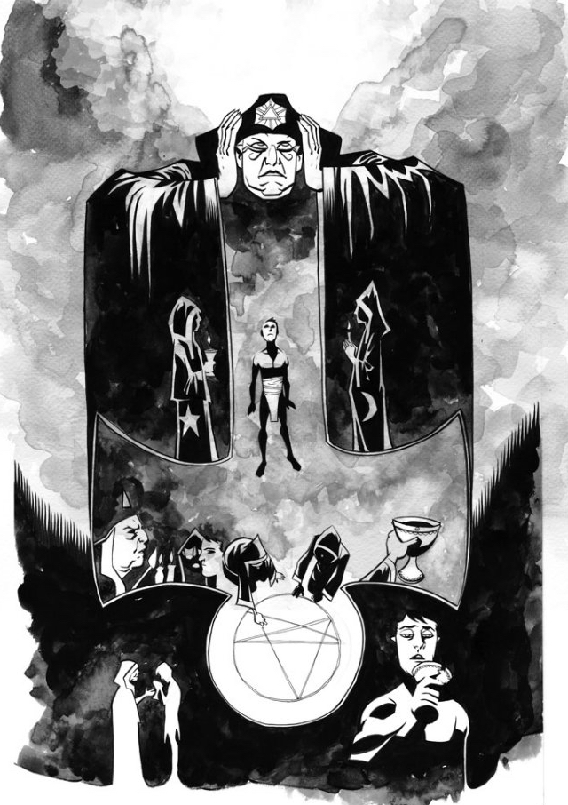
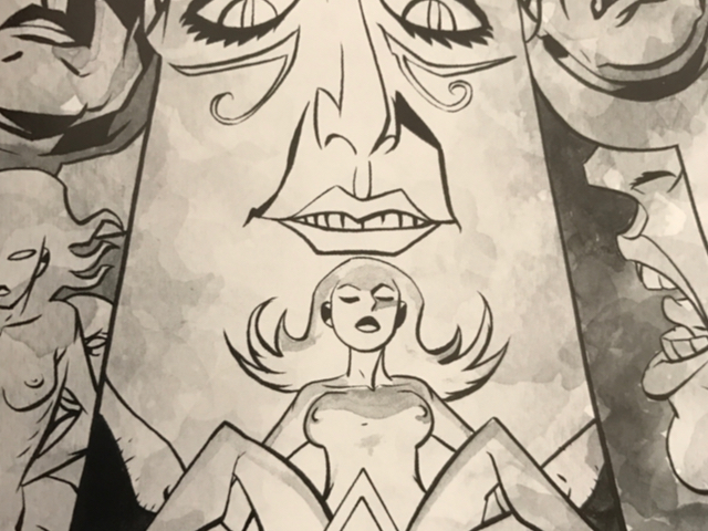
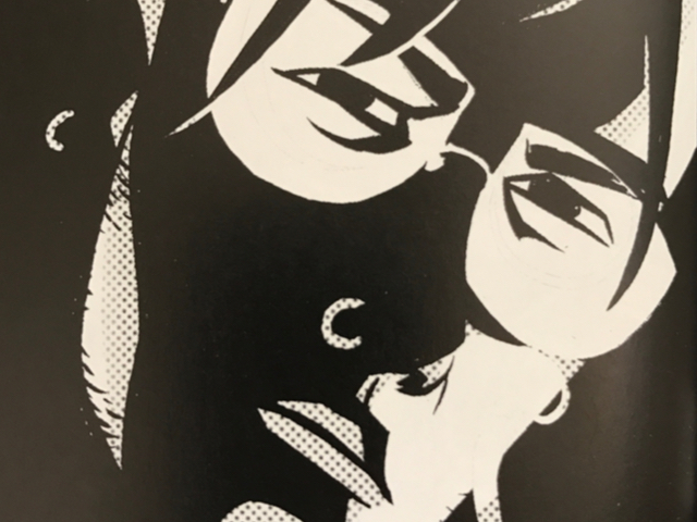
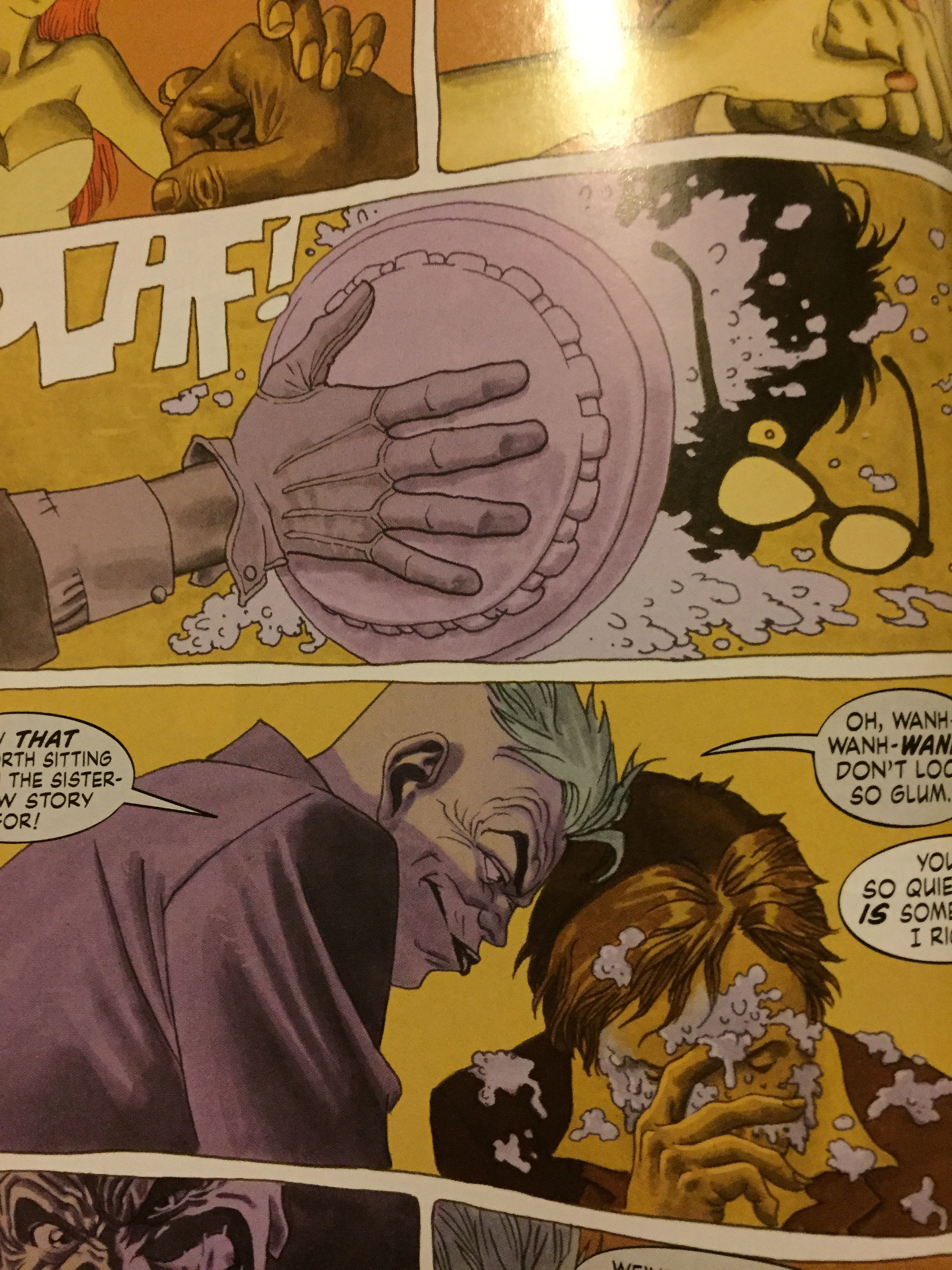
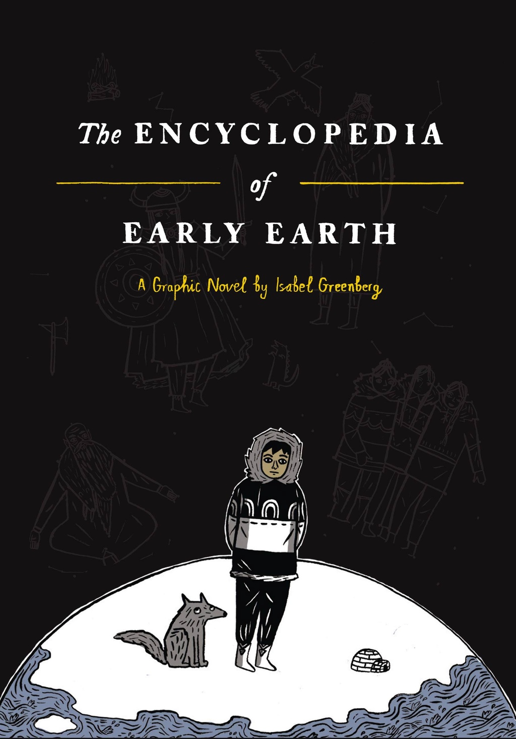
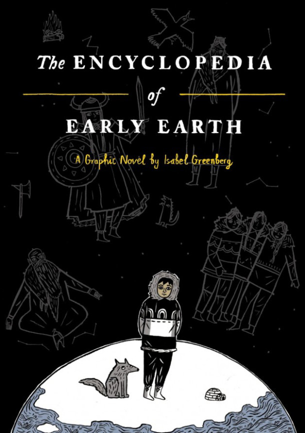
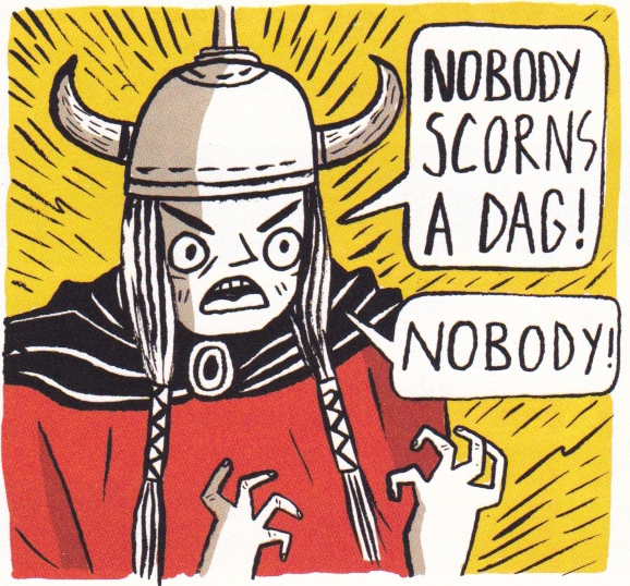
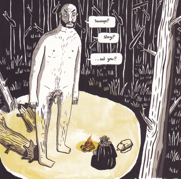
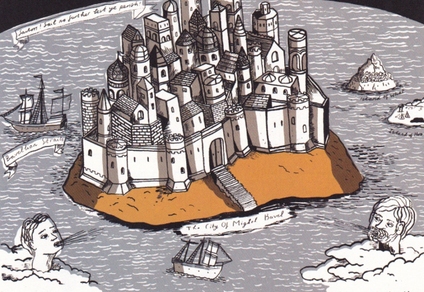
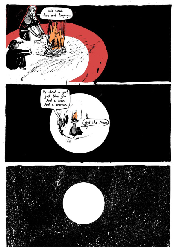
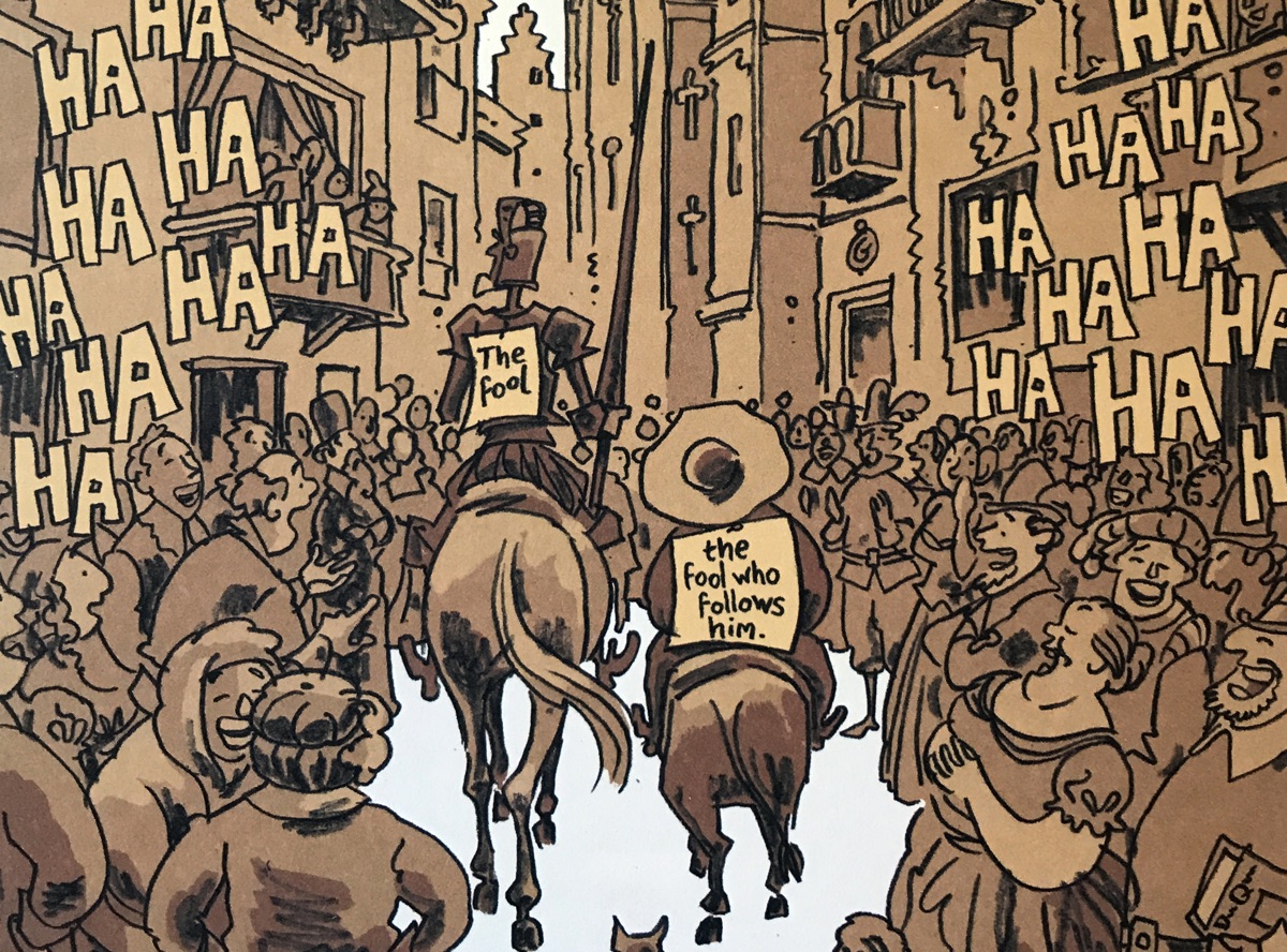
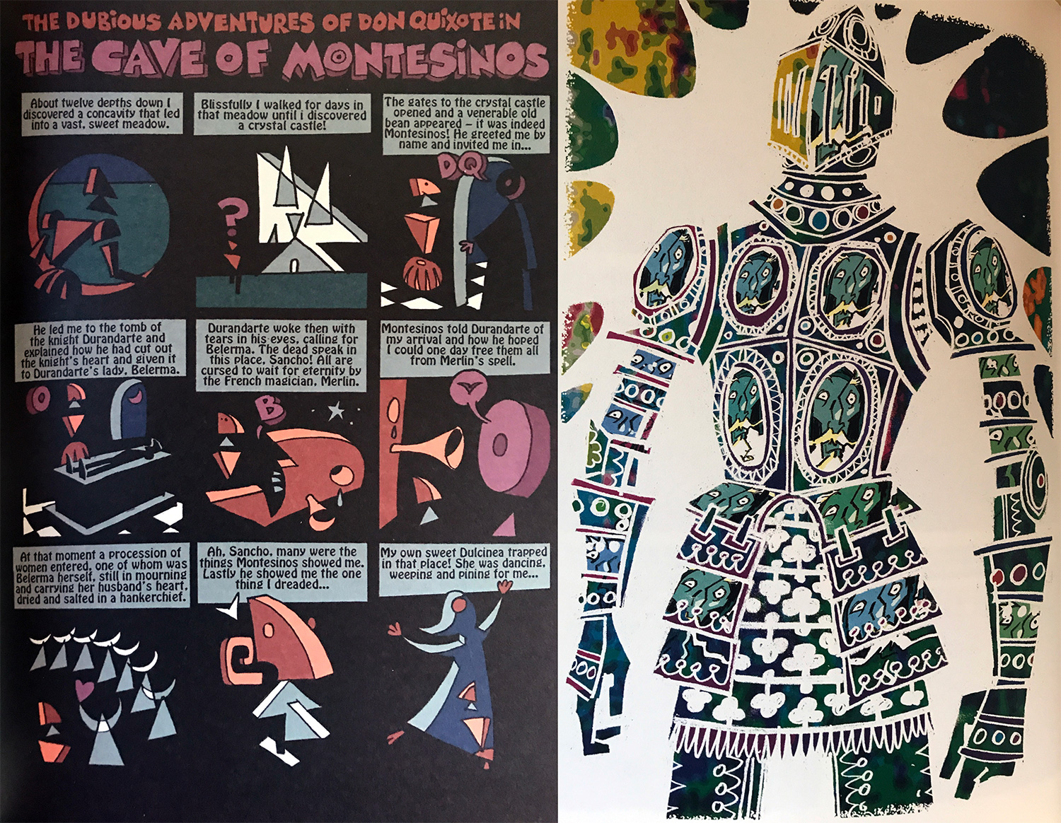
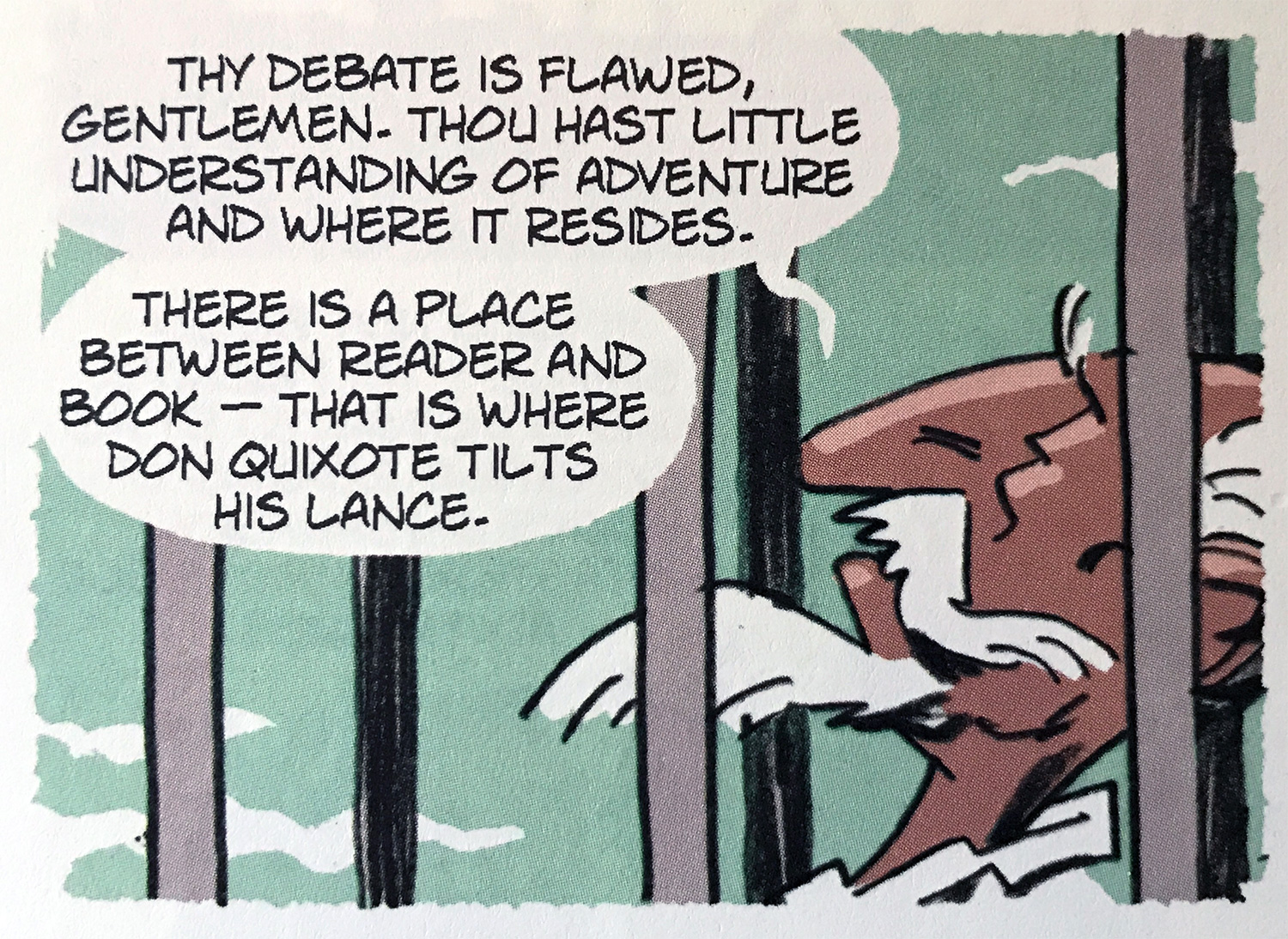
What we bought was a hefty hardback tome, a beautiful book I’m pleased to have on my shelf. It has the smell of a good book, not unlike The Encyclopaedia Of Early Earth that we reviewed quite recently, and when you flick through you’re immediately struck by the consistent quality of the art. Davis takes a few creative detours when the story does, but for the most part the illustration is the same with flat muted colours and loose line work. There are no lined borders, or outlines for the speech balloons and everything has a torn edge. His cartooning is exemplary and every drawing is full of character and feeling. We all agreed on that at least! I wondered if the lead pair began the illustrative tradition of one character fat and one thin, and also if Davis had taken his interpretation from the famous Picasso sketch.

Inventive use of panels and page turns

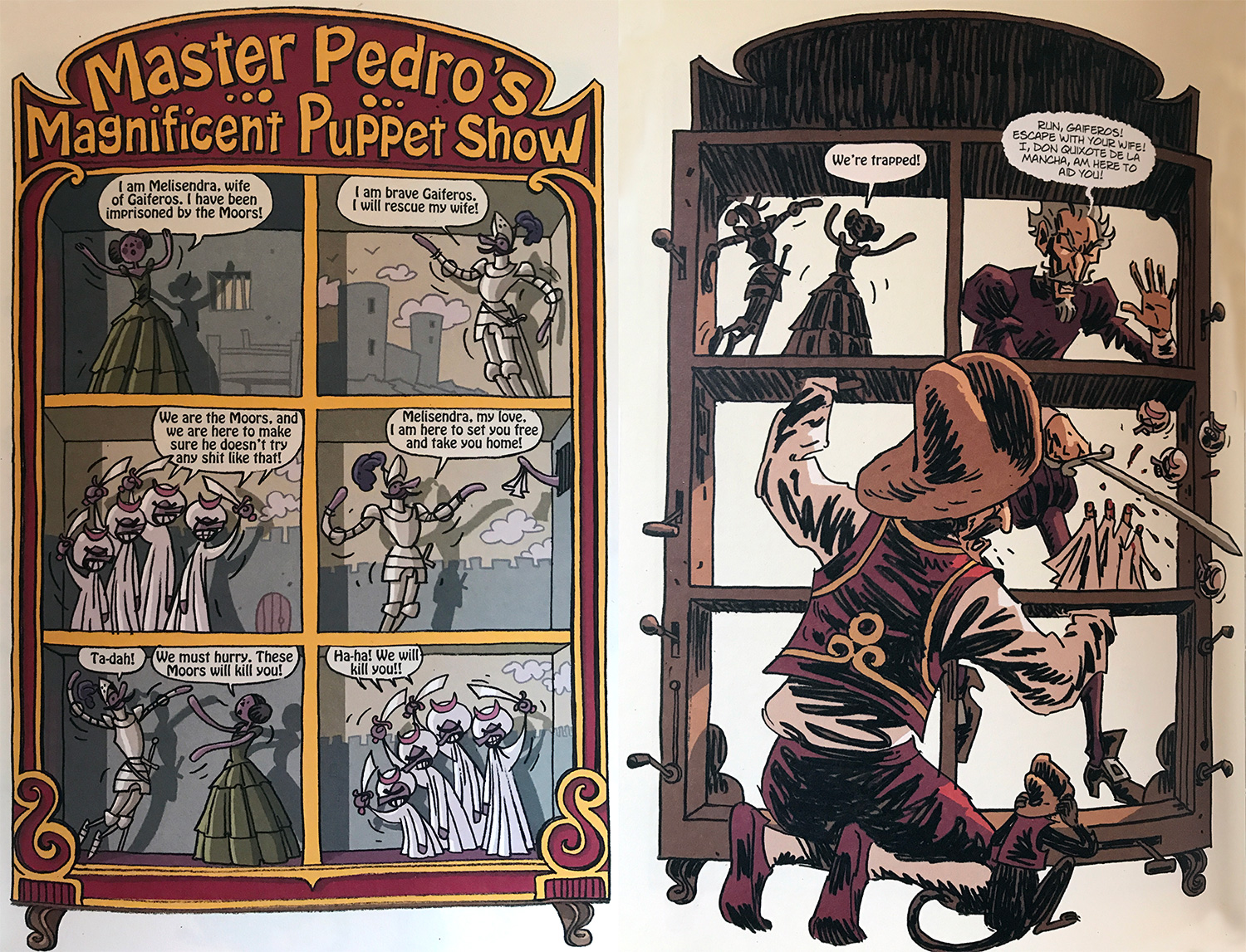
From the opening of the book with the narrator I was immediately laughing. This is a funny book! Dan said he LOL’d within the first few pages and so lifted his trepidation of reading the classic story. The handling of this one-volume edition’s transition from the first half to the second is brilliant too. In fact the book is full of inventiveness, taking asides in the story as their own mini-comic-within-a-comic and also breaking the fourth wall on numerous occasions. Jake said it was a freewheeling Gulliver’s Travels while Dan said he saw feminist thinking in the Girl In The Hills chapters and wondered how this could be reflected in a 400-year-old novel, but then men have always been a nightmare!

Surrealism and the Knight Of Mirrors

We were split overall as to the better halves of the book. If I have any criticism it is for the second half, which for me drags a little once the Duke and Duchess get their claws into our heroes. However, Jake and Kelvin preferred the narrative trickery found there to the repetitiveness of part one. Kelvin noted that the Don was having his “end of life crisis” and said with Quixote and Sancho reunited at their end it was a powerful moment, making up for his difficulty suffering the foolishness of their first adventures. Dan was upset by the way the Duke and Duchess mocked Quixote, and cross to find no comeuppance for the meddling pair.

Where Don Quixote tilts his lance

This book is certainly a contrast some of our more recent choices, and definitely a novel rather than a short read. Jake described it as inventive, with superb colours that reminded him of Lucky Luke, but as it fizzled out a bit and had the whiff of a Guardian reader’s book club gave it ⭐⭐⭐. Kelvin enjoyed it eventually, but only for less than half of it and so matched the ⭐⭐⭐. Dan was surprised that he liked it, as it was not naturally what he would choose to read and gave it ⭐⭐⭐⭐. However, I truly loved reading it and give it ⭐⭐⭐⭐! In fact I loved it so much I went on a bit of a Rob Davis binge afterwards.

More works by Rob Davis

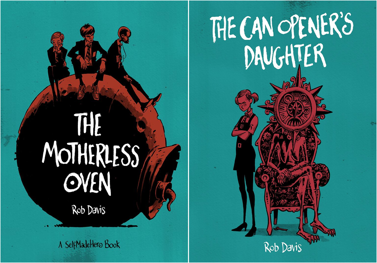
I picked up not only The Motherless Oven, but its sequel The Can-Opener’s Daughter and the 2012 British Comic Awards Book Of The Year: Nel-Son, which was edited by Davis with Woodrow Phoenix and featured a veritable whose who of the British Indie comics scene. …Oven and …Daughter are an expansion of Davis’ short strip “How I Built My Father”, which was an off the wall concept but I found it incredible how Davis took that and expanded it into the parallel reality in these two books. I spent most of the first waiting for an explanation of the ‘rules’ of the world, but most of that does not come until later, if at all. I assume there will be a third part at some point.

Rob Davis is now on my list of ‘must buy new works’ creators.

Aleister and Adolf

When I first heard about Aleister & Adolf via Mike Avon Oeming’s Twitter I envisaged a slam-bang battle royale between two 20th century icons of evil.

I thought we were going to get a pulpy smackdown with Hitler getting his ass kicked by the great beast. Unfortunately, what we got was something very, very different indeed…

The book

The book itself is nicely put together, in the A5 hardback format that Dark Horse seem very fond of. It’s also my second CBC selection in a row that employs an exclusively black, white & red colour scheme (Mister X - August 2016). It wasn’t a conscious decision so let’s chalk that up to Crowley’s will manifesting itself across time and dimensions to influence my comic book club recommendations.

GET OUT OF MY HEAD CROWLEY, YOU MANKY OLD GOAT!

I do like a bit of red and black don’t I?

Dan

The big problem is that Aleister & Adolf just isn’t very good. And Hitler’s barely in it!

The art

Oeming’s art is always pretty distinctive, his signature style giving a loose, cartoony dynamism to everything he draws. Where his style was a tight fit for the exaggerated superhero antics in Powers it can feel jarring in a book that combines terrible real-life events with magical fantasy.

Put simply, Kelv wasn’t a fan of the art. Oeming’s leaning towards to gratuitous T&A didn’t sit right with him and made it difficult for him to get in to the book.

Tom’s an Oeming fan, having first seen his work on DC’s short-lived Judge Dredd run. He found the period visuals interesting and had no problem with Oeming’s propensity for drawing bare flesh!

The visuals are interesting. Nice to see a bit of flesh!

Tom

Jake was more drawn to some very detailed backgrounds, especially the Paxton & Whitfield shopfront (“I like shopfronts”) behind which Crowley plots his magical propaganda attack on the 3rd Reich.

The Paxton and Whitfield shopfront in wartime London

I was in two minds about the art, finding some of the line work loose and a bit rushed. I far preferred the complex panels rendered in grayscale watercolours. However, in general it all feels a bit lightweight and gratuitous.

Crowley summons the great beast

It’s all a bit… bollocks.

Kelvin

Symbolism

Whereas we all thought the story would be about Aleister Crowley and Adolf Hitler going head-to-head on the occult magick battlefield it all turned out to be far more (un)subtle than that.

The book is essentially an illustrated essay on the use of symbolism and iconography as propaganda and the idea that symbols can be infused with a power greater than their visual meaning. There’s an ‘interesting’ modern interpretation of the two-finger ‘V’ salute that ties it in with the source of Crowley’s powers but this ends up being nothing more than a throw away line.

Alone

Although all this sounds fun, the story is delivered with a dryness that Jake compared to an illustrated text book. It was all so serious. In fact, for a book with so much potential to go completely insane, I’m sad to say it was really rather dull!

An academic treatment in comic book form.

Jake

The biggest problem

There’s a lack of respect for certain historical events in this book that really bothers me. Aleister & Adolf takes these events from the 2nd World War and uses them for minor narrative purposes, resulting in some very unpleasant imagery rendered in Oeming’s cartoony style.

I genuinely cannot think of an instance where using the holocaust as a narrative device is a good call. I’m just not sure that the horrors of Belsen have a place in any comic, especially not one that twists these real life events to propel a limp fiction along.

The story is not without any merit though. Douglas Rushkoff has concocted an else worlds-style story that unfortunately hangs on a not very successful twist, telegraphed early on in the book. Kelv had blown the twist by skimming through the book to the end when he got tired of the boobs.

90s web designer

Jake was interested in the framing device - a 90s web designer who’s story bookends the main tale. he found some small sense of connection in that he had friends in the 90s who were into Crowley. There was a certain sense of nostalgia in the deification of a rather pervy old man.

The end

We all agreed that the end was abrupt and a bit rubbish - Just like the one to this write-up. You can blame that on Crowley too. He made me do it.

The scores

Tom - ⭐⭐

Jake - ⭐⭐

Kelv - ⭐

Dan - ⭐

Dark Night: A True Batman Story

With this rather odd book Paul Dini, the father of Harley Quinn, exorcises his demons from a brutal mugging that occurred nearly 30 years ago and changed his life. Being best known for his work on Batman, the co-creator of Batman The Animated Series contrasts the idealism and heroism of Batman with the stark reality of our world.

Trigger warning in this post!: violent mugging, low self esteem, self-loathing, post traumatic stress disorder, alcohol abuse

BTAS for me is the greatest incarnation of Batman. I first fell in love as a child with Adam West’s fabulous Batman of 1966, but BTAS rekindled a spark. I had known a fair bit of Dini’s involvement in the character, having read and heard several interviews with him. It was in one such interview with Kevin Smith on Fatman on Batman where Dini revealed the past trauma.

Alone

Dini was violently attacked, resulting in parts of his skull being powderised. He was lucky to be alive. The trauma was hard to bear as he worked on Batman. He couldn’t summon the spirit of heroism that Batman embodies, when he was at his lowest ever in his life with no one to save him when he himself was a victim of crime. Kevin Smith encouraged Dini to turn this experience into a story. Dini, perhaps as some form of catharsis, eventually took up this challenge.

Raw

Dini is very open with his emotions. I have heard him crying, voice quivering, several times during the course of his interviews when he touches upon subjects that are heartfelt. When he first opened up about this incident, it was perhaps the biggest breakdown of them all. And no wonder.

Alone

And this book is difficult reading in many senses. Frankly it isn’t a story, it’s more like going along to some else’s therapy session. There is a very strong sense of self-loathing and self-destruction from the outset. This all fits with a person who is not able to hold back their emotions. I feel this is a quality that could make for a great writer. But again, in this instance it isn’t a tale. More of a psychiatric report and it’s not much fun.

The club members didn’t greatly enjoy it eiter. Let’s start with Dan.

Typography is important to Dan

He had picked out that the cover was designed by Chip Kidd. But what a disappointment. It looked odd, with the 90s font (perhaps because the book is set during the 90s?) but worst of all the use of mixed case (the font trope for “crazy” I reckon). But not hitting the font notes with Dan is not a good start. Dan thought the dust cover was crap for such an expensive book. The cover underneath is much better.

Dan will never read this again. He had no idea what it was. Wibbling his hand side to side “weird” was how he described it. The beating up sequence scared the crap out of Dan. This wasn’t white middle class panic, as Dan isn’t one to judge a pair of hoodies (he wears many). It made him genuinely upset. Sadly I was oblivious that there were parallels to a similar experience in his youth. Sorry Dan 😞.

This scene to Dan seriously communicated clarity and helplessness. That was fascinating but pretty much the most interesting bit of the book. Batman was otherwise shoe-horned in. It didn’t need the characters as the human story was interesting enough. But Dan doesn’t usually like “real life/true crime” as a genre.

As for the art: Dan has never been a fan of Eduardo Risso, not having liked 100 Bullets. Frankly I didn’t either, nor his run with Azarello on Batman when they followed Loeb and Lee’s seminal Hush run. But I liked his work in this. Dan had mixed feelings where some of it was lovely, and some was so crap that he hated it.

Boo hoo

The biggest problem for Dan was that he couldn’t really sympathise with Dini’s plight. After getting beaten up, he should have learned something from it and become better. I sensed that Dan felt that he just gave in to being “damaged”. To be fair, Dan is a very chirpy and greatly optimistic fellow and I admire him hugely for having such a quality. It would need to be a far greater tragedy, I think, for Dan to see the despair.

Alone

The thing that bothered Dan the most was the lascivious depiction of Dini’s therapist. For him it served no purpose and was simple objectification.

Finally the house ads in such a beautiful book jarred. It felt to him like DC didn’t have enough faith in the book.

⭐⭐

It’s an odd book.

Dan

Trinity

Tom was initially pleased to read a “regular comic”, showcasing recognisable characters and starring one of The Big Three. He totally agrees with Dan about the dust cover. Was the book just too odd for Chip Kidd? Tom hadn’t read much of Paul Dini’s work and even had him confused with Bruce Timm(!). But Tom thinks that Eduardo Risso is great. He said that he’s good at leaving things out, like eyes in silhouette. But he described it as “not pretty - quirky” with personality and character. He preferred the solid black, pen and ink pages than the highly rendered, painted stuff. Tom mainly loved the Risso’s work on the book. His favourite panel was Joker’s pie in the face.

Alone

But when it came to the main character, Tom didn’t feel it was a story really worth telling.

He also noted the analogy where Joker is walled away “didn’t really have anything to do with anything”. And the end sequence where Dini proclaims that Batman had told him to pick himself up again. Tom questioned whether he really did.

⭐⭐⭐⭐

I think the art is fantastic. The story give or take really. – Tom

It’s not a masterpiece

Jake opened up by calling it a vanity project. He had initially liked the idea of mixing reality with Batman, but needed more to cling on to for the story than Dini’s personality. He also didn’t have the context of Dini’s stature at WB Animation, not knowing that he was a BTAS co-creator or developed Animaniacs for Spielberg. He just thought he was a hack 😄.

Jake also thought the beating visceral, but it lost power because he wasn’t rooting for Paul. And he found it jarring that the fictional characters were overplayed. The classic comic book problem of piling in the rogues gallery. Just The Joker and Batman would’ve been good. But it ended up feeling overcrowded.

It needed reigning in a bit, but because it was a vanity project (not in a personality sense) it didn’t gel. He pointed out that it needed an arc that concluded with redemption. But this was lacking. He also questioned what the lesson learned was.

He was supposed to be learning from these characters as they’re part of him but really they’re not. They’re just Batman characters.

⭐⭐

It wasn’t even a missed opportunity. It was his opportunity to tell this which wasn’t very good.

Jake

A fair judgement?

I didn’t feel that this was a strong story either. I enjoyed the art like Tom. However I was disappointed and felt I needed to defend Mr Dini for the harsh view all of my club mates had for him. They didn’t like his character as a self-pitying, self-loathing, self-destructive, leering basic human. But in being human, it’s sometimes human nature that a perceived “weaker” entity is viewed with disdain. My view is that Dini suffered mental health problems that he is never going to be rid of, the attack being his lowest ebb. I think his statement to hear Batman’s plea to “stand up” really is as simple as that. Just standing up and not being trapped in the despair he could have spiralled into. He just carries on. For some people that is a hard battle. His message to himself, and to reader, was clear to me. He was trying to not punish himself for what happened.

Alone

I’m not saying that I like Paul Dini. I don’t know him. My opinions on his mental health is gleaned from what I’ve observed. I fear that putting himself as the subject of a comic book story was viewed as a tale for entertainment, rather than a raw autobiography. There are uncomfortable moments in the book, such as the depiction of his psychiatrist and especially when he was trying to flaunt his meagre wealth at the superficial actress to make himself feel good. But perhaps he was being so overly open that this was indeed a deep-seated attraction? (I’m being defensive again 😏).

As a few of us have said this is an odd book. I had high hopes with the association to BTAS but have yet to pick a Batman book that the club collectively enjoyed. I did however love that Dini had his lasting legacy Harley Quinn appear and not in corset and hot-pants form (because that’s what the fanboys love), but the more innocent animated style jester costume. The real Harley. Although it only occurred to me as I was taking the pictures of the book to illustrate this review (months after our meetup), the connection between Harley and sultry psycho therapist. If Dini did not have an inappropriate (victim/saviour dynamic) crush on her, would we have Harly Quinn? Not so innocent after all…

Alone

As a BTAS nerd I pretty much already knew this story. I think I liked yet another insight into the time of BTAS’ creation. So basically I did enjoy it overall, but I am not clear how much of my enjoyment is due to this being around BTAS’ history. If it is, does that make me a fanboy? Perhaps I’m beating myself up too much for liking it 😅.

⭐⭐⭐

It’s not easy reading but I liked the art. I just want more Batman The Animated Series.

Chao Xian

The Divine

Continuing my mission to select books off the beaten track, I chose The Divine based solely on its cover (and a likely google search for well received OGNs). Knowing little about the content I ordered it at the same time as my last pick Sing No Evil and it also sat by my bed while I pondered whether appeared to be a good fit for the group.

The Divine OGN cover

The creators were new to me, another pair of creative twins to match Moon and Ba of my first pick Daytripper. Asaf and Tomer Hanuka are Israeli born, though the latter now lives in America. They each have individual styles as artists but their collaboration on The Divine (with writer Boaz Lavie) has produce a third unique vision.

The book came about after they saw a photograph of yet another pair of twins, this time young Burmese boys snapped in 2000. The photo was shocking as it showed the boy’s arrest following their taking 800 people hostage in a Thai hospital.

Johnny and Luther Htoo

The boys were 12 at the time and legends had grown around them as supernatural beings. This idea stuck in Tomer’s head and inspired him to paint a series of illustrations of the boys exploring their war torn upbringing and possible magical connections. Eventually with the collaboration of Lavie the story grew into the graphic novel, drawn by Asaf and coloured by Tomer.

We all found the story to be rather run of the mill, stewing in Hollywood tropes and genre traps. Kelvin said he didn’t engage with the lead character, struggling to recall his name, and found him two-dimensional. Jake said he and the other lead were unmemorable, though he enjoyed the setup and thought at first it would be a psychological story. The character Mark (I had to look) is an expectant father pulled into a money-making expedition with his ex-military hardass coworker. Flying to the (fictional) country of Quanlom to blow up a mountain, they encounter resistance from the locals as well as their supernatural friends.

Reservations about the plot and characters aside, I think the comic craft in the book is excellent. Asaf has a fantastic handle on the medium, laying out pages with varying panel sizes: compressing when things get talky or fast, and expanding for the money shot of a beautiful mountain or explosion. The early sequence of Mark’s aircraft flight away from his pregnant wife was particularly well paced. The angle turns in each panel as the plane ascends and she looks on, feeling discarded, and we all felt the blackness of a long-haul flight while looking at the simple aircraft alone on the following two page spread.

The Divine - Tomer's original illustrations presented at the back of the book

Dan, ever the contrarian, blurted out he hated the art! He wished the book had all been like Tomer’s original illustrations (seen in the back of the book). He thought the faces were lumpy and not good characterization. Tomer’s aesthetic is felt in the pages though, in his use of glorious flat as well as rendered colours. He uses simple palettes, different for each sequence of the story, and striking contrasts as well as dull tones to punctuate the magic and violence.

When things got bloody, the book excelled to Kelvin’s taste. The sparks of violence erupt from the pages and, in this modern age of graphic television, he liked the fact there was still things that made him go WOAH! Jake pointed out the section in the cave as particularly well illustrated, the darkness feeling oppressive with vision limited just to the path and immediate people. The shadows make it feel pitch black.

I enjoyed the fantasy elements of the story, though wished they had not been spoilt on the book’s gatefold cover flaps (and here now too I suppose, though I think we have all spoilt our books in these write-ups to date!). There were callbacks to AKIRA, and Princess Mononoke. Clearly the brothers were inspired by Asian comics as much as the Hollywood blockbusters the book seems to be aping. Dan liked the designs of these too, mainly again because they were drawn from those oft-mentioned original illustrations.

Ghost warriors

While we all appreciated parts of the story, we were also all troubled by the driving force behind the book’s creation. By including the photo of the two boys in the back of the book, the creators sought to paint them as Cool, however Jake said it placed the book on ethically dodgy ground. Kelvin said these characters were the only ones he felt for, but it was all distasteful sensationalism. Dan said it trivialized the lives of these true child soldiers, turning them into freaks with a smidgen of a backstory. We are made all too aware of our own privileged lifestyle in the western world when confronted by these realities. By seeking to build upon the rumoured mythology of the two boys, the Hanukas could be seen as exploitative.

Kelvin gave the book three stars; had the story been on a par with the art he said it could have been higher.

Jake felt the same, it was Kool with a K but too much pitched as a movie treatment a writer boshed out in a couple of days. Three Stars

Dan was more scathing, his two stars were solely for the illustrations at the back of the book. He also thought it was overpriced!

I give the book three myself as well. I feel I have found another fantastic alternative cartoonist to follow (the next steps for reading the work of Asaf Hankua is webcomic The Realist) but don’t agree with the praise apparently heaped on this book by the likes of Publishers Weekly and Yann Martel (author of Life Of Pi).

The Encyclopedia of Early Earth by Isabel Greenberg

Cover

The Encyclopedia of Early Earth comes with the disclaimer, ‘READERS! THIS BOOK IS NOT A REAL ENCYLOPEDIA’. I point out that neither is it a book about early earth. And it’s all the better for it.

Map

It is about an early earth however, one assembled from various mythologies, epic poems and folk tales and featuring a pantheon of bird gods invented by author Isabel Greenberg. She incorporates well known stories, like Noah’s flood and the voyages of Odysseus and retells them with wit and verve.

Cyclops

This is a book all about stories – our hero, a young man from the Nord lands is a storyteller, travelling the world and exchanging tales with other cultures, more often than not as a way of getting out of scrapes. It’s all framed by a beautiful story that explains how our hero from the north meets and falls in love with a woman from the south pole. But they can never truly come together due to a quirk in the earth’s magnetic field that keeps them several feet apart until their dying day.

Force field

Experiencing the Encyclopedia wasn’t like reading a linear book, it felt more like handling a three dimensional object to be turned over in your hands, and explored as you might a globe; travelling from north to south, stopping at points along the way and spinning off on unexpected tangents.

Run lads

I loved this book as did Tom and Kelv, appreciating its construction, lightness of tone and humour – particularly the skillful way Greenberg puts modern language in the mouths of gods and ancients without breaking the spell. Not an easy task we all agreed.

Moby Dick

Actually we didn’t all agree. Dan, although he ‘didn’t want to burn it,’ found reading the Encyclopedia like ‘eating a bag of marshmallows’. The colloquialisms particularly grated, pulling him out of the story. He conceded that a lot of skill and attention had gone into the book, but felt it didn’t hold together as a piece of sequential storytelling and wondered if it might have worked better broken into smaller chunks. However the rest of us found the experience entirely satisfying – despite the size of the Encyclopedia we all read the book in a couple of sittings.

The Gods

For Tom the stand out characters were the gods: Birdman (‘Top Cat, King and Cosmic Architect’) and his children, the Ravens Kid and Kiddo. In one of the book’s most most ambitious stories – a retelling of the book of Genesis – we learn how Kiddo creates early earth in her hair, before Kid spitefully cuts it off, leaving the world to grow out of control.

Humans

The Genesis story also takes in a retelling of Noah’s flood with Greenberg integrating the story of the Raven gods and their father into the familiar biblical narrative. This was Kelv’s favourite moment as he found the bickering siblings particularly satisfying and their acts of rebellion against Birdman quite poignant. Kelv also highlighted another memorable character: the Great Dag.

The Great Dag

She is the ruler of a tribe of very angry warriors and prone to furious outbursts. I was even more taken with her great grandmother the tough Old Crone, teller of one of the best stories in the Encyclopedia (which even Dan enjoyed), in which we learn how to tackle man-eating giants with sausage.

Sausage?

My pick was the section set in Migdal Bavel, an island city with pretensions of being a great civilisation. Here the Storyteller encounters a self-important map maker and his team of Genius monkeys from the island of What. In one of the book’s best comic moments we learn how he maps the world by sending these ‘hundred percent reliable’ monkeys away in ‘little pedalo boats with a sachet of paper and pens and jam jars’ to help him measure distances and map early earth.

Migdal Bavel

We all gave the Encyclopedia five stars, apart from Dan who scored it a three, making it the Comic Book Club’s highest scoring comic so far! Greenberg has recently published a sequel, The One Hundred Nights of Hero, which looks equally exquisite and continues in the same vein of what Page45 calls a ‘seamlessly stitched-together sequence of tales.’ It is bigger, brighter and next in my pile of comic books.

One Hundred Nights of Hero

The Encyclopedia of Early Earth is published by Jonathan Cape.

This post originally appeared on Jake’s blog tygertale.com